We knew it wasn’t coming home: how we predicted the World Cup result
We’ve been gripped by the FIFA World Cup 2018 here at Intelligence Towers. There were high scores and high drama as old favorites crashed out early, leaving underdogs to progress to the latter stages. It was the most uncertain World Cup tournament in decades.
Uncertain, perhaps. But apparently not unpredictable. A couple of weeks ago, at the start of the round of 16, we used network theory to make a tongue-in-cheek prediction of the World Cup winner.
To everyone’s surprise, the predictions turned out to be remarkably accurate. Let’s take a closer look at what happened.
Using centrality measures to pick a winner
Our prediction was based on this dataset of World Cup players by Paul Campbell. It also lists their clubs and countries of origin. We had no data about squad or player history, performance, or injuries. But we didn’t need that – we had network science.
Our theory was that teams with the most international connections would perform better than those whose players are mostly signed to domestic clubs:
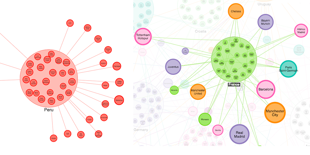
To find the teams with the most wide-reaching connections, we used a social network analysis measure known as Eigenvector Centrality. Eigenvector Centrality scores each node by how many connections it has, weighting those connections by how many connections the node at the other end of the link has, and so on.
As this calculation iterates through the network, it converges on a score that indicates a node’s relative importance. In this case, the result was a list of the final 16, ranked from most international to least:
Country		Centrality score
France		7.48
Belgium		7.07
Germany		7.06
Argentina	7.03
Croatia		6.67
Colombia	6.37
Brazil		5.83
Portugal	5.74
Spain		5.69
Uruguay		5.15
Switzerland	4.96
Poland		4.66
Denmark		3.94
England		3.91
Serbia		3.49
Morocco		3.20
Senegal		2.99
Nigeria		2.58
Mexico		2.51
Japan		2.46
Sweden		2.09
Costa Rica	1.95
Egypt		1.65
Australia	1.10
South Korea	0.86
Tunisia		0.74
Iceland		0.71
Russia		0.59
Peru		0.53
Saudi Arabia	0.36
Panama		0.22
Iran		0.07
Based on our theory, teams with higher centrality scores are more international and therefore should progress further in the competition. How did we do?
A win for Social Network Analysis
Looking back, we can compare each team’s centrality score with how far they progressed. The result was a surprise to us all:
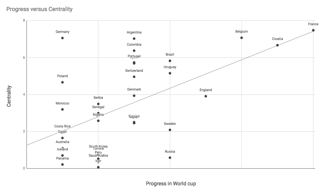
On the left-hand side of the chart, we see the teams that were knocked out at the group stage. On the right-hand side are the teams that progressed further in the competition. Pleasingly, adding a trend line we can see some correlation between the centrality score and team progress in the World Cup – backing the prediction.
Centrality anomalies: The World Cup shocks
The 2018 World Cup was full of surprises. From defending champions Germany failing to make the final 16, to England’s completely unexpected journey to the semi-finals, there were some teams who defied the prediction:
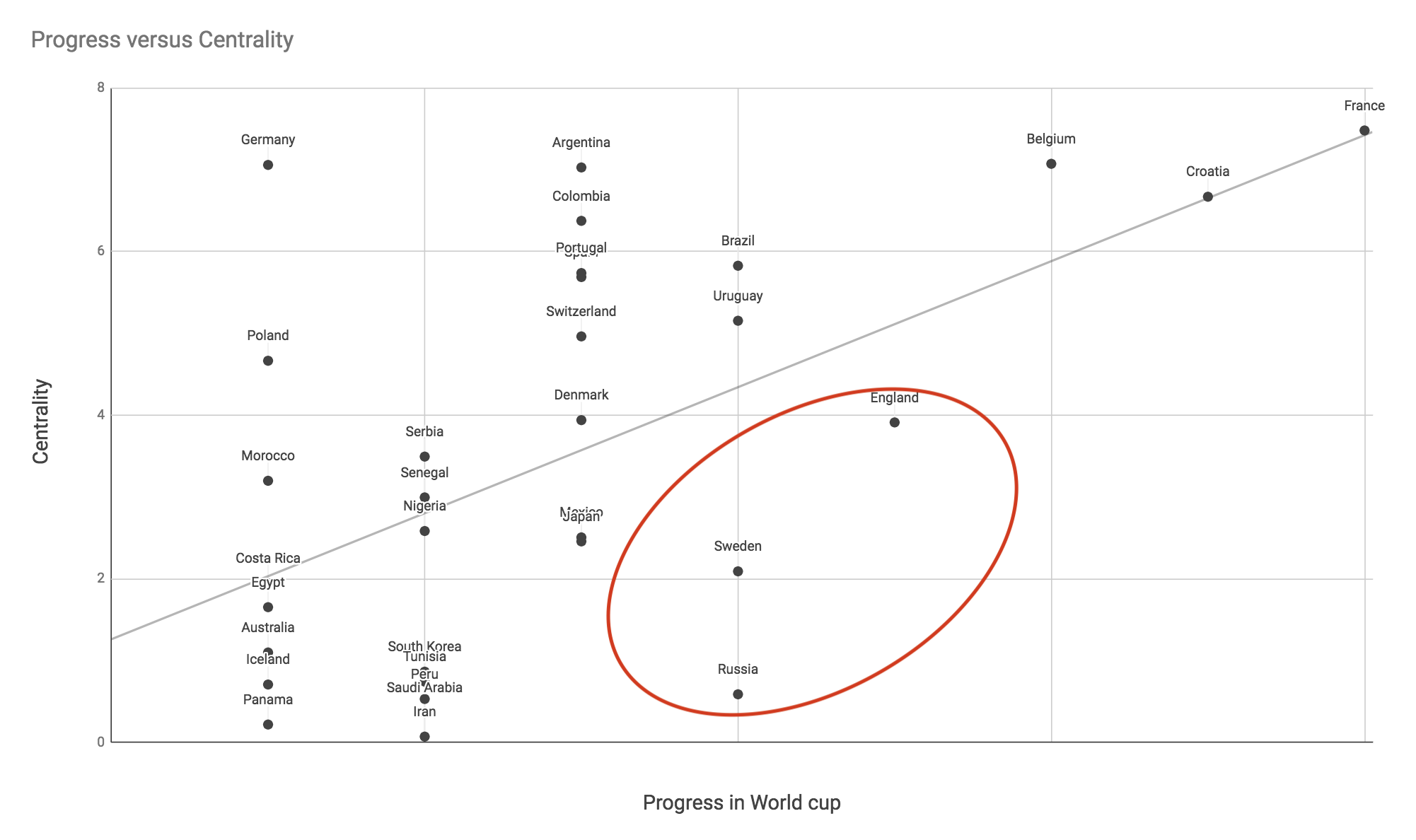
Russia, Sweden and England all progressed further than their centrality score implied they would.
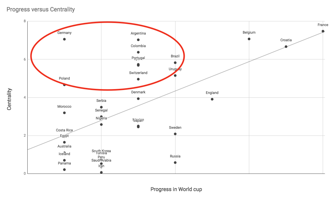
On the other hand, it’s fair to say Germany, Argentina and Brazil expected more from their national teams.
The luck of the draw?
One often-cited reason for this year’s unexpected results was the uneven distribution of quality sides in each half of the draw for the knockout stages.
By the round of 16, it seemed that the majority of teams in one side of the draw consisted of historically strong teams (including France, Argentina, Uruguay, Brazil and Belgium), and the other with historically weaker teams (like Russia, Denmark, Sweden, Switzerland and England).
Based on our scoring, there might be some truth to that:
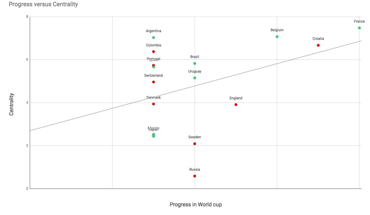
Here the teams are colored based on which ‘group’ they belonged to: red being the weaker side, green being the stronger side.
There’s a bit of spread, but generally the weaker teams had a lower centrality score and the stronger teams had a higher score. But in the end, the strongest team won.
Graph Theory v Zabiyaka the goat
There are lots of ways we could measure the accuracy of this prediction, but what matters most are the results. If we’d used centrality scores to predict the winner of each match, how often would we have been right?
Bookmakers make billions by predicting the outcomes of sporting events, but we all know animals are the real oracles when it comes to the World Cup. In 2014 we had Paul the Octopus. How do our predicting abilities compare?
From the 16 matches in the knockout phase, we were right 12 times, or 75%. From the quarter finals onwards, all predictions were correct.
Zabiyaka the Goat, on the other hand, seems to have got most of her predictions wrong.
Graph theory 1-0 Goats
Try it for yourself
This was a fun experiment to see how far social network analysis can take us when exploring a new dataset, but there are real world uses for this approach.
Often threat analysts work with incomplete data and need to extrapolate insight from the information they have at hand. Analyzing connections is often a great way to get deeper insight into the nodes themselves.
Modern day intelligence (probably unlike football punditry – we’ll go back to our day jobs now) is all about quickly prioritizing from large amounts of incomplete connected data – and in that scenario, graph analysis could be invaluable.
If you’d like to kick off your own evaluation, request a free trial of our toolkits.
image source: https://buff.ly/2me2cFK


