FREE: Start your trial today
Visualize your data! Request full access to our SDKs, demos and live-coding playgrounds.
The newest versions of our data visualization tools bring features that make them faster, better-looking, and easier to use. The improvements we’ve made enrich the user experience and offer more intuitive design options, helping you create visualizations that look great and make your investigative work more efficient.
With the latest update, the floating abstract nodes and links (such as persons of interest and their business connections) now respond intelligently to zoom interactions – automatically repositioning themselves around the geolocated nodes to maintain clarity and readability.
Our tracker nodes feature shows you where moving objects are at a given point in time along their observed trajectory – whether that’s people, ships, or vehicles. You can see their current location and check if they’re still following their expected path.
Using our GeoJSON layer, you can draw areas on the map to monitor specific zones, such as ports or restricted areas. The new tracker node position API makes it easy to detect an intersection between a tracker and an area of interest, and you can customize the UI to create visual alerts for the user.
In this example, we’re monitoring two ships. When they enter one of the zones we’ve drawn on the map, that area lights up in the ship’s color. This makes it easy to see at a glance which ship has breached a region of interest at a given time.
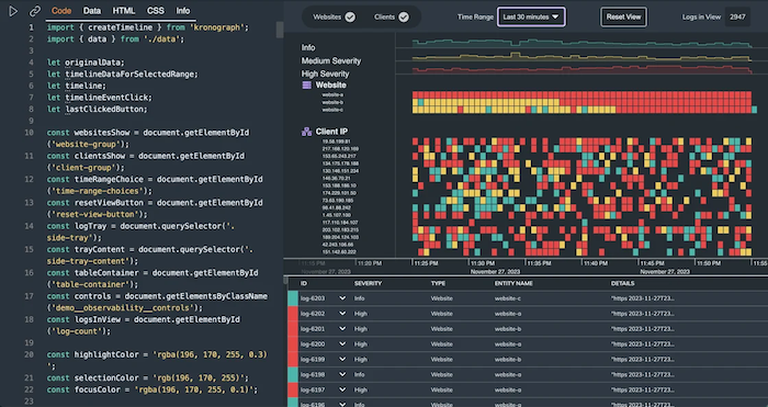
Timeline visualizations shouldn’t force you to choose between overview and detail. KronoGraph 3.5‘s Expanded Rows feature brings you the best of both worlds, and the release lets you explore the new Observability showcase code in the Playground.
The KronoGraph timeline automatically aggregates events when they overlap, or when they’re very close together in time, in order to keep the timeline neat and clutter-free. But in certain cases, it’s important for the user to be able to see and interact with the individual events.
We developed the Expanded Rows feature to make this possible. It expands entities with overlapping duration events across multiple sub-rows either automatically, or on demand:
And we’ve created a new Business Process Analysis demo that demonstrates how KronoGraph’s timeline visualization can reveal performance patterns and bottlenecks in support team workflows:
Following the release of our KronoGraph Observability showcase, we’ve made the source code available in the Playground, so you can experiment with your own datasets and get a head start on your project:
Glyphs are incredibly versatile – you can use them as alerts, counters, short texts, decorations or even as interactive buttons. To make glyphs easier to use and integrate into your charts, we’ve introduced a more intuitive and customisable border styling API which means you can not only set the color but can now also control the width.
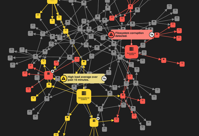
We’ve also redesigned our Impact Analysis demo, which now features an enhanced alert system and interactive annotation glyphs.
All the updated SDKs are available now for customers and evaluators to try, including a live-coding playground and detailed developer documentation.
If you’d like a guided demo, get in touch with a member of our team and we’ll be happy to show you how it works.
Visualize your data! Request full access to our SDKs, demos and live-coding playgrounds.
Registered in England and Wales with Company Number 07625370 | VAT Number 113 1740 61
6-8 Hills Road, Cambridge, CB2 1JP. All material © Cambridge Intelligence .
Privacy Policy | Security Framework


