FREE: KronoGraph white paper
Our essential guide to building powerful and intuitive timeline visualization applications.
The latest KronoGraph version offers visually stunning features and enhancements to inspire your creativity.
We’ve added one of our most-requested new features: a way to view events that happen simultaneously on a timeline. We’ve also updated a popular showcase demo with HTML elements that demonstrate how to enhance timelines with content-rich annotations.
That’s not all. Our time series charts are now in beta development, plus there’s a new option which draws attention to sudden changes in your continuous data.
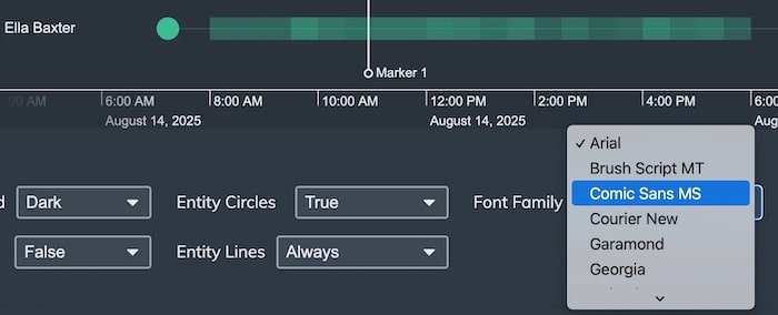
And last but not least, we’ve added another feature which our customers asked for – you can now change the font style in a KronoGraph visualization to match the fonts you use in your app.
When you’re working with KronoGraph timelines, you can now view multiple events that happened at the same time more easily.
To avoid cluttering the timeline with too much information, simultaneous events are represented by an ‘event fold’. Clicking on an event fold will open it, so that you can interact with the individual events inside.
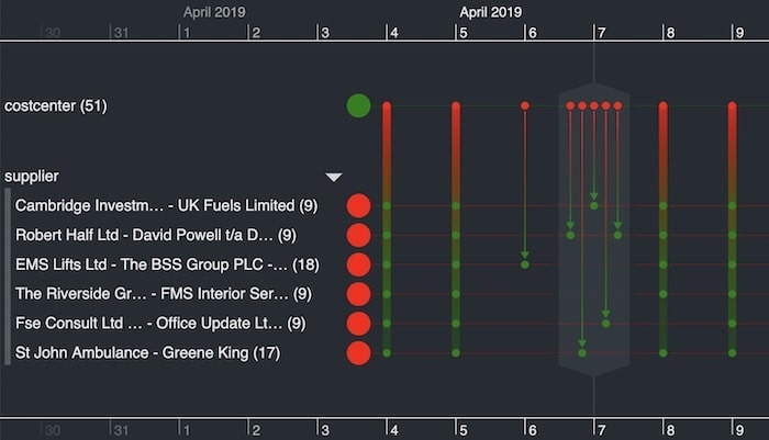
If you sign up to a free KronoGraph trial, you can see this new feature in action in the Event Folds story.
In KronoGraph 1.11, we released two new APIs to get the positions of entities and events on the timeline. To demonstrate the power of this feature, we’ve added our own media-rich annotations to the timeline in the Social Media Showcase, one of many demos available on the SDK.
Media-rich annotations are an effective way to add context to your timeline without obscuring events. You can toggle them on and off, reveal useful information when it’s needed, and style them however you like.
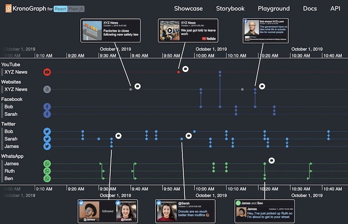
By popular request, you can now change the font family in KronoGraph to match the fonts you use in your application for a more consistent look and feel.
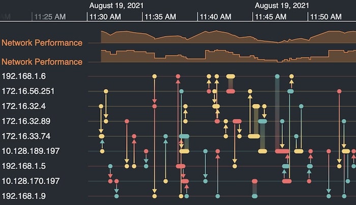
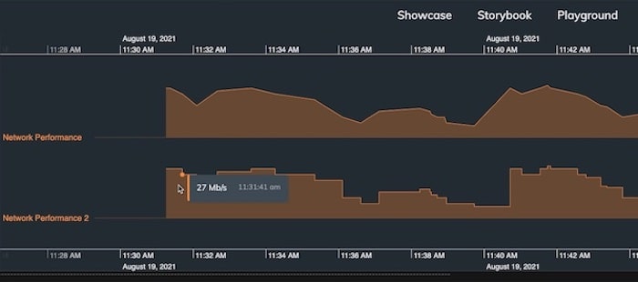
KronoGraph’s popular time series charts are now in beta development, so you can use them in production. They give users an aggregated view of high-volume, continuous data, such as network monitoring metrics or telecoms records.
Previously, time series charts drew a continuous line between data points to provide a ‘linear’ view. Now there’s an option to choose a step view instead. This provides more meaning and accuracy for datasets with discrete points where it’s useful to visualize immediate changes, for example, account balances or network performance.
We hope you enjoy getting creative with these KronoGraph features and enhancements. Do let us know what you think at: [email protected]
As always, it’s better to see the tool in action, and the KronoGraph SDK comes with fully-documented stories, demos and example code. Request a free trial to start visualizing your time-based data today.