FREE: KronoGraph white paper
Our essential guide to building powerful and intuitive timeline visualization applications.
We’re proud to announce that version 1.1 of KronoGraph, our interactive timeline visualization tool, is available to download. It comes with a very special feature for exploring patterns of behavior by wrapping data in different timeline scales, along with fully-documented examples to get you started quickly.
For investigators to recognize anomalies in their time-based data, they first need to understand what a typical pattern of activity looks like. Pattern of life analysis is a powerful technique used by intelligence agencies worldwide.
KronoGraph’s timeline scale wrapping feature is a fully-interactive way to uncover familiar event sequences that might otherwise go unnoticed.

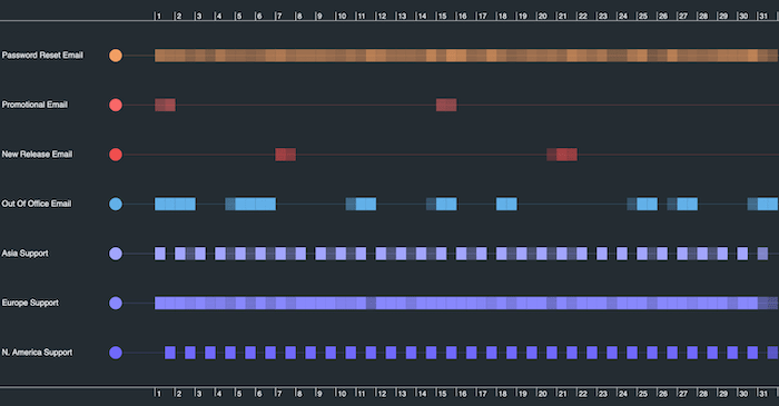
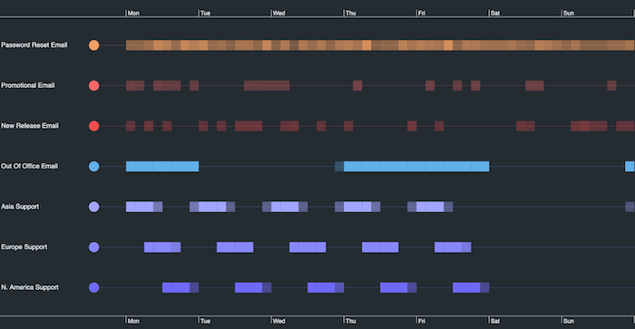
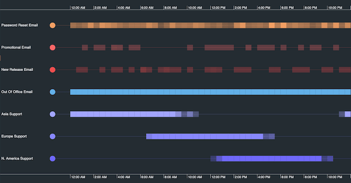
Investigators summarize their data over a specific period – a day, a week, a month, etc. – to understand what ‘typical’ activity looks like. KronoGraph wraps the chosen duration in the selected timeline scale, making clear how activities are distributed and revealing hidden patterns at a glance.

Once the data at a certain timeline scale has been explored, users instinctively want to look at the data on other scales to build up a more detailed pattern of activities. There’s no need to scroll to the time period you want: KronoGraph automatically filters and fits the timeline data to the screen.

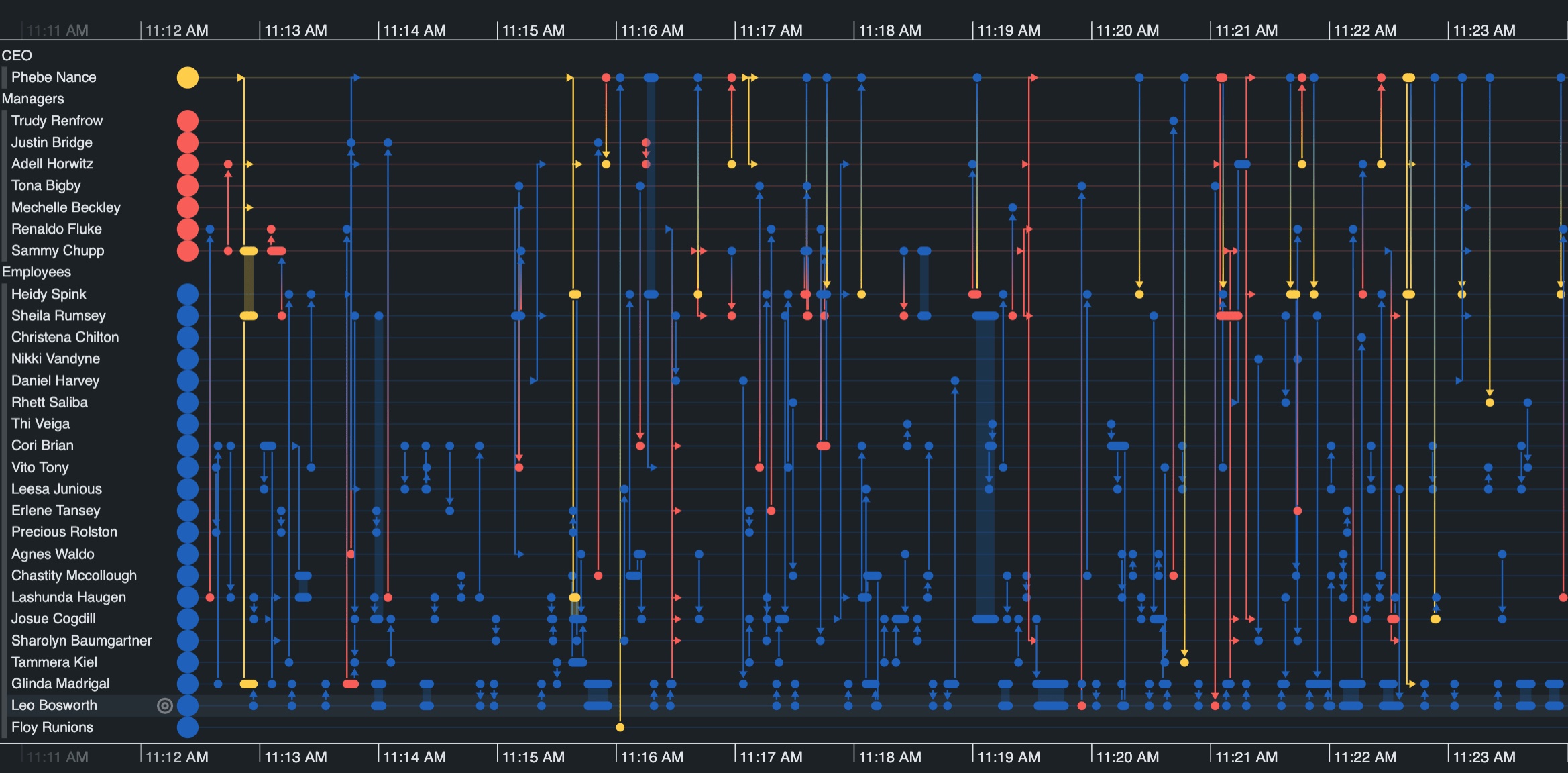
The best way to get up to speed with scale wrapping is to try it for yourself. We’ve created a brand new demo to showcase how to discover patterns in a dataset of company emails. Use timeline scale wrapping to find out when the CEO usually starts emailing, and which employees send messages at unusual hours.

Ready to add scale wrapping to your timeline visualization application? Follow the dedicated story, complete with example code, to get started fast. There’s also detailed developer documentation including updates to the KronoGraph API library.
To help your timeline application users carry out pattern of life analysis, simply download the latest version of KronoGraph.
Not an existing KronoGraph user? No problem! Request a free trial to get started