Discover MapWeave
The revolutionary geospatial visualization SDK that uncovers every connection.
If you’re already using Mapbox for data visualization but need to reveal the hidden connections and relationships in location-based data, our geospatial visualization SDK could be exactly what you’re missing. While Mapbox excels at traditional mapping and location-based views, it doesn’t offer built-in graph analysis or network visualization capabilities. And that’s where MapWeave comes in.
MapWeave is a specialized JavaScript library that complements Mapbox perfectly, adding powerful graph and link analysis features to your existing mapping projects. Instead of replacing your Mapbox setup, MapWeave enhances it, letting you visualize not just where your data points are located, but how they’re connected and what patterns emerge from their evolving relationships.
In this technical tutorial, I’ll show you how to integrate MapWeave’s geospatial visualization capabilities with your existing Mapbox data visualization setup. Using real-world data from US international airport entries (sourced from the National Travel and Tourism Office), I’ll build a hybrid visualization that reveals both geographic hotspots and the network connections between high-traffic border crossing areas.
MapWeave’s plugin architecture is specifically designed to complement mapping libraries like Mapbox and MapLibre. This integration approach means you can:
If you’re not already using MapWeave, our geospatial visualization SDK, you can request a free trial now.
We’ll use Vite as our build tool for quick project scaffolding, and TypeScript for type safety. MapWeave is built with TypeScript, and provides full typing capabilities for your project.
(Once you’ve downloaded MapWeave, you can refer to the Getting Started guide on the SDK site.)
Use the vanilla TypeScript template:
npm init vite@latest my-mapweave-app -- --template vanilla-ts
Then go into the created app folder:
cd my-mapweave-app
And finally, copy MapWeave from your downloads:
cp ~/Downloads/mapweave-x.x.x.tgz .
npm add file:mapweave-x.x.x.tgz
npm i
Now we can create our first MapWeave visualization with the base tiles provided by Mapbox. That requires a few changes to the main.ts file in the src folder:
import "./style.css";
import { MapWeave, ViewState } from "mapweave/mapbox";
import "mapbox-gl/dist/mapbox-gl.css";
import { NetworkLayer } from "mapweave/layers";
import { Map } from "mapbox-gl";

let mapweave: MapWeave;
let networkLayer: NetworkLayer;
let mapBoxMap: Map;
let comboNodes: { [key: string]: string[] } = {};
let selectedNodeId: string | null;
let idsToForeground: string[] = [];

const defaultView: ViewState = {
  latitude: 25,
  longitude: 10,
  zoom: 1.5,
  pitch: 0,
  bearing: 0,
};

function runMapWeave() {
  mapweave = new MapWeave({
    container: "mw",
    options: {
      accessToken: VITE_MAP_BOX_API_KEY,
    },
  });

  mapweave.view(defaultView);
}

runMapWeave();
Here we imported the MapWeave package that uses the Mapbox adapter – which comes built-in with MapWeave. We also import Mapbox itself. Set some variables we’ll need in the future, and import and relevant TypeScript types for those.
To work with MapBox you’ll need a developer API key that they provide. You can replace the value of the VITE_MAP_BOX_API_KEY variable with your key. For production applications, we recommend saving the key in an ‘.env’ file, which you can import into your application. More on that can be found on Vite’s documentation.
We also set the default view for our map, which will centre the view on the continental United States.
The next step is to make sure the map displays properly, with the right viewport and container:
<!doctype html>
<html lang="en">
<head>
  <meta charset="UTF-8" />
  <link rel="stylesheet" href="src/style.css" />
  <script type="module" src="src/main.js"></script>
  <meta name="viewport" content="width=device-width, initial-scale=1.0" />
  <title>MapWeave App</title>
</head>
<body>
  <div id="mw"></div>
</body>
</html>
In index.html we change the main div element’s id from ‘app’ to ‘mw’. This will be the div element in which MapWeave will be initialized.
#mw {
  height: 100vh;
}

body {
  margin: 0;
}
Then we set our CSS in style.css so the app is full screen and there are no default borders around it.
Finally, run the app with npm run dev. You should now be able to see an empty map based on the default Mapbox tile set.
MapWeave’s network layer solves complex geospatial graph challenges, including handling nodes without geographical locations and visualizing highly connected graphs without visual clutter.
We’ll adjust main.ts to import the network layer:
import { NetworkLayer, NetworkLayerOptions } from "mapweave/layers";
On top of our file we’ll import the layer and its option types. Make sure you import the JavaScript version of the layer, and not the React component one.
Under the defaultView const, we’ll add some options for the layer, which will adjust its look.
const networkLayerOptions: NetworkLayerOptions = {
  layout: { desiredLinkDistance: 40 },
  labels: { collision: { priorityProp: "labelPriority" } },
};
The desiredLinkDistance controls spacing for non-geolocated nodes, while priorityProp manages label layering similar to CSS z-index.
Update the runMapWeave function:
function runMapWeave() {
mapweave = new MapWeave({
container: "mw",
options: {
accessToken: VITE_MAP_BOX_API_KEY,
},
});
networkLayer = new NetworkLayer({
data: {
node1: {
type: "node",
latitude: 42.6334,
longitude: -71.3162,
},
node2: {
type: "node",
latitude: 40.1951,
longitude: -123.1313,
},
link1: {
type: "link",
id1: "node1",
id2: "node2",
},
},
options: networkLayerOptions,
});
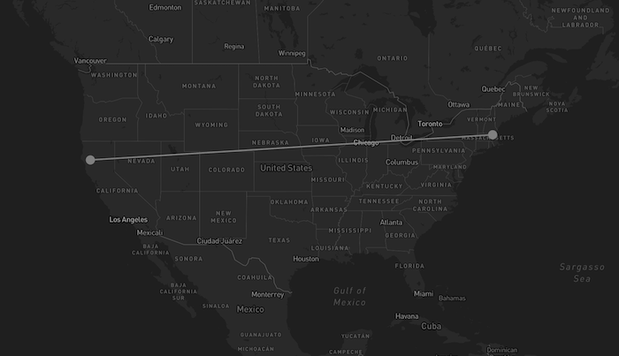
mapweave.addLayer(networkLayer);
mapweave.view(defaultView);
}
You should now see two connected nodes spanning the continental United States:
Data from the National Travel and Tourism Office’s I-94 arrivals program is free to download. We’ll take travel data for December 2024 and convert it from CSV to MapWeave’s expected format, JSON.
The JSON format represents an array of objects. Each object represents an airport border port of entry and it has the following properties: ‘airport’, ‘lat’, ‘long’, ‘port_code’, and finally a ‘data’ object containing how many people have entered at that airport per country.
We put our newly created data.ts file in a new directory called data. In this example, I’ve used a const called rawData:
export const rawData = [
  {
    airport: "Anchorage, AK (ANC)",
    lat: 61.1744,
    long: -149.9961,
    port_code: "3126",
    data: {
      Germany: "8",
      Italy: "2",
      Netherlands: "1",
      Spain: "1",
      "Hong Kong": "12",
      Japan: "33",
      "South Korea": "3",
      Philippines: "1",
      "PRC (Excl HK)": "7",
      Taiwan: "4",
      Singapore: "4",
      Turkey: "1",
      Australia: "2",
      Argentina: "1",
      Peru: "1",
      Panama: "2",
    },
  },
  ...
]
In data.ts we’ll create an object that maps the lat and long coordinates for each country. This will help us position each country node that we create at the right location.
Here’s a snippet of that object, which we export as a const called countryLocations:
export const countryLocations: {
  [key: string]: { lat: number; long: number };
} = {
  Austria: { lat: 47.2, long: 13.2 },
  // ... more countries
};
Back in the main.ts file, we’ll import the rawData and countryLocations at the top. I’m also importing a plane SVG image that we can use for our airport nodes. You can use any SVG image here:
import { rawData, countryLocations } from "./data/data";
import planeIcon from "./images/plane.svg";
Next we need to give MapWeave our data in a format that it understands. Each layer in MapWeave accepts different types of data in the form of a standard JavaScript object. For the network layer, we need to transform our data into nodes and links:
function transformDataToPortsOfEntryAndCountries(
  inputData: { [key: string]: any }[]
) {
  const newData: NetworkLayerData = {};

  for (const item of inputData) {
    const { airport, lat, long, port_code: portCode, data } = item;
    let numOfPeople = 0;

    for (const country in data) {
      const numberOfPeopleEntering = Number(data[country]);
      numOfPeople += numberOfPeopleEntering;
      const countryNodeId = `${country}`;
      const linkId = `${portCode}-${countryNodeId}`;

      // Create country nodes
      if (!newData[countryNodeId]) {
        newData[countryNodeId] = {
          type: "node",
          latitude: countryLocations[country].lat,
          longitude: countryLocations[country].long,
          color: "rgb(0, 254, 220)",
          size: 3,
          label: [
            {
              text: `${country}: ${new Intl.NumberFormat("en-US").format(
                numberOfPeopleEntering
              )}`,
              backgroundColor: "rgba(86, 101, 115, 0.5)",
              radius: 7,
            },
          ],
          data: {
            peopleEntering: numberOfPeopleEntering,
            labelPriority: 0,
            nodeType: "country",
          },
        };
      } else {
        // Update existing country node
        const updatedPeopleNumber =
          newData[countryNodeId].data.peopleEntering + numberOfPeopleEntering;

        newData[countryNodeId] = {
          ...newData[countryNodeId],
          label: [
            {
              text: `${country}: ${new Intl.NumberFormat("en-US").format(
                updatedPeopleNumber
              )}`,
              backgroundColor: "rgba(86, 101, 115, 0.5)",
              radius: 7,
            },
          ],
          data: {
            ...newData[countryNodeId].data,
            peopleEntering: updatedPeopleNumber,
          },
        };
      }

      // Create links between countries and airports
      newData[linkId] = {
        type: "link",
        color: "rgba(104, 172, 255, 0.03)",
        id1: countryNodeId,
        id2: portCode,
      };
    }

    // Create airport nodes
    newData[portCode] = {
      type: "node",
      color: "#2471a3",
      latitude: Number(lat),
      longitude: Number(long),
      image: { url: planeIcon, color: "white", scale: 1.1 },
      label: [
        {
          text: `${airport.slice(-4, -1)}: ${new Intl.NumberFormat(
            "en-US"
          ).format(numOfPeople)}`,
          backgroundColor: "rgba(86, 101, 115, 0.5)",
          radius: 11,
        },
      ],
      data: {
        peopleEnteringPerCountry: data,
        peopleEntering: numOfPeople,
        airport: airport,
        labelPriority: 0,
        nodeType: "port-of-entry",
      },
    };
  }

  return newData;
}
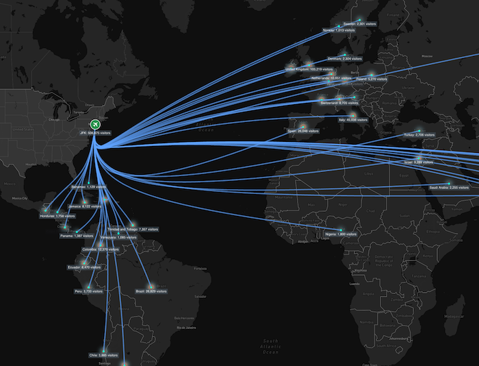
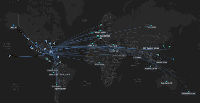
We want to have a node for each port of entry as well as each country, both showing the total number of people entering or exiting.
Now, we can pass the transformed data to the data property when creating the network layer:
networkLayer = new NetworkLayer({
  data: transformDataToPortsOfEntryAndCountries(rawData),
  options: networkLayerOptions,
});
You should now see all the new nodes and links on your map:
It’s hard to examine the visualization at this stage, because of the number of links and port-of-entry nodes we’ve added. That’s easily solved using MapWeave’s advanced geospatial visualization features.
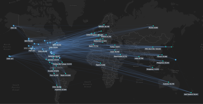
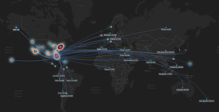
To make the data shine on first load, we’ll use the network layer’s proximity combine, link bundling and adaptive opacity features.
Update the networkLayerOptions to turn on all the features:
const networkLayerOptions: NetworkLayerOptions = {
  layout: { desiredLinkDistance: 40 },
  labels: { collision: { priorityProp: "labelPriority" } },
  proximityCombine: {
    enabled: true,
    radius: 22,
    onCombineNodes,
  },
  adaptiveOpacity: {
    enabled: true,
    minimumOpacity: 0.25,
    nodeCountThreshold: 100,
  },
  links: {
    bundling: { enabled: true },
  },
};
The proximity combine radius lets us fine-tune how close to each other the nodes need to be before they are grouped. Adaptive opacity surfaces the most important nodes and links in a view based on the betweenness graph score. We adjust the minimumOpacity to make links not in the current view fade away when we zoom and nodeCountTreshold leaves more of the nodes visible on the map.
The proximity combine options also take an onCombineNodes function that determines the look of the group node. We can place that function alongside the data transformation ones we wrote earlier:
function onCombineNodes({ id, nodes, setStyle }: ComboNodeDefinition) {
  const isPortOfEntry =
    Object.values(nodes)[0]?.data?.nodeType === "port-of-entry";

  setStyle({
    color: isPortOfEntry ? "#0d5280" : "rgb(31, 154, 137)",
    border: { color: "white", width: 1 },
    size: 6,
    image: { url: "", color: "rgba(0,0,0,0)" },
    label: [
      {
        text: `${Object.keys(nodes).length}`,
        position: "center",
        backgroundColor: "rgba(0,0,0,0)",
        fontSize: 7,
      },
    ],
    data: { labelPriority: 100 },
  });

  // Keep track of which nodes are in which combo node
  // We use this for our `on click` interactions
  comboNodes[id] = Object.keys(nodes);
}
The function takes a few parameters, which MapWeave will pass to it. Here we’ll use all of them: id, nodes and setStyle. The last is a function, which will let us style the resulting group node. We’ll style the node in a slightly different shade of blue, add a white border and a text label showing the number of nodes that have been grouped. A high label priority has been set so the labels on group nodes are always visible, and take priority over other labels that might want to get drawn in the same area of the map.
This creates a much cleaner initial view with grouped nodes and bundled links, making it much more readable for our users:
Now we’ll use the flexibility of MapWeave 3rd party integrations and use Mapbox’s heatmap layer inside MapWeave so we can visually show the most popular ports-of-entry areas on the map based on the number of people entering each crossing.
MapWeave provides direct access to the underlying Mapbox instance, allowing us to add Mapbox’s heatmap layer.
Adjust the runMapWeave function so we can save the Mapbox map in a variable and then run a function to create the heatmap layer.
function runMapWeave() {
  // ... existing code

  // Access Mapbox instance
  if (mapweave.map) {
    mapBoxMap = mapweave.map;
    initializeMapBoxLayers();
  }
}
Following this, we can create a function that will set up the heatmap layer and its options. The options include the intensity of the heatmap based on people crossing, the colors for each intensity and also the heatmap’s size and opacity based on zoom level.
function initializeMapBoxLayers() {
  mapBoxMap.on("load", () => {
    const mapWeaveData = transformDataToPortsOfEntryAndCountries(rawData);

    mapBoxMap.addSource("visitors", {
      type: "geojson",
      data: transformDataToGeoJsonPoint(mapWeaveData),
    });

    mapBoxMap.addLayer({
      id: "visitors-heat",
      type: "heatmap",
      source: "visitors",
      paint: {
        "heatmap-weight": [
          "interpolate",
          ["linear"],
          ["get", "peopleEntering"],
          0, 0,
          100, 0.1,
          1000, 0.25,
          10_000, 0.5,
          100_000, 0.75,
          500_000, 1,
        ],
        "heatmap-intensity": ["interpolate", ["linear"], ["zoom"], 0, 1, 10, 5],
        "heatmap-color": [
          "interpolate",
          ["linear"],
          ["heatmap-density"],
          0, "rgba(33, 140, 172, 0)",
          0.2, "rgba(147, 207, 224, 0.35)",
          0.4, "rgba(240, 233, 209, 0.5)",
          0.6, "rgba(253, 219, 199, 0.75)",
          0.8, "rgba(239, 138, 98, 0.85)",
          1, "rgb(116, 23, 38)",
        ],
        "heatmap-radius": ["interpolate", ["linear"], ["zoom"], 0, 30, 9, 50],
        "heatmap-opacity": [
          "interpolate",
          ["linear"],
          ["zoom"],
          0, 1,
          5, 1,
          15, 0.1,
        ],
      },
    });
  });
}
On load of the Mapbox basemap we not only create a new heatmap layer but we also need to specify a new source of data for the heatmap layer. We do so with the addSource method from Mapbox. It takes a GeoJSON source so we need to convert our existing data to the one expected by the heatmap. We’ll do that by creating a new function and pass the newly converted data to the data prop of the addSource method.
The function is transformDataToGeoJsonPoint. We can put it above or below the heatmap initialization function:
function transformDataToGeoJsonPoint(data: NetworkLayerData) {
  const geoJson: GeoJsonLayerData = { type: "FeatureCollection", features: [] };

  for (const item in data) {
    const itemValue = data[item];

    if (
      itemValue.type === "node" &&
      itemValue?.longitude &&
      itemValue?.latitude &&
      itemValue?.data?.nodeType === "port-of-entry"
    ) {
      const peopleEntering = itemValue.data.peopleEntering;
      const coordinates = [itemValue.longitude, itemValue.latitude];

      geoJson.features.push({
        type: "Feature",
        geometry: { type: "Point", coordinates },
        properties: { peopleEntering },
      });
    }
  }

  return geoJson;
}
We convert the location of each airport port-of-entry to a GeoJSON point feature with a property that represents the number of crossings which the heatmap layer will use as a reference.
Finally, we have a finished visualization that lets users zoom in to areas with high or low traffic guided by the heatmap at a high level.
It’s easy to see the advantage of combining MapWeave’s graph visualization capabilities with Mapbox’s mapping expertise. We’ve got clean graph visualization on maps without overwhelming visual clutter; intelligent node grouping that adapts to zoom levels; and integrated heatmap analysis showing traffic density patterns.
From this foundation, you can extend the application by adding MapWeave’s GeoJSON layer for border visualization, implementing real-time data updates, creating custom interaction patterns, and building responsive interfaces with React components.
The combination of TypeScript support and MapWeave’s flexible architecture will keep your geospatial applications maintainable and scalable as they grow in complexity. You can also customize the look and feel of the visualization to improve the clarity – above I’ve updated the basemap to increase the contrast, and adjusted the link opacity and node size.
The revolutionary geospatial visualization SDK that uncovers every connection.
Registered in England and Wales with Company Number 07625370 | VAT Number 113 1740 61
6-8 Hills Road, Cambridge, CB2 1JP. All material © Cambridge Intelligence .
Privacy Policy | Security Framework


