Discover MapWeave
The revolutionary geospatial visualization SDK that uncovers every connection.
From military conflict and piracy, to illegal fishing and smuggling operations, today’s maritime intelligence analysts contend with a growing list of challenges. With vast ocean territories and billions of vessel movements to monitor, teams need faster, smarter ways to uncover critical insights, identify threats, and take action.
Let’s explore how modern geospatial, graph, and timeline visualization technologies are helping teams to:
All the visualizations you’ll see here are built using our data visualization toolkits, notably MapWeave, our geospatial visualization SDK. But first, let’s establish some foundational concepts about maritime intelligence.
Maritime intelligence is the process of turning vast amounts of ocean-based data into clear, actionable insights. It can involve tracking vessel movements and analyzing behavioral trends. Using tools like AI, satellite imagery, and real-time monitoring, maritime intelligence helps organizations anticipate risks, improve decision-making, and stay ahead of threats. It plays a vital role in protecting maritime operations and ensuring the safe, legal, and efficient use of global waterways.
Enhanced security: Maritime visualization helps to detect and deter illegal activities, protect critical infrastructure, and prevent maritime-related security threats.
Improved safety: By monitoring maritime traffic and conditions, maritime intelligence input can help prevent accidents, improve search and rescue operations, and enhance overall maritime safety.
Economic benefits: Maritime intelligence supports safe and efficient maritime trade, protects marine resources, and helps to prevent illegal activities that can harm the economy.
Environmental protection: Maritime intelligence plays a role in monitoring and addressing illegal dumping, pollution, and other environmental threats.
Maritime Domain Awareness (MDA) is essential for understanding what is happening in the maritime environment, assessing potential implications, and being ready to act. It encompasses three key components:
Maritime situational awareness: Gathering and analyzing data on vessels, cargo, personnel, and infrastructure to understand current maritime conditions
Maritime threat awareness: Identifying and assessing risks such as piracy, smuggling, illegal fishing, and terrorism
Maritime response awareness: Ensuring the capacity to respond quickly and effectively to emerging threats or incidents
MapWeave supports MDA by providing powerful visualization and integration tools that help users make sense of complex maritime data, enabling faster decision-making and more informed action.
There’s a wealth of open and closed source data to support maritime investigations, but we’ll focus on two main types:
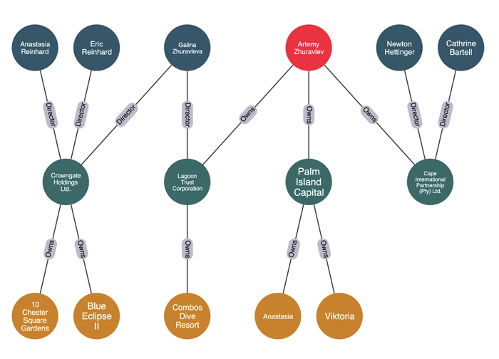
This kind of data isn’t just about who owns what, but rather, who benefits from it. Beneficial ownership information can be enhanced and enriched by leveraging data from multiple sources, and is ideal for graph-based link analysis. For example, it can help maritime intelligence analysts uncover how sanctioned individuals maintain ties to other entities – people, companies, vessels, and high-value assets – through layered corporate ownership structures, deriving benefit from something, without an obvious association.
For ships, the Automatic Identification System (AIS) is the most common source of real-time and historical location data. It collects and shares location data across a network of vessel-based, terrestrial, and satellite transceivers. Later on, we’ll take a look at how AIS data can be supplemented with other sources in maritime intelligence visualization, particularly space-based data such as RF data, Synthetic Aperture Radar (SAR) and traditional photo imagery from satellites to provide further evidential data.
Here’s a graph visualization of a subset of a beneficial ownership dataset. It shows the relationship between a sanctioned individual and a number of high value assets, including ships:
This graph is a great way to understand structure and hierarchy. But when location matters for maritime intelligence operations, a geospatial view can be more powerful – especially if we’re monitoring mobile targets such as people and vessels.
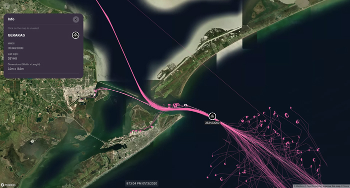
MapWeave’s unique geospatial layout reveals both macro-level patterns – such as sanctioned individuals who own vessels across multiple countries – and micro-level connections as you zoom into specific regions, like clustered networks of people and addresses in the UK and South Africa:
But maritime datasets can get much larger than this, particularly once we take AIS observations of vessel positions into account. This is where MapWeave’s powerful observations layer transforms maritime intelligence visualization.
We can use the observations layer to load large volumes of AIS measurements into the browser (we’ve tested it with well over a million data points), and explore a range of different visualization options.
In this example, we’re inferring trajectories (paths between successive observations of the same vessel) from the raw data, and visualizing them over satellite imagery provided through our mapbox adapter. This helps us understand ‘normal behavior’, referred to as ‘pattern-of-life’ – you can see the most common shipping lanes around the Florida coast and the Bahamas.
The interactive time bar displays peaks in activity, while small white tracker nodes on the map show vessel positions at the selected time point.
We’ve seen how pattern-of-life analysis helps maritime intelligence analysts to understand normal patterns – it’s also key to spotting outliers and unusual behavior. KronoGraph is a great supporting tool for this: it’s our toolkit for building rich, interactive timeline narratives.
KronoGraph’s ‘scale wrapping’ mode shows a heatmap view of activity over a particular repeating period. This timeline spans 24 hours:
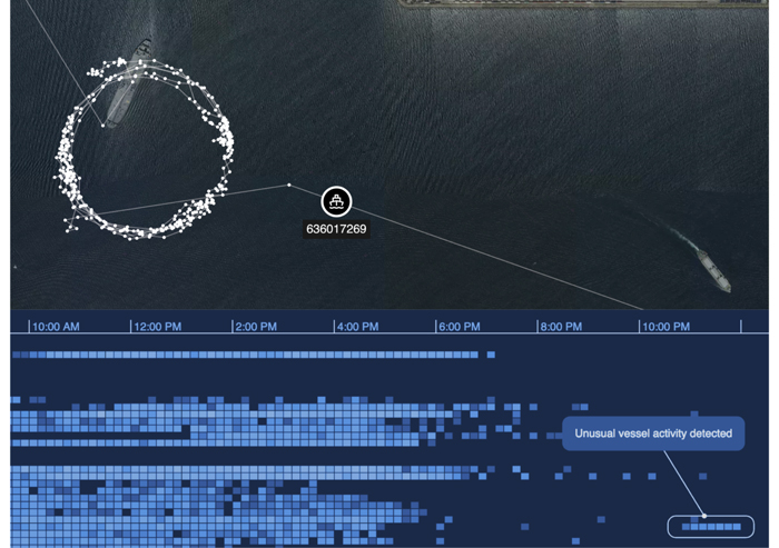
When analysts or AI/ML systems detect unusual activity, KronoGraph provides critical context, revealing exactly how the vessel’s suspicious trajectory deviates from its typical daily pattern.
These tools are not just useful for historical analysis. They can also be used to support real-time monitoring of ocean activity. Let’s see how.
In an operational context, the main challenge with maritime data is separating signal from noise. Analysts often need to monitor thousands of vessels simultaneously. While some of them may already have been flagged as suspicious, many potential threats remain hidden.
A typical geospatial intelligence fusion platform usually offers a number of sophisticated data feeds, and AI-based detection and alerting. The analyst’s challenge is to understand the meaning of alerts when they arise, and make decisions on how to interpret them. This is where visualization comes in.
An alert might be triggered by the detection of a known AIS ‘spoofing’ pattern or a sudden loss of AIS data. Identifying when a vessel has ‘gone dark’ or is concealing its true location is crucial – but automated reports can often produce false positives.
A tool like MapWeave, which can highlight, annotate and replay these suspicious events, can be a vital part of the decision-making process.
In this example, the ship’s AIS signal doesn’t match a separate tracking signal picked up by a satellite using radio frequency monitoring. The AIS track seems particularly suspicious, with a known spoofing signature of randomly generated position readings.
The MapWeave visualization plays back exactly how the trajectories separate, and explains the meaning of the alert. If the analyst thinks this is a genuine issue, they might flag this vessel as suspicious.
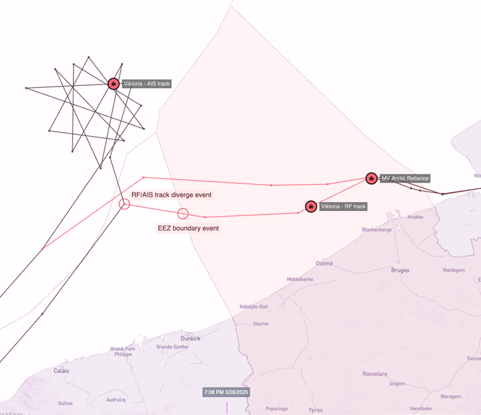
Shortly afterwards, another alert is triggered. Here we’re using MapWeave’s GeoJSON layer to add geofenced zones, in this case, the Exclusive Economic Zones (EEZs) of countries in our area of interest. We now believe the real position of the suspicious vessel lies within the EEZ of a particular country.
The analyst can then use a time bar control to replay recent events and confirm their understanding of the situation.
Finally, we illustrate another kind of alert – that of a proximity or convoy event. Our suspicious vessel, ‘Viktoria’, has come close to another vessel, ‘MV Arctic Reliance’ for an extended period of time. Again, the MapWeave view gives us an interactive picture of the narrative.
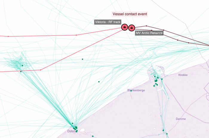
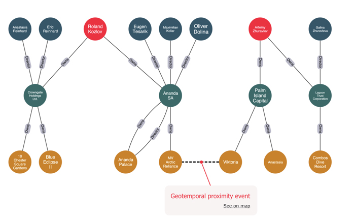
What’s useful about a ‘geotemporal event’, like a flagged ship spending a long time near another vessel, is the way it uncovers new connections in the broader investigation.
Once we’re confident that a proximity event is meaningful (perhaps through detailed analysis of trajectories using MapWeave and KronoGraph), we can add a new link to the beneficial owner graph and discover new paths and connections that weren’t there before.
In this case, having observed the suspicious behavior of those two vessels, we can add a plausible connection between two sanctioned individuals and their associated companies:
The visualizations featured in this article were built using our specialized data visualization toolkits – including MapWeave for geospatial visualization, KronoGraph for timeline analysis, and KeyLines/ReGraph for graph visualization. To discover how these tools can enhance your maritime intelligence capabilities, contact our team for a personalized demonstration.
The revolutionary geospatial visualization SDK that uncovers every connection.
Registered in England and Wales with Company Number 07625370 | VAT Number 113 1740 61
6-8 Hills Road, Cambridge, CB2 1JP. All material © Cambridge Intelligence .
Privacy Policy | Security Framework


