FREE: Buyer's guide to graph visualization
This practical guide to choosing the right technology for your project includes a handy comparison template.
Summary: This article looks at five open-source data visualization libraries that teams often use when prototyping graph and timeline analysis applications: D3.js, GraphViz, Viz.js, Cytoscape.js, and Vis.js. It explains why these tools are a good fit for early exploration, and where teams sometimes hit limits around support, performance, scalability and production-readiness. Open source can help prove an idea, while licensed SDKs offer the stability and developer support needed to take successful prototypes into full-scale products.
Teams working on data visualization applications always aim to build the best product they can. In an ideal world, that means sourcing the best of everything from the get-go, including people, ideas and tools.
In real life, projects don’t always pan out that way. Those brilliant ideas don’t become fully-funded well-resourced projects until they’ve proved themselves at the prototype stage. We know this, and it’s why we offer free evaluations of our graph and timeline toolkits.
We also know (because customers tell us) that stakeholders don’t always expect the earliest prototyping to rely on best-in-class technology. Many use open source data visualization alternatives to successfully demonstrate their ideas, then come to us for help migrating to our toolkit libraries to build their final product. The options we’ll look at in detail are:
First let’s examine some of the many benefits customers experience when they switch from a free option to licensed SDKs like ours (or bypass the free option completely).
Open source tools rely on committed volunteers, as well as the wider user community, for support. Unless the bug you’re experiencing has been voted up by others, it’s unlikely to be prioritized. You might spend valuable developer time trying to fix it yourself, or paying a third-party support team to figure it out for you.
“We chose Cambridge Intelligence because their products provided the level of support and documentation we needed. It also has the best performance and the right combination of features to provide that intuitive access to data our users needed.”
Our commercial data visualization toolkits are fully-documented by dedicated technical writers and come with expert technical support. That means fast fixes and direct contact with the developers who built the toolkits.
We have dedicated commercial developers to help you with proof-of-concept prototypes, and give free training workshops. The product roadmap keeps you updated on what’s coming, and free customer-only events throughout the year keep you in touch with the latest data visualization plans and developments.
To set expectations, you’ll need to understand the performance capabilities of any open source tools you consider. Is it designed to scale as the volume of your data increases? Do they have the metrics to prove it?
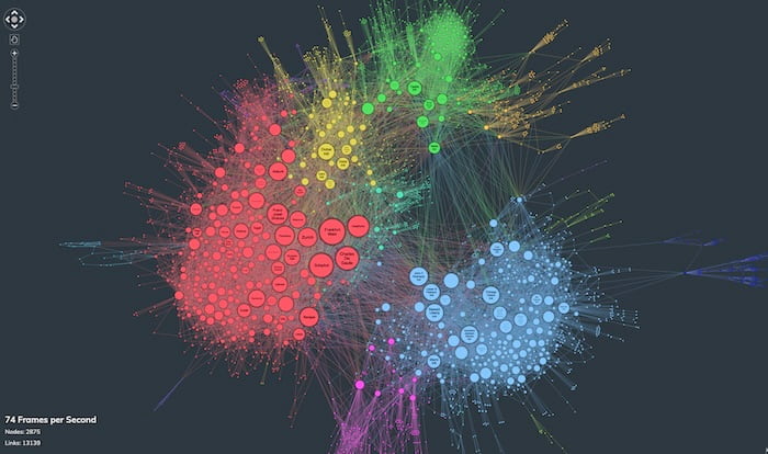
Our data visualization toolkits are designed with high performance in mind. Our graph visualization SDKs include performance demos, so you can run layouts of thousands of chart items and monitor the frames per second (FPS) rate for comparison.
Is the open source data visualization toolkit you’re considering designed for your particular use case?
Some have a specific customer in mind, such as Cytoscape.js (predominantly for research scientists). Others offer a more generic solution for drawing in the browser, like D3 network graph tools. Both can work with different use cases, but are they the best choice? Have they been tested in high-stakes commercial or mission-critical environments?
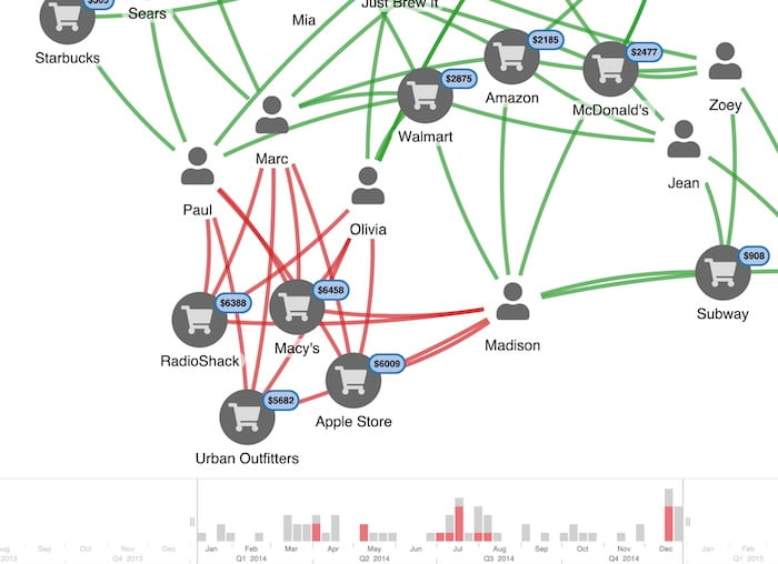
We’ve partnered with leading organizations in cybersecurity, intelligence and fraud detection for years, and helped them overcome their data visualization challenges. We’ve already designed libraries to support powerful workflows and user experiences that deliver insight.
This practical guide to choosing the right technology for your project includes a handy comparison template.
D3 makes sense for media organizations such as The New York Times […] where a single graphic may be seen by a million readers
History: First created by Stanford alumni and released in 2011. The name is an abbreviation of “data-driven documents”, where “documents’ is the Document Object Model (DOM) standard.
Format: A free, open-source JavaScript library for “manipulating documents based on data using HTML, SVG and CSS” (G2 product review).
Funding: D3.js is managed by Observable, a team of visualization enthusiasts who develop licensed and open source tools in their Observable Platform.
Users talk about:
React-force-graph – D3 force-directed graph components built in React by Vasco Asturiano to support 2-dimensional, 3-dimensional, virtual reality and augmented reality graph visualizations.
[Graphviz] has important applications in networking, bioinformatics, software engineering, database and web design, machine learning, and in visual interfaces for other technical domains.
History: Created by researchers at AT&T Bell Labs in 1991.
Format: Open source automatic graph drawing/design tool that uses a simple graph description language (DOT) for nodes, edges, clusters etc.
Funding: Still owned by AT&T Research and Lucent Bell Labs, and maintained by “a few very talented volunteers”.
Users talk about:
A hack to put GraphViz on the web.
History:Made available and maintained by mdaines at slowscan.net since 2015.
Format: Packages for working with GraphViz in JavaScript, including CodeMirror support for GraphViz’s DOT language, and a WebAssembly build using a JavaScript wrapper.
Funding: Solely funded by mdaines (as far as we know).
Users talk about:
Designed to make it as easy as possible for programmers and scientists to use graph theory in their apps […].
History: Created at the University of Toronto’s Donnelly Center, and first published online in Oxford Bioinformatics 2016. Cytoscape.js is the sister project of Cytoscape, which is an open source software platform primarily aimed at data analysts and researchers working in life sciences and social sciences.
Format: A Cytoscape alternative for developers who need an open source JavaScript library that supports graph theory.
Funding: Provided by government grants, universities and private enterprise, including the National Resource for Network Biology (NRNB), the University of California San Francisco (UCSF) and Unilever.
Users talk about:
[Vis.js is] designed to be easy to use, to handle large amounts of dynamic data, and to enable manipulation of and interaction with the data.
History: Originally created by R&D organization almende before it was taken over by the Vis.js community in 2019.
Format: A JavaScript library of visualization components for network, timeline, 2D and 3D graphs.
Funding: Sponsored by 24 organizations and 36 individuals at the time of writing.
Users talk about:
We’ve worked successfully with customers whose apps started out using open source data visualization options. They migrated to our licensed products without a hitch, and saw their projects evolve, improve and succeed.
For others, open source alternatives offered “good enough” capabilities for their project goals, which is still a win for data visualization.
If you’re weighing up toolkit options right now – both open source and licensed types – consider a free trial of our data visualization SDKs.
Visualize your data! Request full access to our SDKs, demos and live-coding playgrounds.
Registered in England and Wales with Company Number 07625370 | VAT Number 113 1740 61
6-8 Hills Road, Cambridge, CB2 1JP. All material © Cambridge Intelligence .
Privacy Policy | Security Framework


