FREE: Start your trial today
Visualize your data! Request full access to our SDKs, demos and live-coding playgrounds.
The latest versions of our graph and timeline data visualization SDKs – KeyLines, ReGraph, and KronoGraph – introduce features that improve performance, aesthetics, and usability. From sleeker animations to richer styling and smoother interactions, these updates help you create visualizations that are not only beautiful, but transform your investigative workflow.
The latest releases of KeyLines focus on refining link visuals and boosting performance – making charts more engaging and easier to understand.
KeyLines 8.3 introduces new styling options for labels on links. Add borders with customizable colors, widths, and radii, and use padding to enhance label clarity. These features help selected or important links stand out in complex visualizations.
KeyLines 8.2 supports animated flow for angled links, bringing motion to your network. We’ve also improved performance when working with combos and aggregate links, enabling faster and more fluid charts even when using large datasets.
The Figma Design Kit is now generally available, enabling teams to plan and refine visualizations before writing code.
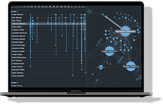
Our React-based toolkit, ReGraph, brings a more polished visual experience with smarter combo layouts and enhanced label styling.
ReGraph 5.3 improves the animation and placement of combos, reducing visual clutter and unnecessary motion. These improvements particularly benefit large, dynamic charts.
And the organic layout is now even more efficient when adding and expanding items into large charts, resulting in less unnecessary movement and better performance.
Like KeyLines, ReGraph now supports border and padding options for labels on links, letting you design with greater control and clarity. And thanks to improved anti-aliasing for rectangular labels, sloping rectangular labels are now drawn with smoother edges.
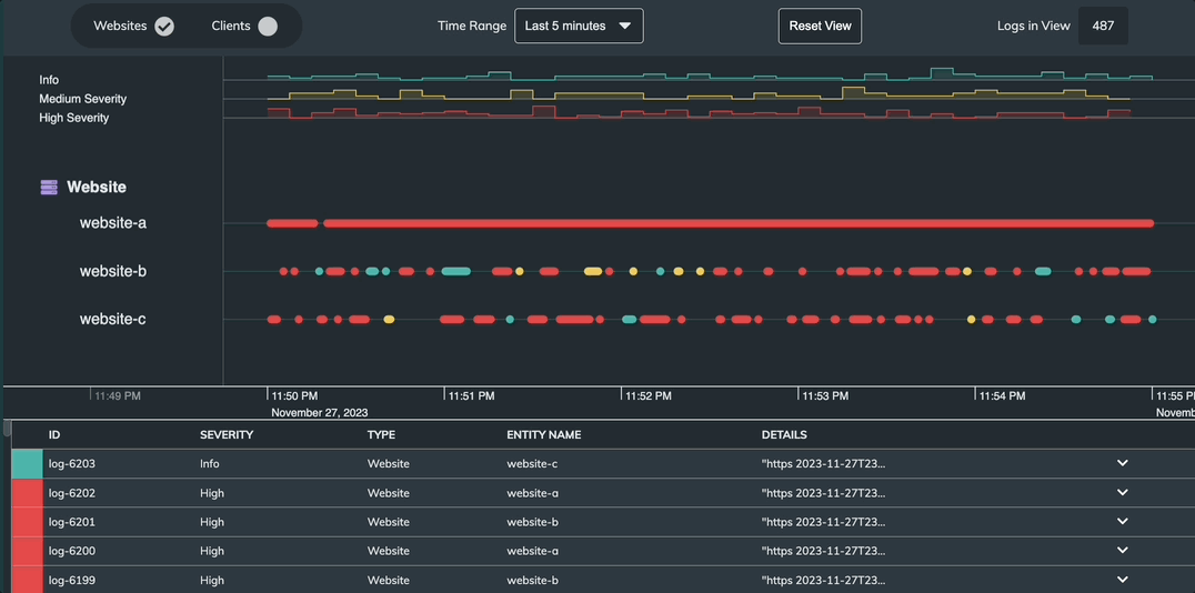
Our timeline toolkit adds a new Log Visualization showcase and an upgraded development playground, making it easier to build and test sophisticated timelines.
The new Log Visualization showcase demonstrates how a timeline view of events and resources can bring a table of event logs to life, helping users detect anomalies and patterns at a glance.
We’ve enhanced the KronoGraph Playground to load faster and handle interactive development more efficiently – so you can iterate more quickly and explore ideas without friction.
KeyLines 8.3, ReGraph 5.3, and KronoGraph 3.4 are available now for customers and evaluators. With refreshed demos, new APIs, and performance upgrades, they provide everything you need to craft compelling, user-friendly visual applications.
If you’d like a guided walkthrough, get in touch with our team – we’d love to show you what’s new.
Visualize your data! Request full access to our SDKs, demos and live-coding playgrounds.
Registered in England and Wales with Company Number 07625370 | VAT Number 113 1740 61
6-8 Hills Road, Cambridge, CB2 1JP. All material © Cambridge Intelligence .
Privacy Policy | Security Framework


