
Our KeyLines and ReGraph SDKs are game changers for graph visualization design. UX designers can achieve designs that they’d only dreamed of previously – and developers can bring the most wild and wonderful graph design to life, without compromise.
Product developers are under pressure to stand out in today’s crowded and competitive markets, where big players like Apple and Google have raised the bar for product design. In an attempt to keep up with them, organizations bring UI and UX professionals into the development process early, but then struggle to replicate their graph design. Add to this the fact that some designers and developers are unfamiliar with graph visualization concepts, and you can run into major problems.
That’s where KeyLines and ReGraph can help. They allow you to create a visualization component that’s specifically tailored to integrate with the rest of your application. And for teams that are new to graph visualization, we have inspirational demos, a live-coding playground where you can experiment and collaborate, and responsive tech support from the same experts who built the toolkits.
But with infinite customizability and styling options available, where do you begin? Let’s look at four key features that will give you a strong head start.
1. Give users the full picture with multiple labels
KeyLines and ReGraph allow multiple labels for nodes, with complete control over the styling and position of each label.
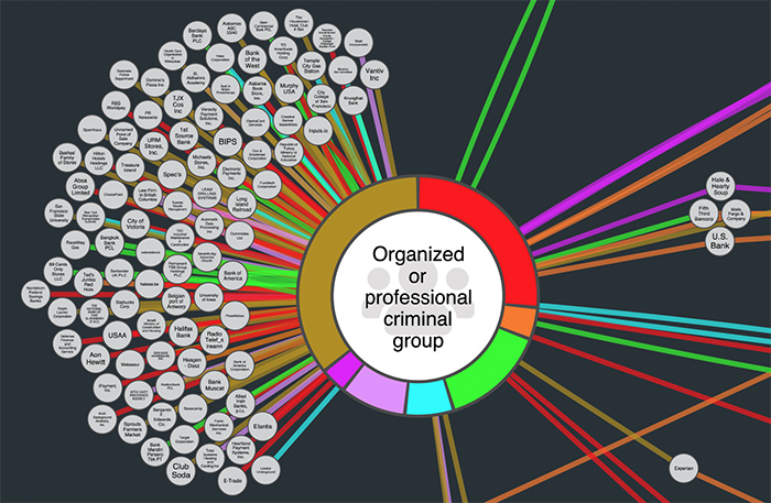
We challenged our development teams to push the boundaries of this functionality, using labels in complex designs that convey detailed information in a clean, intuitive and stylish way.
They also took advantage of other advanced node customization features, including font icons and rectangular node shapes:
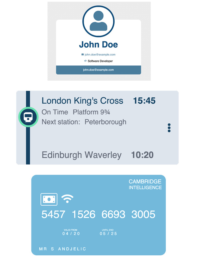
The advanced customization options mean you can add as many labels as you want, and edit each one as a separate field. Use padding and relative positions to arrange labels anywhere on the node, and accommodate text of any length. In this way, you can develop a set of elegant, flexible and responsive designs that are easy for users to understand and engage with.
How’s it done?
To enable multiple labels in your design, simply turn your t property or label property into an array like this:
//kl
t: [{ ...labelStyling, ...labelContent, }, { ...labelStyling, ...labelContent, }], //etc.

//rg
label: [{ ...labelStyling, ...labelContent, }, { ...labelStyling, ...labelContent, }], //etc.
2. Detail on demand with adaptive styling
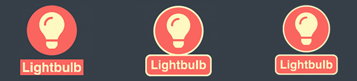
Using our built in adaptive styling feature, it’s easy to create nodes that reveal different levels of detail in response to the user’s zoom level. It’s a great way to keep the chart relevant to the user’s investigation at each stage:
When zoomed out, the font icons make it clear that the nodes represent people in an organizational chart. We can infer the reporting structure based on the graph layout. Zooming further in, we can see their names – and on closer inspection, the labeling reveals detailed information on each individual.
How’s it done?
You can design the elements of a custom node with the same level of control you’d expect when coding an HTML element, from font style to the position and padding of each label. The following code adds a set of five labels to a node, which fade in depending on font size as the user zooms in:
label: [
   {
     fontIcon: { text: 'fa-user', },
     fontSize: 40,
     padding: { left: 10, },
     position: { horizontal: 0, vertical: 'middle', },
   },
   {
     bold: true,
     fontSize: 5,
     text: 'ID: GB90828',
     position: { horizontal: 45, vertical: 10, },
   },
   {
     bold: true,
     fontSize: 14,
     text: 'Dwayne Baumbach',
     padding: { right: 10, },
     position: { horizontal: 45, vertical: 18, },
   },
   {
     fontSize: 5,
     text: 'APPLICATIONS DEVELOPER',
     position: { horizontal: 45, vertical: 35, },
   },
   {
     bold: true,
     fontSize: 5,
     text: 'Joined 30 September 2018',
     padding: { bottom: 10, },
     position: { horizontal: 45, vertical: 42, },
   },
 ],
3. Get pixel perfect with margin and padding controls
Most design software has controls for margins (the space between the edges of labels) and padding (the space between the text and the edge of the label). Now developers have the same level of control in KeyLines and ReGraph.
You can position different node elements with pixel-perfect accuracy. Need a bit more breathing space between your label and the right-hand edge of your node? Add some extra padding using the code below – it’ll adjust automatically if you change the width of your label.
padding: { right: 10, },
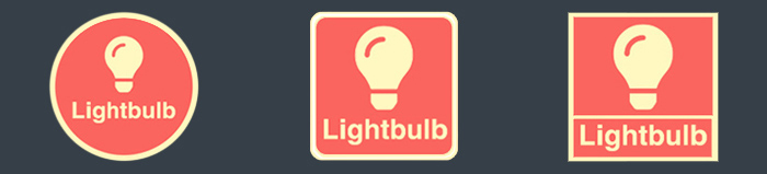
Let’s look at a classic node design and see if there’s room for improvement.
The first node in the image below is popular with our customers. It’s a great option for your graph design, and we’ll keep using it in many of our demos. But you can have even more control over how it looks. The second two nodes show how, with simple tweaks to the padding and label position, you can try out more elegant alternatives:
How’s it done?
A margin setting of -2 gives a snug fit – pushing it up to 2 separates the label from the node. A little padding gives the label room to breathe, and looks more professional. Here’s the code:
// #noGap
padding: ‘4 4 2 4’,
margin: -2,
// #gap
padding: ‘4 4 2 4’,
margin: 2,
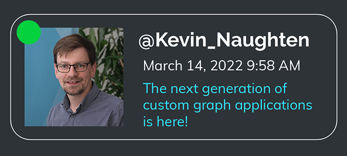
Another look that our customers often ask for brings the label and font icon into the same node. That’s no problem with fine-grained styling options:
Experiment with position, padding, borderRadius, and border on both your node and label to get the exact style you want.
4. Let auto-sizing do the hard work
Want to fit text onto your node regardless of length? Need a way to intelligently wrap text? Keen to keep the text size the same, but allow for nodes of different sizes? We’ve got you covered!
Real data comes in a wide variety of inputs, and creating a design that accommodates all of them is difficult but often necessary. ReGraph and KeyLines take the stress out of these graph design struggles. You keep control of the contents of your node by adjusting the font size automatically, wrapping the text, or creating a node or label container that adapts to fit its contents:
How’s it done?
The key properties you need to wrap, auto-size and align your text are textWrap, maxWidth, and textAlignment. For example:
{
   "t": labelContents,
   "fs": 8,
   "position": {
       "horizontal": "left"
   },
   "padding": "10 8 10 8",
   "maxWidth": 200,
   "textWrap": "normal",
   "textAlignment": { "horizontal": 'left' }
    // ^or 'right' for RTL text
},
If you want to keep the node size fixed and change the text size instead, you can also use “fontSize”: “auto”. This is particularly useful when you want the text to fill a circular node, so you can pack nodes really tightly and make efficient use of screen space:
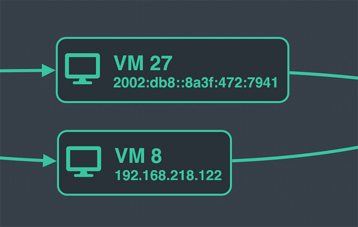
Perhaps you’re monitoring an IT network and have to keep track of a lot of different IP addresses. You can easily accommodate IPv4 and IPv6 addresses with node auto-sizing. Simply set height and width to “auto” and your nodes will be exactly the right size for the labels every time:
shape: { height: 'auto', width: 'auto' }
Explore infinite graph design and styling capabilities
Hopefully these four tricks have sparked some ideas, and you’re inspired to try out advanced node customization for yourself. Let us know what you come up with, in your experiments with the graph design functions we’ve unlocked.
Not already using KeyLines and ReGraph? Sign up for a free trial today.
Share:
