
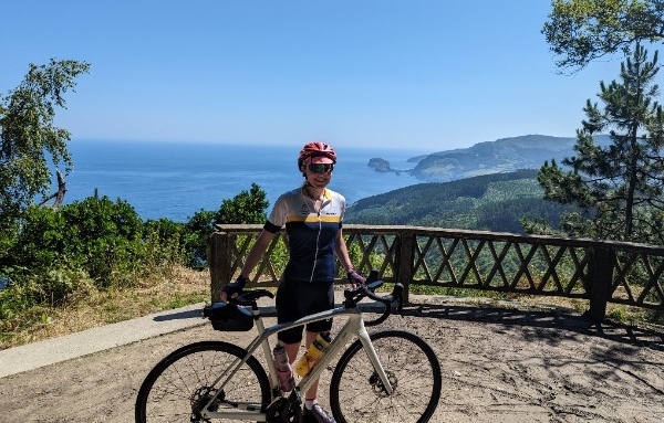
On Saturday 24th June 2023, I set off from Bilbao, Spain, to ride the Tour de France route with Le Loop. In the lead up to this, my day job as a software developer gave me a break from hard training rides, but my love of cycling sparked a mini side project: building web apps with the data visualization tools I help to develop, and using them to analyze and visualize Tour de France data.
Through custom filtering, styling and grouping techniques, I’ll use different Tour de France datasets to explore the history, legends, nationalities, locations and exciting 2022 finale in a visual way, finding insights in hidden connections.
Visualizing Tour de France race history
Keen to see what the entire history of Tour de France teams and riders looks like, I visualized thomascamminady’s LeTourDataset.
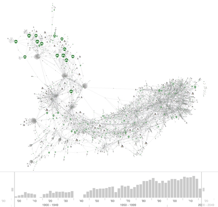
Green bike nodes represent teams, and they’re sized by the number of times riders listed that team as the one they rode the tour for. The time bar across the bottom shows how race participation increased steadily, with two gaps showing when the race wasn’t held due to the first and second world wars.
It’s a busy chart, but I’m drawn to the cluster of larger team nodes in the top left.
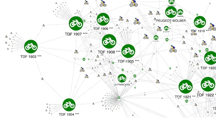
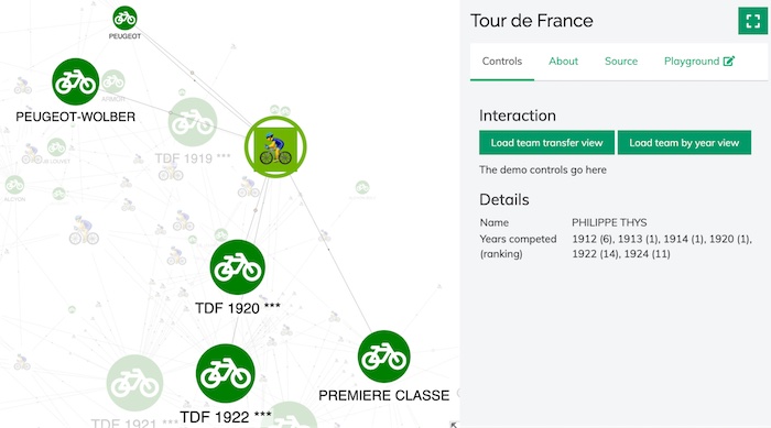
Hmmmm. Those “TDF 190# ***” don’t look right – they’re clearly not teams – but I know what’s happened. Before 1930, any amateur rider could compete: they didn’t make team memberships compulsory until 1930. So in the original data, these individuals have the year they took part listed as their team name. (It’s a reminder that every source dataset can benefit from a review and clean-up exercise before visualizing it!)
If we look at the teams that did exist in the early years, we can see how the team strategy paid off. A closer look at the Peugeot-Wolber team performance in 1914 shows that, of the 11 riders in the team, eight finished in the top ten general classification race (GC), including the top three places.

The winner was Belgian rider Philippe Thys, who claimed victory despite incurring a 30-minute penalty for buying a new wheel to fix a mechanical problem on stage 14.
Cyclists in the chart are sized according to a ‘success’ score based on the number of tours completed and their rankings. When I select Thys, details on the right-hand side show he competed six times and won three.
Let’s look at what’s happened with more recent tours and teams. I use the time bar sliders to filter the data and show results from the last 20 years.
One larger rider node in the bottom right corner stands out. Closer investigation reveals it’s British 4-times Tour de France winner, Chris Froome.
Most cycling fans know that his victories came as part of Sky-sponsored teams, but he’s also linked to a third, much smaller team in this chart. I select it and see it’s Barloworld, a South African team that received wild card entries for the tour in 2007 and 2008.
The largest of the other nodes linked to this team is Froome’s future super domestique turned 2018 winner (and 2019 runner up), Geraint Thomas.
Tour de France legends
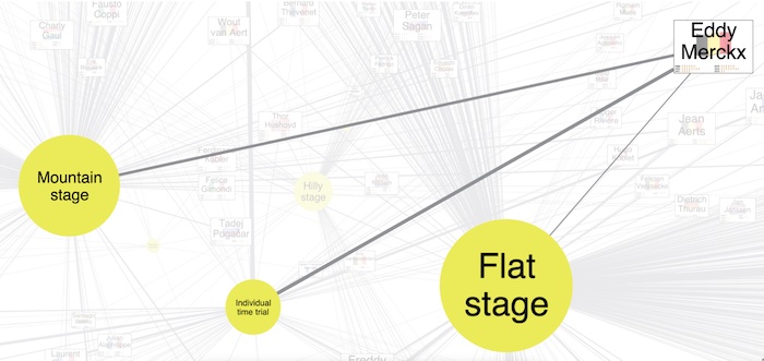
This visualization focuses on riders and stage wins. Each rider is linked to the type of stage won, which reveals a lot about how race specialists have evolved over the years.
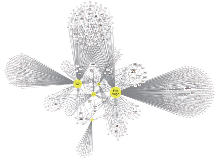
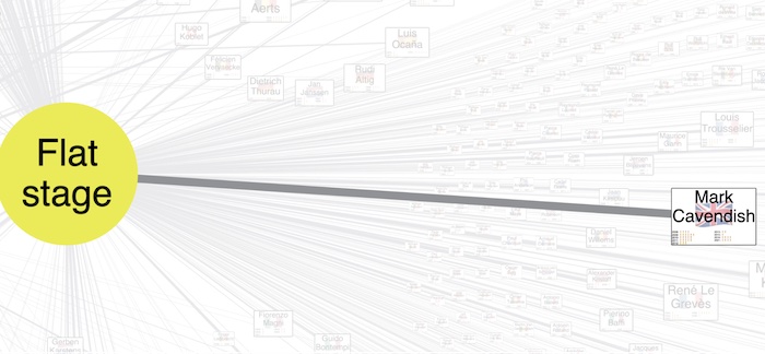
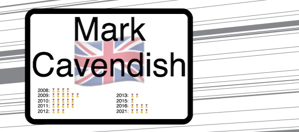
As you’d expect, British sprint specialist Mark Cavendish – the largest node in the cluster on the right of the chart – has only ever won flat stages (a massive 34 in total):
The other large node in the chart shows that Belgian legend of the sixties and seventies – the great Eddy Merckx – has won the same number of stages. But he was as strong in the mountains as he was on the flat, so he’s linked to multiple stage types.
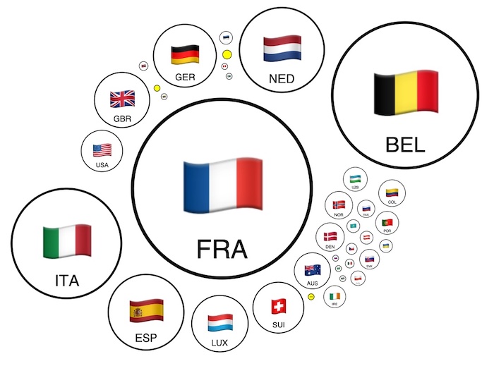
Stage winners by nationality
I simplified the data further by grouping stage winners by their countries of origin. French nationals have won the most stages (over 700), although a Frenchman hasn’t won the GC since Bernard Hinault in 1985.
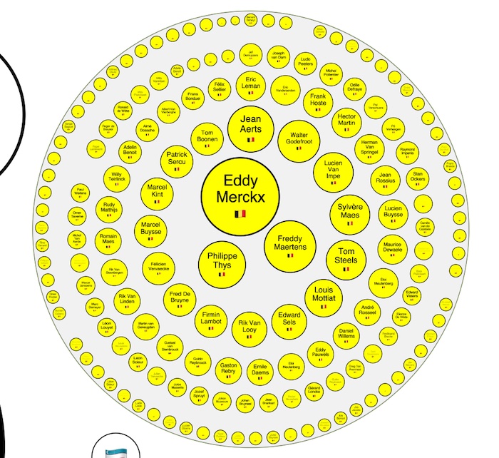
I can dig deeper inside these group nodes to see the riders from each country sized according to how many stages they’ve won. Here’s Belgium’s winners, prominently featuring our friends Eddy Merckx and Phillipe Thys:
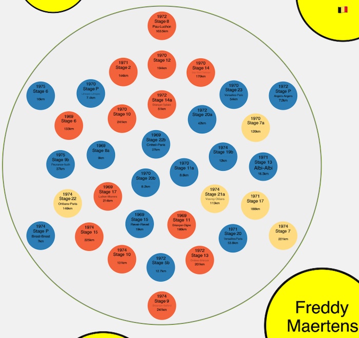
When I click on Eddy Merckx, I go deeper still and see details of each stage victory, including the year, stage number, and distance:
Location, location, location
Obviously, the Tour de France is no longer just a sporting event: it’s a huge commercial enterprise. European neighbors bid millions of euros to host the grand départ (opening race stages), while French towns and cities pay handsomely for the privilege of hosting a stage.
I’m interested to see what the hundreds of different locations that’ve been used as the start or finish of a stage look like. I’ve sized them according to how many times they’ve hosted.
Unsurprisingly, Paris – venue of the race finish every year since 1975 – is the largest node, followed by Bordeaux in the southwest and Pau on the edge of the Pyrenees.
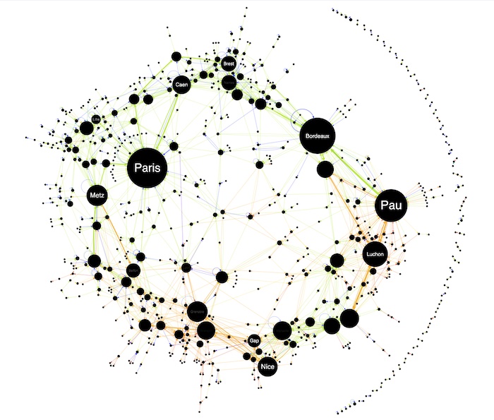
The links show the direction between locations and I’ve sized them by how many times that stage route has featured. They’re also colored by stage type: green for flat, blue for time trials, red for hilly, orange for mountains.
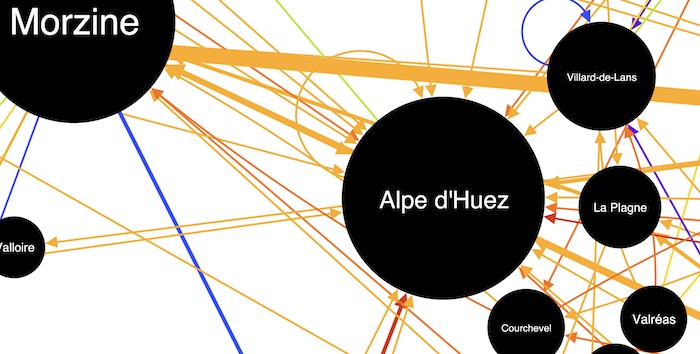
Zooming in shows how many iconic mountain finishes there’ve been on Alpe d’Huez – a grueling 13.8km climb with an average 8.1% gradient and 21 hairpin turns.
The crescent of nodes on the right-hand side show outliers in our data that don’t link directly to the other, more popular stages. These are where grand départ locations outside France feature. We can zoom in to spot London, which hosted the start and finish of the 7.9km 2007 prologue time trial plus the start of a flat stage to Canterbury. In 2014, London also hosted the finish of a stage that started in my hometown, Cambridge.
How the 2022 Tour de France was won
22 teams of eight riders set off from Copenhagen on July 1st 2022. I’ve arranged them here in club colors and grid formation to give an idea of the peloton’s size.
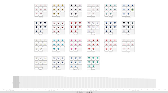
The 186 riders who started the 2022 race. Data from procyclingstats.com and letour.fr
As in 2021, the favorites for GC were from UAE Team Emirates and Team Jumbo-Visma. It was a fantastic battle with Jumbo-Visma’s Jonas Vingegaard from Denmark beating Slovenian UAE rider and 2020 champion, Tadej Pogačar.
Watch how the race between the two teams unfolded. You can see that Vingegaard’s Jumbo-Visma teammate Wout Van Aert took the yellow jersey early on before Pogačar (top left for UAE) won it from him. Vingegaard took it over from stage 11 and never relinquished it.
You can see how UAE Team Emirates was decimated by COVID-19 (it also ended my 2022 Le Loop attempt on stage 8). Jumbo-Visma were also down to 5 riders by the end, but claimed GC, points race, and king of the mountains victories.
Chapeau to every rider
Building these web apps and exploring the Tour de France data in a visual way was great fun. It also shows how easy it is to explore large and complex datasets with interactive graph visualization.
I could take this exploration further – plot stages on a real map to spot geographic patterns, combine nationalities with mountain stage winners to see if riders from high altitude countries have an advantage, or include financial data to reveal correlations between team success and investment. If you want to learn more about what our toolkits can do, get in touch.
Right now I’ll enjoy my own Tour de France adventure before watching the final week of the professional race from the comfort of my sofa.

Share:
