The healthcare data visualization challenge
The healthcare industry is inherently complicated.
It involves a lot of people, stakeholders, processes and procedures. It’s tightly regulated and deals with the highest possible stakes: peoples’ health and well-being.
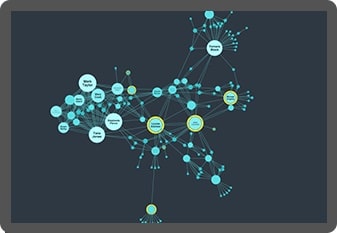
Increasingly, healthcare providers are turning to graph technology and data visualization to understand the complex networks of data at their disposal. Powerful healthcare data visualization tools transform that complex data into valuable, useful insight.
Data visualization, especially graph visualization and timeline visualization, helps healthcare providers and professionals to join the dots in data.
Let’s see how it helps them improve services, drive efficiencies and deliver better patient outcomes.
Healthcare data visualization: knowledge graphs
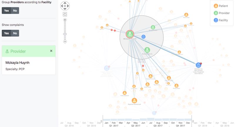
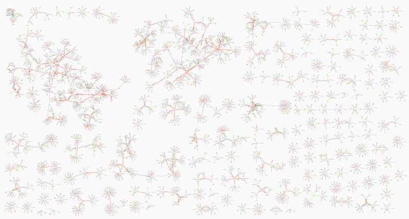
Modern healthcare generates a lot of data. Patient records, admissions data, electronic health records, billing data, insurance policies and claims: every interaction leaves a complex digital footprint.
These footprints are often scattered between systems, limiting the ability to understand the full picture and make the best decisions. Using graph visualization tools, it’s possible to collate all of this data into a single unified view, allowing systems users – clinicians, data analysts or non-specialist staff – to piece everything together and get a complete overview of the patient’s situation.
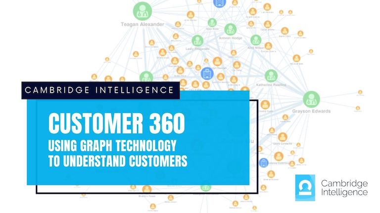
These tools – often called customer 360 or patient 360 – are powerful knowledge graphs that answer many different questions.
- What is this patient’s medical history? What is their next best treatment?
- Have other patients suffered these symptoms before? What were their diagnoses, prognoses and treatments?
- Which institutions and clinicians have spare capacity?
- Which clinicians have the most complaints? Who is complaining, and about what?
Interactive graph visualization allows users to query, explore and understand complex data, creating insightful and intuitive knowledge graphs.
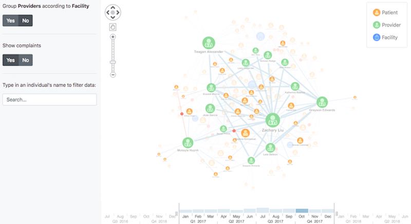
Pulling data from multiple siloed systems, knowledge graphs give a single, unified view of a situation, allowing them to make better decisions, faster.
Learn more in our white papers
We’ve helped some of the world’s leading healthcare organizations visualize their data.
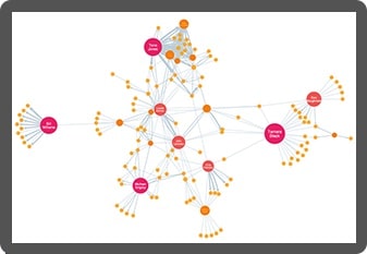
Healthcare data visualization: fraud detection
Billions of dollars are lost every year to healthcare fraud. According to the US Government Accountability Office, 74% of the $1.3 trillion lost to improper payments since 2003 was lost through healthcare-related programs.
Detecting fraud in programs as vast as Medicare and Medicaid might seem like an impossible task. Incorporating graph visualization into fraud detection tools, it’s possible to spot patterns and anomalies, and uncover incidences of fraud.
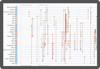
In healthcare fraud detection, you need to see connections. Between patients, providers, clinicians, insurance policies and claims. Graph visualization makes it easy to see those connections, so we can recognise normal patterns and anomalies that might indicate fraud.
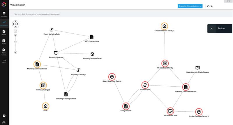
Healthcare data visualization: regulatory compliance
Healthcare is one of the most tightly-regulated industries. Ranging from data protection to HIPAA compliance, from anti-bribery rules to regulations controlling the prescription of opioids. Healthcare organizations and providers need effective processes and total visibility of their data to maintain a robust compliance regime, while still delivering the the best possible care.
Graph visualization is the ideal tool for managing regulatory compliance. This example of trust-hub’s privacy data compliance platform examines an organization’s data assets, and the people, processes, systems and places associated with them.
Custom healthcare data visualization
We work with healthcare-related businesses worldwide, helping them to make sense of big data.
Using our graph visualization and timeline visualization technologies, they build interactive applications that join the dots and reveal the insight they need to understand.

Overcome data silos
Interact with data from across the healthcare environment. Our products’ flexible approach overcome silos and gain insight from multiple sources, giving you a clearer, more complete picture.

Visual tools that scale
Our toolkits support data visualization at scale. Whether you’ve got a large and distributed team, or huge volumes of data to analyze, we’ve designed our products to scale-up to the size or any organization and operation.

Get answers faster
Discover more intuitive ways to understand your healthcare data. Timeline and graph visualization tools reveal insight more effectively than other automated or manual processes, leading to faster and better decisions.

Manage confidential data
Our toolkits are trusted by government agencies, police forces and healthcare organizations around the world. They sit inside your firewall, don’t track users, never call home and can be easily SSL encrypted.
Want to try it for yourself?
KeyLines
The graph visualization SDK for JavaScript developers
KeyLines is your fast-track to graph visualization success on any tech stack.
ReGraph
Hassle-free graph visualization for React developers
ReGraph for React makes building state-based graph visualizations a breeze.
KronoGraph
Advanced timeline visualizations that scale quickly & easily
Build interactive timeline views, customized for your applications.