In marketing, ‘attribution’ can be a dirty word. It’s all about tracking human behavior, and using that data to make business decisions – and customer behavior analysis has never been an easy task. Web analytics will tell you what actions a customer took, but it’s much harder to find out why they completed a purchase.
We’re helping Bonsai, a marketing and management consultancy, achieve their goal of building a martech solution that makes attribution practical, beautiful and actionable. It’s designed to help marketing analysts build a reliable, agile strategy, and produce reports that are easy for anyone to understand.
Bonsai’s analytics platform shows us that the customer journey is a graph
Tracking the customer journey
Most martech solutions focus on aggregate views of consumer behavior: a webpage had 1000 unique visitors, an email was opened 200 times, a campaign generated 50 new leads. Insights come thick and fast, but they can be vague and misleading.
When you’re following a customer path, it’s important to analyze the touchpoints independently from the outcomes. If a company sends a marketing email in July, prompting a transaction in September, the sale might not be attributed back to the original email campaign.
And engagements won’t appear like a row of stepping stones. Many marketers don’t realize that aggregated customer behavior analysis can never tell the full story, because the customer journey isn’t a straightforward model – it’s a graph. The routes they take can be unexpected, but they’re easy to track – given the right tools to expose them.
A new breed of marketing analytics tool
Bonsai’s marketing analytics platform, Pyxis, is still in beta development but it’s shaping up to be an impressive marketing tool. It maps out customer behavior in a way that’s thorough, but lets marketers focus on what’s important. Analysts can measure the performance of different campaigns, mediums, platforms and locations all at once, revealing the best mix for a lucrative customer journey, and flagging potential dead ends. Marketing analysis that used to take months can be completed in less than a day.
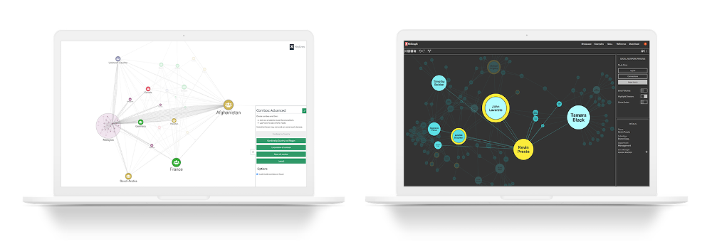
Pyxis draws a visual chart from a company’s existing data, from digital analytics to media platforms. You don’t need to bring any new code to your website, you simply need to provide access to your data the way you prefer. It uses KeyLines, our graph visualization toolkit, to create a visualization component that charts and explores consumer journeys.
Pyxis gives users the interactive, intuitive UI they need to analyze each unique interaction, and understand which ones are adding value and where there’s room for improvement.
Using Pyxis to get fast marketing insights
Let’s use some fictional marketing data to illustrate how Pyxis works.
Before we even see a graph, we’re prompted to select the period of activity we want to analyze. Bonsai have made innovative use of the KeyLines time bar to create the interactive “analysis and impact windows” pictured below.
In this example, we’re looking at the quarter Q3-4 touch points, and long-term profitability.
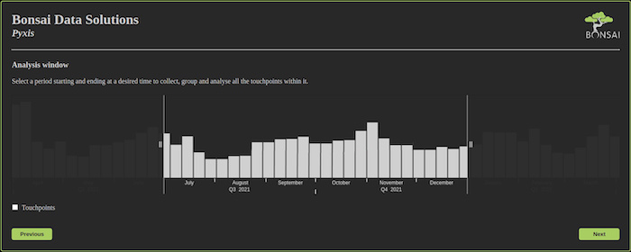
The analysis window lets us select the window of time we want to focus on.
Now we decide how we want to aggregate our insights. What are we trying to analyze in our strategy – media, campaigns, or perhaps keywords? We can select one or more options to bring the information into our chart. In this example we’ll look at the campaigns and mediums we’re using in our marketing strategy.
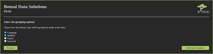
Selecting our grouping options
Just a few months can encompass countless campaigns and mediums, but large data sets aren’t a problem for Pyxis. It can process and filter countless data, and KeyLines’ powerful rendering engine can quickly pull together complex charts that expose several layers of data – and the intuitive UI makes it easy to drill down to the information that interests us.
This chart shows campaigns running in our time window, and the number of consumer journeys that reached ACME’s website during that time. The timeline at the bottom lets us isolate specific time periods.
Overview
Now let’s dig deeper. We’ll show how Pyxis can answer questions like:
- Which touchpoints are the best value for money?
- Are we wasting money anywhere?
Which touchpoints are the best value for money?
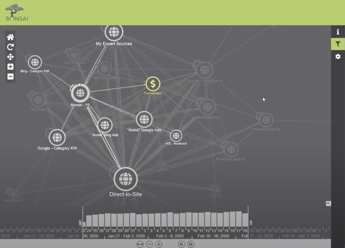
Each node on the chart represents a consumer touchpoint, and each link shows a path leading between them. KeyLines’ path highlighting function helps us track the consumer journeys that interest us. Links between sources show that more than one media source can contribute to a customer’s decision – some people engaged with several, and not always in the same order, before making a purchase.
KeyLines’ customization function lets Bonsai add a lot of meaning. Larger nodes and thicker lines show touchpoints and paths used by a higher number of consumers. The heavier the shade of green, the more often the path led to a conversion. At a glance, we can see the customer touchpoints which most often appear on a path to success.
One way to get a quick insight into the strength of a touchpoint is to remove it and re-render the chart. How else would the consumer have found us if we weren’t using Google? Comparing the ‘before’ and ‘after’ allows us to measure its incremental impact on our marketing revenue.
Bonsai are experimenting with different KeyLines styles and customizations for the platform. In the example below, font icons showing a logo or a symbol add real-world context. The “donuts” around the nodes act as a mini chart, showing the percentage of people who passed through that touchpoint that became customers.
“It was a game-changer when we realized that we could use the visualization to pinpoint what wasn’t connected to the success graph.” – Matt Butler, Co-Founder – Bonsai Solutions
Are we wasting money anywhere?
The crescent of isolated nodes on the right of the chart shows “singletons”. These are touchpoints – perhaps Facebook or YouTube campaigns – that were engaged with by customers who didn’t make a purchase, and didn’t engage with any other digital touchpoints, either.
This is inevitable in many cases, often where the touchpoint is unpaid, and is usually no cause for concern. Even so, we can use the advanced network filtering function to check for paid campaigns that are a waste of money. We can rely on Pyxis to recommend areas where that money can be better invested.
Bonsai are working to to enrich the Pyxis UI with other features from KeyLines, including the grouping function. The KeyLines combos feature lets users group by any category – vendor, campaign, channel or subchannel.
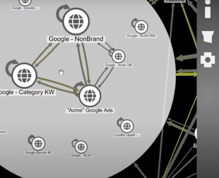
Our graph visualization products offer intuitive ways to group and combine different nodes.
In this example, we’ve expanded the “Google” node, which represents several different Google-related touchpoints. Expanding them reveals the details inside.
As well as reducing clutter in the chart, a grouped node helps analysts to investigate what else group members – for instance, a customer segment – have in common.
Graph data modeling: the best approach to customer behavior analysis
Even at beta stage, Pyxis shows how graph and timeline visualization offers fast, game-changing insights that save organizations lots of money and time. With just a little manipulation, a graph can highlight opportunities to eliminate or even pre-empt waste, and help businesses make quick and smart decisions about how and where to invest their marketing budget. And we’re not limited to visualizing digital engagements. We could filter our customer data by time and location to see how other events influence consumer behavior – for instance, a magazine ad, a public holiday, or a competitor’s marketing campaign.
Ready to visualize your connected data?
Bring clarity, confidence and interactive intelligence to your product – with visualizations that transform how users understand and explore complex data.
Share: