
Cambridge Intelligence Figma Design Kit

Design graph and timeline applications before you code


Figma design kit

Prototype, refine and align your UI using a structured design system built specifically for graph and timeline-driven applications.

The Cambridge Intelligence Figma Design Kit accelerates the path from concept to production, helping designers and developers move faster with fewer iterations.

Download the current version to get started. SDK customers receive ongoing updates as new features are released.

The tour of the Figma design kit

Getting started with the Figma Design Kit

Designing graph and timeline applications from scratch can be challenging, especially when complex data, interaction patterns and visual clarity are involved. The Cambridge Intelligence Figma Design Kit removes the blank-page problem with a structured design system built specifically for connected data.

With 100+ reusable components and prebuilt application templates, you can rapidly prototype workflows, explore interaction patterns and refine visual styles before development begins. All components are organised, themed and ready to customise so you can move from concept to validated design with confidence.

Watch a guided tour of the Design Kit, presented by the designer who created it.

Built for rapid prototyping

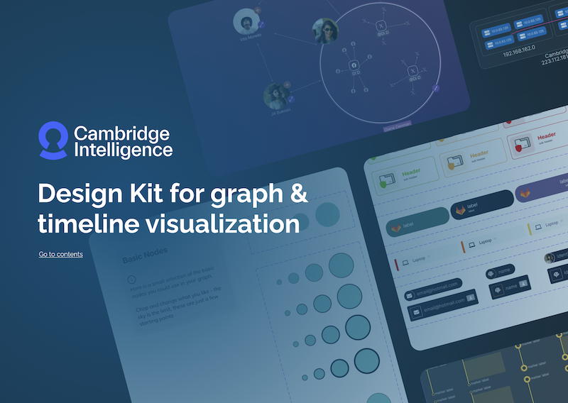
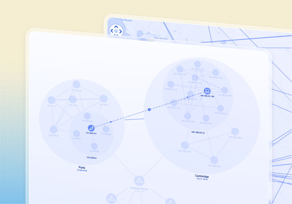
Start with real application templates

Fully designed graph and timeline templates based on our most popular SDK demos. Use them as a starting point to explore workflows and accelerate early-stage prototyping.

scale icon

100+ reusable components

Nodes, links, combos, timelines and annotations — all built as reusable components to help you prototype complex data interactions without writing code.

Dark mode

Variable-driven theming

Light and dark themes are preconfigured using Figma variables. Update styles once and see changes reflected consistently across your entire design system.

Integration icon

Explore SDK capabilities visually

The Design Kit mirrors the structure and capabilities of our SDKs, helping designers explore what’s possible and validate interaction patterns before development begins.

Best icon

Built on visualization best practices

Component structures and layouts reflect approaches to show clarity in complex, connected data, guiding you toward intuitive, user-friendly designs.

Dev icon

Streamlined developer handover

Components align with SDK features and APIs, making it easier for developers to turn validated prototypes into working applications with less rework.