
When choosing a graph visualization design solution for your application, there’s a lot to consider. It should be a perfect fit for your data, your users and the questions they need to answer. It needs to make a great first impression, and look like a seamless part of your application – not a flashy add-on. The interface needs to feel familiar and intuitive, letting users uncover quick and meaningful insights. And on top of that – it needs to match your designer’s vision exactly.
Our graph visualization toolkits such as KeyLines and ReGraph tick all of these boxes. They deliver almost infinite flexibility and customization options. You have full control over your charts’ look and behavior, with rich new node customization and interactivity options.
Find out how clever graph visualization design can solve four of the biggest design challenges you’ll face when developing an application.
1: A graph visualization design that stands out from the crowd
It’s a cliche that customers “buy with their eyes”, but it takes a unique and eye-catching application to stand out in a crowded marketplace. And we’re not just talking about aesthetics, although that’s important. You need to convince customers that they’re looking at an app that’s easy to work with, and quick to offer meaningful insights.
When you’re competing in the cyber vendor market, you have especially high design and UI standards to meet. Let’s have a look at a visualization design for a market-leading impact analysis application.
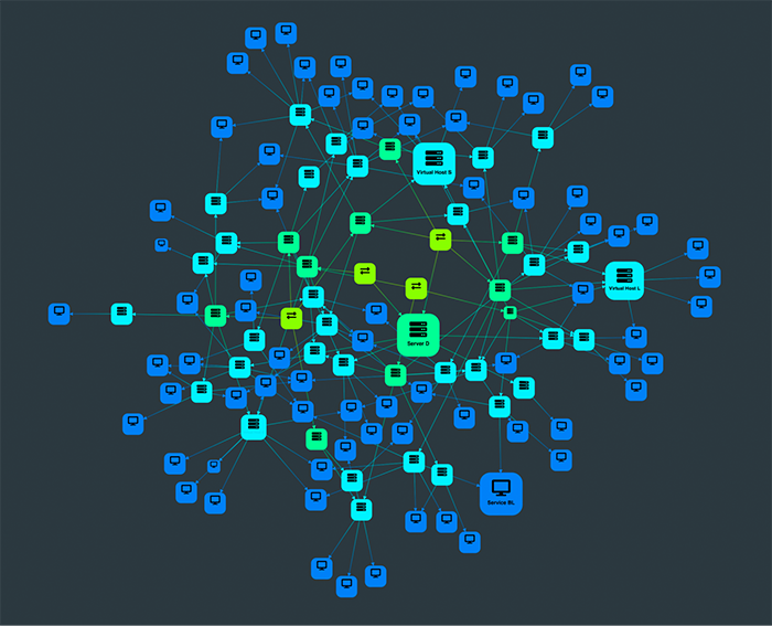
This chart maps out an entire IT infrastructure. Switches, servers, hosts and services are colored by category, and sized to show their connectivity. We’ve muted the colors for less-connected nodes, so that the more important devices stand out; and we’ve added font icons to make it clear what type of infrastructure is represented by each node:
When we select a node of interest, the chart adapts to focus on a neat sequential visualization of that particular node and its dependencies:
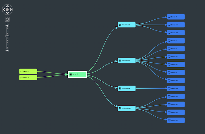
Now we can see the names of each individual piece of infrastructure, and understand their relationships and their position in the flow of information.
Clicking on the background brings us back to the full network visualization, where we can toggle from impact analysis to an alerts list view. When we feed alerts data into the chart, it helps us spot problem areas by color coding based on their status:
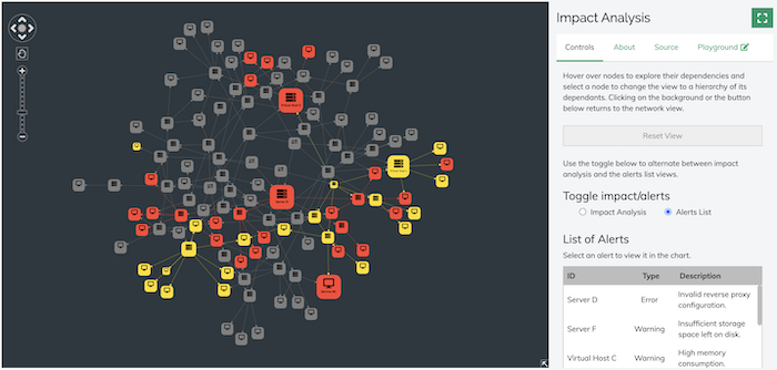
It’s easy for network engineers to prioritize alerts for investigation by clicking on the larger, red nodes. But we also have the option to select an alert from the list on the right. Either way, we can bring up a visualization of a particular host or server that’s triggered an alert:
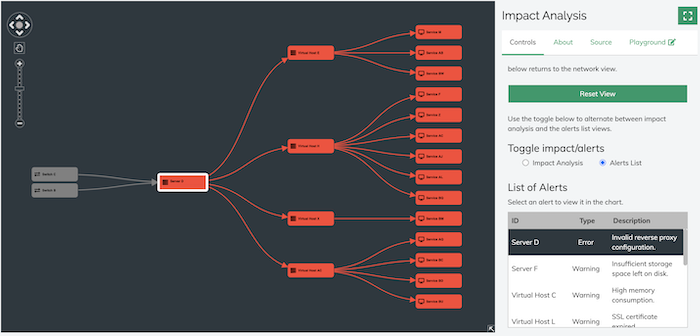
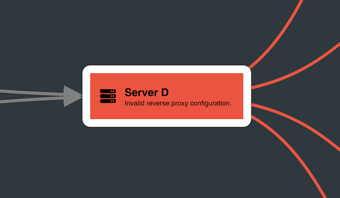
In this example, it’s clear that the root cause of a number of services being down stems from an invalid proxy config on at the server level. Now that we’ve pinned down the problem, we can bring in more detail by zooming in to that specific server:
Throughout each interaction, the application demonstrates a slick and intuitive UX, starting with the big picture and revealing the root of a problem in just a few seconds.
So you don’t have to throw in every visual trick you know to stand out from the crowd. An elegant graph visualization design will grab the attention it deserves, and build trust right from the outset, delivering on its promise of a great UX.
2: Creating a consistent look & feel
Lots of graph visualization applications look great but have a strong visual identity that clashes with your app. You should never have to redesign your app to fit with a tool that you’re integrating with. A visualization component built using our SDKs is completely customizable to your style requirements, giving your application a look that’s so seamlessly on-brand, users will assume it’s entirely home-cooked.
As an example, we’ve built an HR application for Cambridge Intelligence:
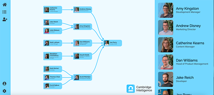
We’ve added a graph to our menu panel that takes many of its design cues from Material Design, but we’ve made it look native to the application. We did this by using customization features to apply a branded color scheme, and import staff photos and our logo.
Because the branding and formatting is consistent, users will understand how to interact with the chart and menu. Using our toolkits, it’s easy to create a unified UX that’s stylish and professional – and instantly recognizable as a product from your organization.
3. Giving users the right info at the right time
It’s important for your users to get the information they need exactly when it becomes most relevant. They should be able to self-direct through a visualization smoothly and intuitively, and quickly uncover the answers buried in their data.
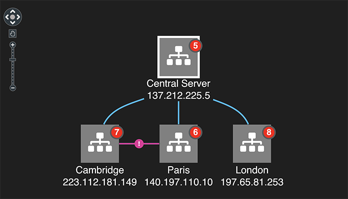
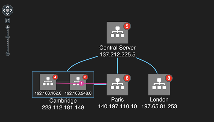
This IT network visualization gives a simple overview of a complex dataset. The chart comprises just four nodes, representing a central server and the cities it’s connected to:
We’ve made certain design choices to make sure the user won’t get overwhelmed by information at any stage. With just a few clicks, they can carry out an investigation that’s clear and streamlined, allowing them to make business-critical decisions with confidence.
We’re featuring only the most important information at the top level. We get an instant understanding of our IT infrastructure, its connections and the alert we need to focus on – and that’s all down to the customization choices we’ve made.
Red glyphs on the nodes show us how many items each one contains. The combos function – our advanced grouping feature – allows us to investigate further, expanding nodes to show their contents:
As we dig deeper, our node customizations give us the key information we need, as we need it – without cluttering up the chart.
The color coding makes it easy to identify the source of the alert. Once we’ve narrowed down our investigation to two specific devices, we can highlight the corresponding nodes and examine their connections, while sending the rest of the chart items to the background so you can still see them in context:
We’ve used node customization here to make some incredibly complex, time sensitive and critical data easy to navigate. The contrasting colors and recognizable font icons let us paint a swift picture of our network and its components. Users can identify the relationships between them, and cut through the noise to find the section of infrastructure that needs urgent attention. When a network has been compromised, a clean visualization can not only help identify the root cause, but give the user the information they need to prevent it happening again.
A visualization design that puts the user in control
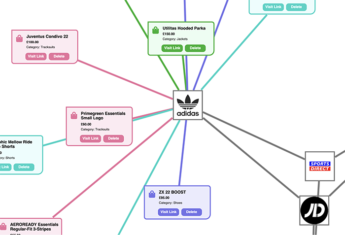
Node customization isn’t all about visual styling – it can bring in a whole new level of interactivity, allowing users to control the chart as they explore it.
The visualization below represents sportswear vendors and their products. The vendors are represented by familiar logos. We’ve added detailed information about products and prices to the nodes, which the user can reveal on zoom. And if we want to know about a specific product, we can instantly access related web content, by following a link within the node. Another link lets us remove products that aren’t relevant to our investigation, to keep the chart as clean and relevant as possible.
These heavily customized nodes are richly informative and interactive, but they’re still neatly laid out, and the level of detail doesn’t distract the user:
4. Bring your designer’s vision to life
Many organizations make big investments in user experience design, and that means working with experts who have very detailed and well-informed plans for how your application should look and behave. Your designer and developer have a common goal – building an intuitive and rewarding UX – and a good SDK will empower them to work together to achieve that.
Using our toolkits, you can meet the most specific graph visualization design vision without slowing down your project, and without making any compromises. And if you’re looking for a style or a feature that you’re not sure how to achieve, our excellent support team will do their best to help you make it happen.
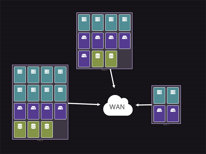
This app visualizes CPU usage in an IT infrastructure. Zoomed out, we have a clean and tidy overview of servers connected to a Wide Area Network (WAN), color-coded by type. The devices are grouped according to their physical location on the floor of a building:
This visualization needs to match the innovative design features of the wider application. No problem – our SDK can easily recreate them. Notice the dynamic color changing progress bars that indicate the level of CPU usage. Hovering over any node grays out the others, to make it easier to focus on what’s important:
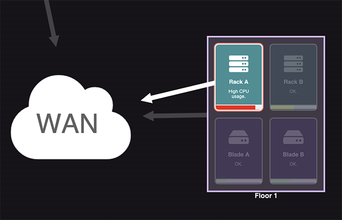
Again, this chart is simple, clean and easy to scan for issues at a zoomed out level, and information-rich when we zoom into a specific area of interest. Users see at a glance where problem areas are and what devices might need attention.
Challenges accepted?
KeyLines and ReGraph deliver almost infinite flexibility and customization options for variety of use cases – if you can dream it, we can help you build it.
Whether you’re working on a new product or looking to upgrade an existing application, you’ll get the expert support and collaboration tools you need to face up to every design challenge.
Sign up to a free trial or get in touch.
Share:
