2026 has begun with renewed focus on global trade enforcement. In recent months, the US and France, supported by the UK in several cases, have intercepted and seized sanctioned oil tankers. At the same time, Ukraine has targeted vessels in the Black Sea believed to be part of Russia’s so called “shadow fleet”.
These events raise an important question: are sanctions working?
Seizing individual vessels only goes so far. The networks enabling restricted states to keep exporting oil are vast and deliberately opaque: ownership structures are obscured, routes shift, and intermediary companies multiply. Shadow fleets are one part of this picture, but far from the whole story.
The broader challenge lies in understanding the full trade ecosystem: how volumes change, how routes shift, and which companies and states sit at the centre of these networks. To explore these questions, we partnered with Kpler, the leading data provider in global trade intelligence, building on their data with our visualization SDKs to turn complex shipping activity into clear, communicable intelligence for analysts, investigators, policymakers and executives alike.
Kpler’s sample dataset gave us a window into sanctioned oil trade flows. That data let us tackle three core questions:
- Was there a geographic redistribution of Russian oil exports following the 2022 invasion of Ukraine?
- Did Russian oil export volumes materially change – in other words, did the international sanctions work?
- Which companies were most central to these trade flows?
Let’s answer these questions by combining network, temporal and geospatial views.
The data and the analytical approach
Kpler’s dataset covered five years of liquid commodity trades originating from Russia, spanning January 2020 to January 2025.
Each record included:
- The companies involved in the transaction
- The product traded and associated volumes
- Origin and destination installations (ports, refineries, etc.), including geospatial coordinates
- The date/times of trade completion
This combination of entities, locations, volumes, and time created a multidimensional analytical problem: trade flows are not just who traded with whom, but also where, when and at what scale.
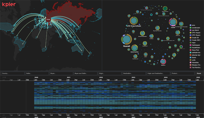
To explore this effectively, we designed a UI built from three complementary visual dimensions, supported by cross-filtering controls:
1. Network (Graph) viewA graph visualization representing company-to-company trade relationships, allowing analysts to identify central actors, clusters, and structural shifts in the network.
2. Geospatial (Map) viewA map visualization showing both country-level flows and installation-to-installation shipment routes, revealing geographic redistribution patterns.
3. Temporal (Timeline) viewA timeline visualization plotting trades across the full five-year period. At a high level, this acts as a heatmap of activity over time, and as a dynamic temporal filter for the network on map views.
Together, these three views form a coordinated analytical environment: users can move between network, geographic, and temporal perspectives without losing context.
You can see a screenshot of the UI below. We’ll dive into each visualization individually and then discuss the interactions across them.
Company-to-company trade connections
To understand the structure of the trade network, we began with a graph visualization built using KeyLines.
The dataset contained 288 distinct companies connected by 1632 trade relationships. Instead of overwhelming the user with every single link, we focus on the companies themselves, allowing analysts to understand the relative importance of actors before exploring their connections.
Nodes are sized by degree centrality, showing the number of direct trading relationships each company has. This immediately surfaces the most structurally influential players in the network.
Additional visual encodings provide further context. Donut segments around each node indicate the types of products traded, enabling analysts to distinguish between diversified actors and those focused on specific commodities.
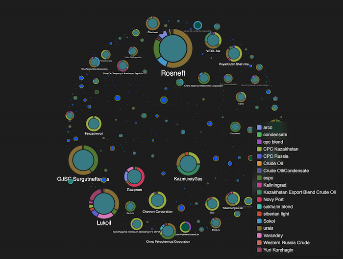
Major energy companies such as Rosneft, Lukoil and Gazprom emerge as highly connected hubs, consistent with their role in Russia’s oil and gas export ecosystem. The network also reveals clusters of intermediary entities whose positions warrant closer inspection.
This view answers one of our core questions: Which companies were most central to these trade flows?
Clicking on any company expands its immediate trading relationships across the five-year period, revealing directional flows between counterparties.
Arrows and node color indicate whether the company acted as a buyer, seller, or both – helping analysts quickly distinguish exporters from intermediaries and reciprocal trading relationships.
Link width is used strategically:
- When viewing all products, it represents the relative number of trades between two companies, highlighting frequently recurring relationships
- When filtering to a specific product, it reflects the relative quantity traded, shifting focus from transaction frequency to material volume
This UI allows investigators to move between structural connectivity and commercial weight, identifying not just who is connected, but which relationships meaningfully drive trade flows.
The geospatial (and geopolitical) perspective
To understand where trade flows were being redirected, we introduced a geospatial view using MapWeave.
The dataset included 259 installations and 771 unique shipment routes between them over the five-year period. Rather than plotting every installation-to-installation link immediately, which would create visual clutter, the initial view presents an aggregated flow map showing trade between Russia and destination countries.
Country nodes are derived from installation coordinates, allowing us to roll up flows to the national level. Link thickness and color encode the relative number of trades between Russia and each destination, making shifts in geographic emphasis immediately visible.
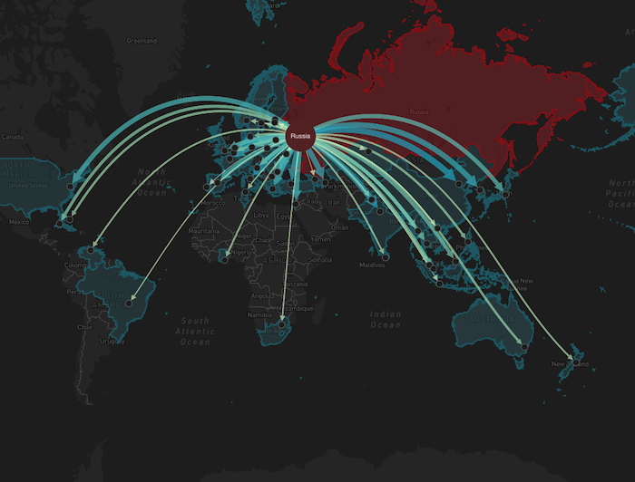
From this high-level view, users can drill down interactively. Selecting a country filters the map to show only the installations and shipment routes relevant to that trade corridor.
For example (the animation above):
- Selecting Turkey reveals multiple Russian and Turkish installations participating in trade.
- Selecting Georgia shows all trade known about in this dataset only occurred between Sheskharis Oil Terminal and Batumi.
This progression from aggregated geopolitical flows to installation-level detail enables analysts to quickly identify redistribution patterns and assess how diversified or concentrated specific trade relationships are.
The temporal dimension: trade activity over time
To examine how trade activity evolved before and after February 2022, when Russia invaded Ukraine, we introduced a temporal view using KronoGraph.
Each player-to-player trade across the five-year dataset was plotted on the timeline. When event density exceeds a defined threshold, the interface automatically aggregates activity into a heatmap, preserving readability while still revealing macro-level patterns.
As users zoom into narrower time windows, aggregated heatmap cells resolve into individual trade events. These appear as directional links between companies, positioned along their respective rows on the timeline. This allows analysts to move from macro trends to specific transactions.
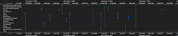
For example, focusing on Hyundai OilBank reveals trading activity with multiple Russian-linked entities up to approximately November 2022, after which activity ceases in this dataset.
But is that an isolated case or was that the wider trend?
To answer our first core question, whether sanctions materially reduced Russian oil exports, we introduced a marker for February 2022 (the start of the invasion of Ukraine) and compared activity levels before and after that point.
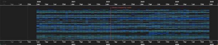
Visually, the relative density of heatmap cells on either side of the marker does not suggest a significant decline in trade activity.
To validate this observation, we calculated the average monthly trade counts across the two periods:
- Pre-February 2022 (25 months): 212.4 trades per month
- Post-February 2022 (35 months): 232.5 trades per month
Within this dataset, overall trade volume did not decrease following sanctions, and in fact shows a modest increase in monthly trade frequency.
This temporal perspective provides critical context. While individual companies may have withdrawn, aggregate trade activity continued, suggesting redistribution rather than contraction.
From tactical signals to strategic insight
Individually, each visualization provides a valuable, though partial, perspective. Together, they enable a strategic assessment.
Let’s return to our second core question: Was there a geographic redistribution of Russian oil exports following February 2022?
To investigate this in detail, we focused on the Urals product – one of Russia’s primary crude export grades – typically shipped from western and south-western terminals including Ust-Luga, Primorsk, and Sheskharis.
Phase 1: Pre-invasion baseline (Jan 2020 – Jan 2022)
Using the timeline to filter the network and map views to the two-year period prior to the invasion, we establish a baseline.
Before February 2022, Urals shipments were distributed across:
- Multiple installations in the United States
- A wide spread across Europe
- Several destinations in India
- Significant flows to China
The trade network shows broad geographic diversification across Western and Asian markets.
Phase 2: First year post-invasion (Feb 2022 – Feb 2023)
Advancing the temporal filter to the 12 months following the invasion reveals immediate redistribution effects.
These key changes become visible:
- Shipments to the USA cease
- European installations substantially reduce
- Indian installations notably increase
- Chinese destinations remain active
The geospatial map makes this shift immediately legible.
Phase 3: Late 2024 snapshot
Filtering to the final ten months of the dataset shows a more consolidated pattern.By Spring 2024:
- European destinations are limited to Kaliningrad (a Russian exclave) and Turkey
- The majority of shipments are concentrated in South and Southeast Asia
- India and China dominate as primary recipients
This confirms a substantial geographic reorientation of trade flows.
Quantifying the shift
The visual patterns suggest redistribution rather than contraction. To validate that observation, we compared pre- and post-February 2022 averages:
Trade frequency:
- Pre-invasion (25 months): 61.4 trades per month
- Post-invasion (35 months): 76.9 trades per month
Monthly volume:
- Pre-invasion: 6.5 million barrels
- Post-invasion: 8.5 million barrels
Within this dataset, both trade frequency and traded volume increased following sanctions.
Strategic implication
From a purely structural perspective, sanctions did not eliminate trade activity in this commodity. Instead, the system reoriented with Western demand declining and Asian demand absorbing volume. The network reorganized geographically while maintaining, and even increasing, trade flows.
This conclusion only becomes clear when temporal filtering, network relationships, and geospatial flows are analyzed together.
Who were the companies involved?
Having examined redistribution patterns, we can now turn to our third core question: Which companies were most central to these trade flows?
Focusing on the final six months of the dataset and filtering to the Urals product, the network view reveals several dozen active trading entities in late 2024. The structure remains highly interconnected, reinforcing that redistribution did not simplify the ecosystem.
One effective way to narrow investigation is by geography. Selecting Turkey on the map filters both the network and timeline to show only the companies and trades associated with Russian-Turkish Urals shipments.
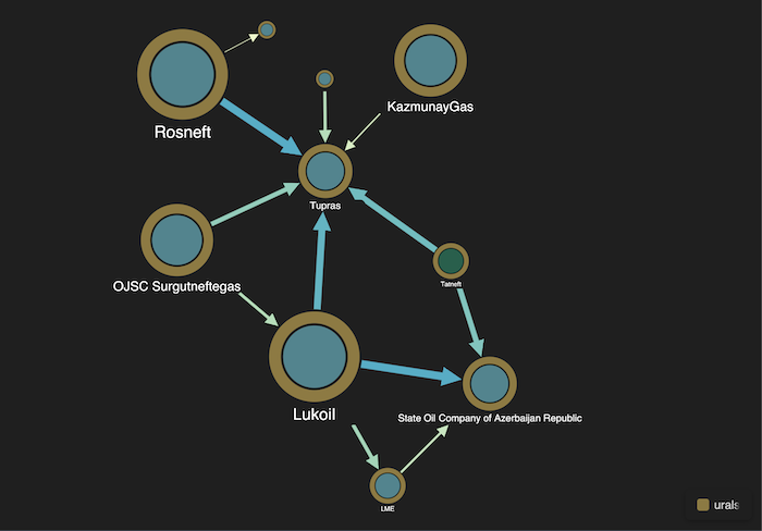
On the seller side, major Russian energy firms – including Rosneft, Lukoil, and Surgutneftegas – remain prominent. On the buyer side, two companies stand out: SOCAR (State Oil Company of Azerbaijan Republic) and Tüpraş.
Investigating Tüpraş
Selecting Tüpraş in the graph filters the timeline to display only its relevant trades and simultaneously narrows the map to the installations receiving shipments.
Over this six-month period, Tüpraş received dozens of Urals shipments, primarily from Rosneft, Lukoil, and Tatneft. All shipments were routed to two Turkish refineries: İzmit and Aliağa.
This progression – network to timeline to installation detail – demonstrates how analysts can move from identifying a key actor to examining trade intensity and specific operational destinations within seconds.
Investigating SOCAR
Applying the same workflow to SOCAR reveals a similar but distinct trading profile.
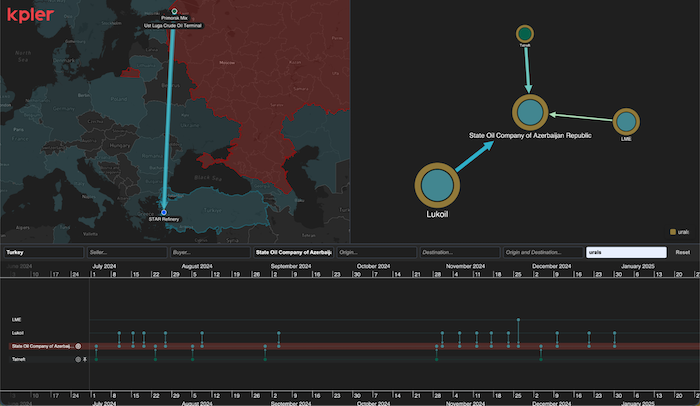
SOCAR’s Urals purchases during this period primarily involved Lukoil and Tatneft, with one shipment from LME. All shipments were directed to the STAR refinery in western Turkey.
Subsequent open-source reporting has noted evolving sanction dynamics around refineries processing Russian-origin crude, alongside shifts in Turkish import sourcing patterns.
Rather than relying on static reports, this multimodal view allows analysts to continuously reassess participation, counterparties and geographic exposure as trade conditions evolve.
From companies to vessels
The investigation does not stop at company-level relationships.
By selecting a specific trade event on the timeline, the map can transition from abstract network flows to concrete shipment routes and vessel observations.
This enables analysts to inspect vessel movement patterns, including AIS behavior and route efficiency, linking corporate trade relationships to physical maritime activity.
Such drill-down capability bridges strategic trade analysis with operational maritime intelligence.
What does this mean for sanctions enforcement?
We’ve shown that the combination of global trade intelligence data like that provided by Kpler, and our visualization SDKs enable software teams to build very powerful front-end applications which can reveal global trade and geopolitical patterns and shifts, while simultaneously enabling analysts to drill down to an incredibly detailed level.
Complex trade ecosystems cannot be understood from a single perspective.
- The network view reveals structural relationships and central actors
- The geospatial view exposes redistribution patterns and destination shifts
- The temporal view shows how activity evolves before and after major geopolitical events
When coordinated, these perspectives transform raw trade records into actionable intelligence.
In this case, the combined analysis shows that following February 2022:- Overall trade frequency did not decline
- Export destinations shifted significantly towards Asia
- A broad, resilient network of companies continued facilitating flows
For software teams building analytical tools in domains such as supply chain security, sanctions enforcement, or maritime intelligence, the challenge is not just accessing data but presenting it in a way that supports both strategic assessment and tactical investigation.
This demonstrator shows how global trade intelligence data, combined with coordinated network, temporal and geospatial visualization can enable exactly that.
Discover KeyLines and MapWeave
Visit our public SDK sites: