Time-based data visualization is a vital part of visual data analysis. In this blog post, we’ll take a closer look at visualizing complex connected data – often called ‘graph data’, and its evolution over time.
Graph data is rarely static. As time passes, entities change, events happen and connections get made and broken. To truly understand your graphs, you need to be able to visualize all of that.
That’s why we built the time bar – available in our KeyLines and ReGraph graph visualization toolkits, and KronoGraph, our toolkit for building interactive timeline visualization applications.
What is the time bar?
Our time bar is a powerful time-based data visualization tool. It lets you filter and interact with your time-based graph data.
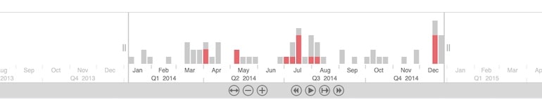
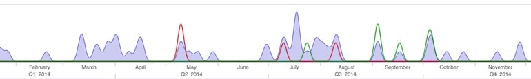
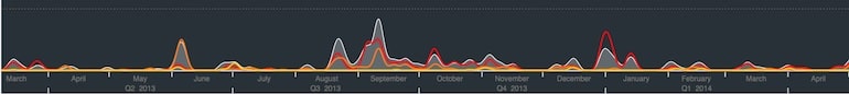
The time bar combines a histogram, showing overall graph and activity, with trendlines, which show specific node or sub-graph activity. Users can navigate, filter and playback their graph activity with scale and navigation controls.
Why should I use the time bar in my graph visualization application?
Most graph data has a time dimension, which your analysts need to understand. The time bar makes that fast and intuitive, so your users can easily filter and explore time-based graphs, isolate specific periods of time, or watch connections form, evolve and break.
How does the time bar interact with KeyLines and ReGraph?
We’ve designed the time bar to work seamlessly with our graph visualization toolkits, resulting in seamless time-based data visualization tools.
You simply load your graph data into your KeyLines or ReGraph application and, as long as you’ve included a timestamp or array of timestamps in your data, it’ll show up in your time bar.
You can also tell the time bar to show the value of your data. For example, if you’re visualizing financial transactions and want to see their total value rather than a count of the transactions that took place, you just define this in your data object.
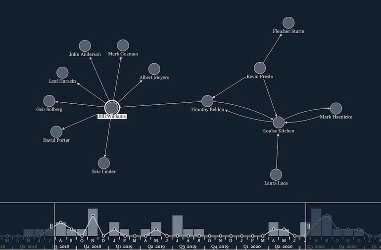
Interactions in one component will also happen in the other. Simply select a node in your graph visualization to show that selection in the time bar. Or if you filter to a specific time period in the time bar, the graph visualization chart updates to show only the nodes and links within that period.
Can the time bar handle events with durations?
Yes. The time bar can represent instantaneous events, like text messages or transactions, or events with a duration, like a phone call.
Again, both the time bar and graph visualization component use the same data format. So you just need to define your data once in your time-based data visualization. The time bar ignores any chart-only properties and vice versa.
Can I customize my time-based data visualization?
The time bar comes with a number of customization options, to help it fit your application’s look and feel.
Any combination of the scales can be shown or hidden, and localizing them is easy:
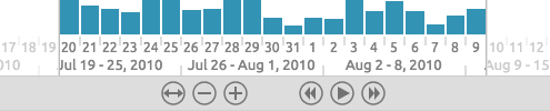
You can also change the fonts, bar colors, highlight colors, remove the controls or hide the sliders:
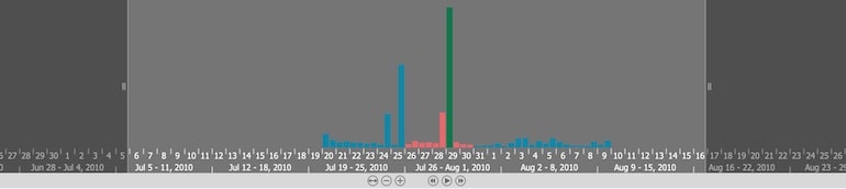
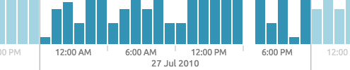
The stacked histogram option is handy if your data contains different groups of nodes and links:
Or you can switch the histogram look for a smooth area plot:
Combining these options, it’s easy to build a very stylish time bar:
What if I need to see individual events?
The time bar is great for looking at overall graph activity, or summaries of specific node activity. But analysts and investigators often need their time-based data visualization to give a more granular view.
If you want to see when specific events unfolded, and how they connect to one another, timeline visualization is a great option for you.
Our KronoGraph toolkit makes it quick and easy to build timeline visualizations that drive investigations.
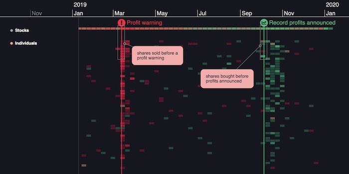
Time flows from left to right, with entities listed on the left-hand side and the events connecting them taking place along the scale. You can include markers to provide additional context or useful background information:
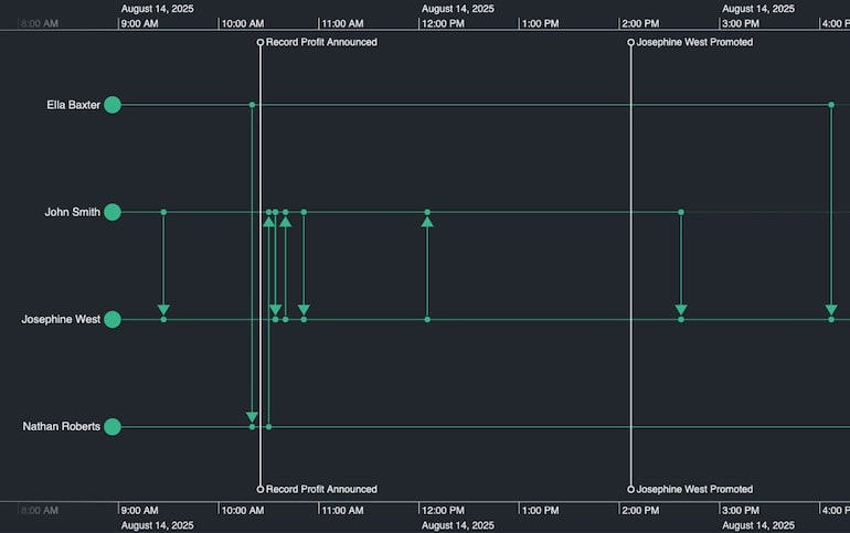
And smart aggregation techniques summarize the data, in groups (for entities) or a heatmap view (for events) so your timelines look great at any scale.
Get an objective expert’s view of the KronoGraph toolkit
Download a free analyst report from Bloor Research to see how KronoGraph, our timeline visualization SDK, stacks up.
Smart event spacing with KronoGraph’s nonlinear scale mode
Timelines often feature dense clusters of activity separated by long gaps. The resulting visualization can be frustrating for an investigator to explore and manipulate, as it takes a lot of panning and zooming for them to understand what they’re looking at.
Nonlinear timescale mode optimizes your screen space to expand active periods and contract quieter areas of the timeline. In this visualization of decades of terrorist activity, nonlinear scaling makes it easy to quickly navigate from a heatmap overview to the early 2000s, and locate a specific event:
Add context with annotations
If you have annotations in your dataset, you can have them automatically added to your KronoGraph timeline, enhancing the narrative element. Users can hide or display them, and they can be protected to guard against tampering. For datasets that don’t include annotations at source, users can add, edit or delete them by interacting with the chart.
Annotations let users tell the story behind their complex data visualization. They’re a great way of enhancing a report or presentation as part of a collaborative workflow, to share with anyone who needs a quick understanding of an investigation.
Unleash the power of time-based data visualization
The time bar and KronoGraph are powerful ways to uncover insight in your time-based data. If you want to explore them for yourself, request a free trial.
This post was originally published some time ago. It’s still popular, so we’ve updated it with new example visualizations to keep it useful and relevant.


