In the latest updates to our graph visualization toolkits you’ll find clever adaptive layout options, a clearer way to look at sequential data, and (by popular demand) a slick new option for styling your application.
New adaptive behavior for layouts
Layouts are essential for untangling and understanding any network. Once the data in your graph visualization is exactly where you need it, you may not want every change to trigger a full layout.
New layout options mean components adapt subtly and intuitively every time you add, expand or remove items. Components adjust using minimal movements, so you don’t lose track of where key nodes exist.
Color your overview window
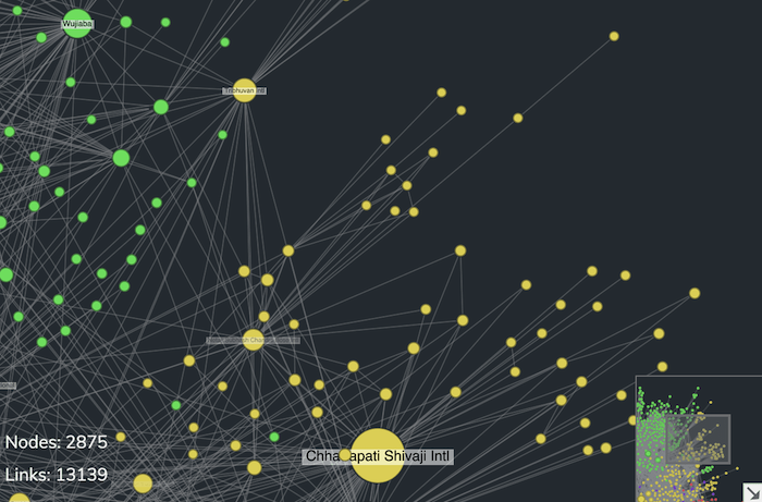
It’s important to get the style of your graph visualization app just right. Now you can customize the colors of the overview window, the handy thumbnail image that helps analysts navigate large charts.
Using dark mode? Get a matching overview window for a stylish look.
Stretch goal achieved for sequential layouts
There’s a new option to stretch sequential layouts to increase the spacing between tiers of data. It gives analysts more freedom to experiment and achieve the right structure for their hierarchical networks.
Something to look forward to…
We’re thrilled to announce that new major versions of both KeyLines and ReGraph are on their way.
Right now we’re working hard on the great new features you’ll see in KeyLines 6.0 and ReGraph 2.0. They’re due for release in the coming months, but if you can’t wait until then to find out more, get in touch.
You bring the data: we’ll help you visualize it
Need a graph visualization tool that you, your developers and your users will love? Free trials of our toolkit technology are available on request.


