FREE: Start your trial today
Visualize your data! Request full access to our SDKs, demos and live-coding playgrounds.
The way you represent relationships between nodes can make or break your link visualization. The link styles you choose affect how easily users can interpret connections, navigate the chart and uncover insights. Do the links bring clarity? Do they emphasize key relationships? Can users differentiate between types of flow?
Our data visualization toolkit approach gives near-limitless styling options. This blog post guides you through five popular design choices for links – including some that were only added at the end of 2024 – and describes when and why to use them.
We’re used to seeing hierarchies, such as organizational charts, mapped out in orthogonally branching shapes. You can achieve the same effect in your node-link visualizations when you use a sequential layout.
Angled links between tiers of data make levels of dependency much clearer. Sharp edges reinforce distinctions between each data level, and make it easy to follow the direction of flow.
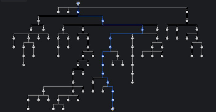
Similar to angled links, curved links between levels of nodes in a sequential layout make it clear which tier each node belongs to. The curved option adds an organic style – a good choice for visualizing the flow of entities, such as network traffic, funds or communication. The connections themselves are just as important as the hierarchical levels they move through.
The types of links you use aren’t just design considerations: they can be a valuable way to convey different types of information too. Which leads us to…
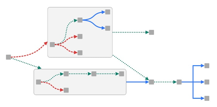
You can mix and match style options to represent different relationships between entities in the same node-link visualization. Mixed link shapes can include curved, angled or direct links, and each can be used to convey its own distinct meaning. You can also reinforce their meaning with additional styling, such as solid, dashed or dotted lines in different colors. It’s an efficient way to convey information without overwhelming users with too many visual clues.
In this example, the nodes look identical, but the link shapes and colors tell us there are different types of traffic flowing between them.

In a busy chart of densely-connected nodes, certain relationships are more important to your investigation than others. Setting link priority pushes those key connections to the front and makes them easy to spot.
This graph visualizes email traffic between employees, collected by the FBI investigating the Enron scandal. You can see the high volume of emails sent between colleagues creates a hairball of overlapping links. Selecting a node makes its direct connections more prominent, but not all of those links stand out.
Compare that with a graph that has a link priority set on the nodes that are neighbors of the selected node. Now analysts see an unobstructed view of those critical paths.
Charts often show multiple links between the same two nodes or combos – think financial transactions between accounts, calls between cellphones, journeys made between home and work. The higher the number of links, the more crowded the chart becomes, so analysts end up with a cluttered visualization of ugly, onion-like formations.
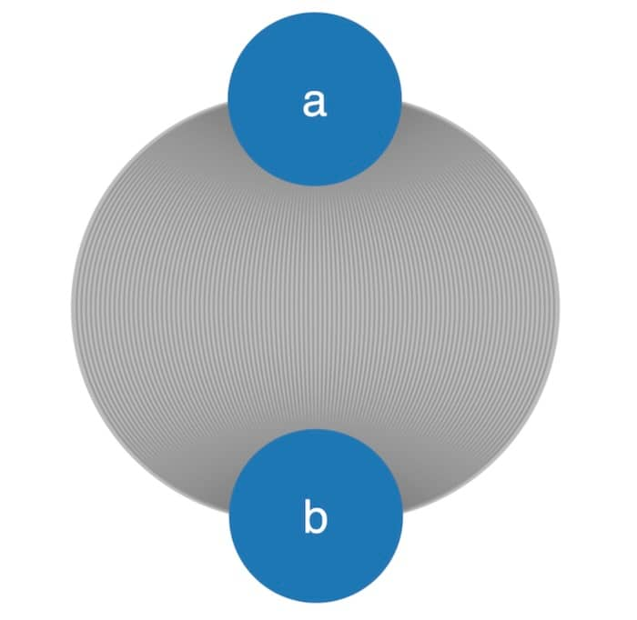
Link aggregation combines multiple connections between pairs of nodes and combos into fewer, more manageable links. You can also aggregate links based on a custom data property and direction.
Here’s an example from a food supply chain, where multiple links between sites represent transportation by road, rail and air, easily recognized by color. The simplified version aggregates links by transportation type. When an analyst needs to see the detail of each journey inside an aggregate link, it’s just a click away.
Customized glyph icons on links tell the analysts how many journeys were made in total, and which transportation method was used. Glyphs are a quick and easy way to communicate different characteristics, and you have fine-grained control over where to place them. Find out how to get more from your graphs with glyphs.
Notice how the red and green aggregate links are wider than the blue single link. We use link widths to represent the volume of traffic – in this case, the combined number of journeys – between nodes. Use them when the quantity of flow is important: the wider the link, the greater the volume.
Almost all of the node-link visualization examples in this post so far rely on arrowheads to show the direction of flow. They’re familiar and instantly recognizable, but they’re not the only way to convey flow between nodes.
This graph shows the flow of money between accounts during a money laundering investigation. Flow animation, in the form of red dashed lines, flag suspicious transactions sent from and received by different accounts.
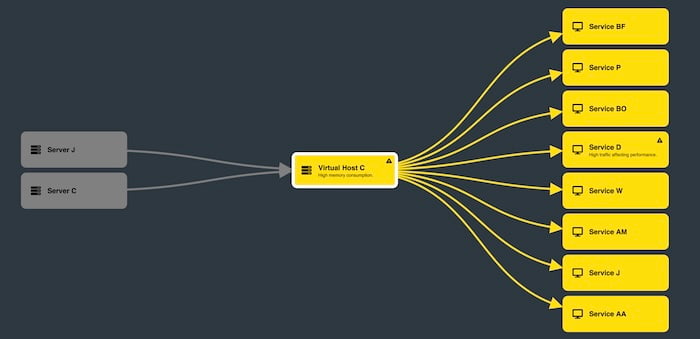
This IT network alert example doesn’t use arrows at all, but the direction of communication between machines is just as clear.
Effective link styling should be an important consideration for your graph visualization data model. Feedback on the most recent link customization options added to KeyLines and ReGraph – angled links, mixed link shapes and link priority – has been hugely positive so far. What do you think of them? We’d love to hear from you
To start visualizing the connections in your data, request a free trial today.