
Glyphs have been a core part of our products since the early days. They offer a quick and easy way to communicate different characteristics and add decorations to items in your network. You probably know them as counters or images placed on a node’s border.
What you may not know is that you now have much more fine-grained control over where you place your glyphs, opening up a wide range of interesting styling possibilities.
This blog shows five of our favorite uses for glyphs to help breathe new life into your charts.
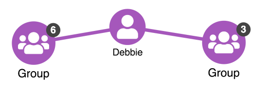
1. Glyphs as labels
Because glyphs come with a curved border, they make an interesting alternative to node titles. In this example, we’ve applied a slight transparency to the blue glyphs and placed them directly below the node, with the position (p property) set as 180 degrees from the node’s center.
2. Interactive glyphs
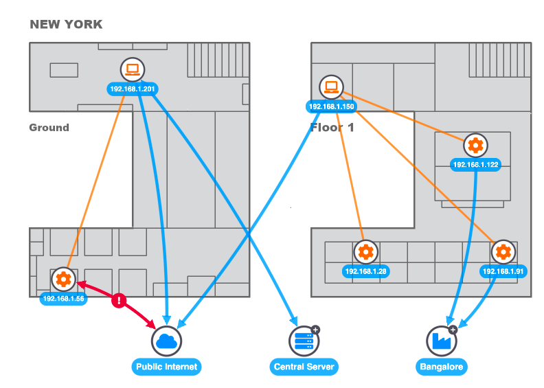
Like any other visual item, glyphs can be targeted by event handlers so you know exactly what’s been clicked on. You can use this to add interactive controls to your nodes. One popular example is an expand indicator that tells users that there are further connections to explore, inviting them to click and bring in new items from the back end.
There are plenty of other creative possibilities. Here we use a glyph as a ‘switch control’ so users can turn on or off particular parts of a network.
And in this example, we use interactive glyphs as ‘pins’ to fix or remove certain key players from a network under investigation. Notice we’ve used a hover style so it’s clear to users that the glyph is interactive – the pin changes color when you hover over it.
3. Glyphs as masks
A popular question on our support channel is “how can I add a strikethrough or mask effect to my nodes to represent a status change?”.
Easy. Set the position (p property) of a glyph to 0, so that it appears in the center of a node, and increase its enlargement to match the node size.
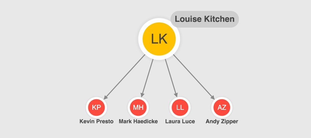
4. Glyphs for multiple text decoration
A popular option for nodes representing people is to use a badge effect where initials appear on the node, with their full name below.
Glyphs make this easy. You could either use a glyph and a label, or two glyphs – one for the full name and one for the initials. In this example we’ve also used the halo feature to add a subtle shadow effect around nodes.
5. Glyphs on donuts
As a final fun example, here we’ve used donuts and glyphs together to create interactive context menus around nodes. Customized glyph icons show what each segment of a donut represents. We simply center them in each segment to create a useful visual key.
Want to learn more?
We hope these examples have inspired you to get more adventurous with styling.
Glyphs are just one of the many options of customization available to tailor the look and feel of your charts using Cambridge Intelligence’s graph visualization technology. If you haven’t used it yet, request a free trial.
Share:
