In this blog post, we see how Virtana OpsCruise – a leading modern applications observability platform and Gartner Cool Vendor – uses KeyLines to provide visibility and actionable insights into complex cloud-based applications.
What is Kubernetes Observability?
When maintaining complex systems, DevOps engineers and software architects need visibility into the full picture. They want to understand the full topology and structure of the application and its connected components.
They’d appreciate simplicity, too, but that went out of the window years ago. Cloud deployment and “X-as-a-service” models have made traditional static software architecture redundant.
Instead, containerization is the standard model for building applications that scale and adapt on demand. This is where individual applications of a service run in their own container, but on shared hardware. They each have their own file system, CPU allocation, memory, etc, but they’re not tied to the underlying infrastructure. It’s a more agile, predictable and efficient approach.
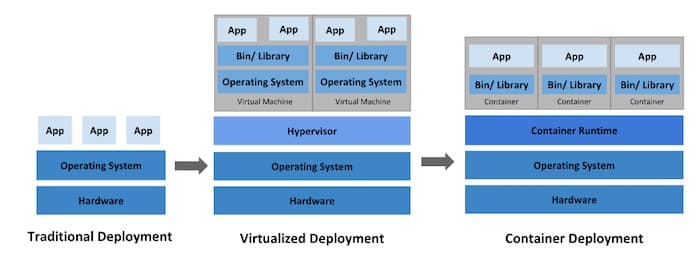
Deployment Evolution image by Kubernetes.io, licensed under CC-BY-4.0
For the engineers building and maintaining containerized systems, this agility creates a problem. The application architecture changes constantly, with vertical and horizontal dependencies and transient services spun up (or closed down) as demand dictates.
More complexity often means greater fragility, too. Diagnosing issues is no longer a case of following an architecture diagram until you find a blockage. It’s more like finding a grain of sand in a plate of spaghetti. While someone else is eating it.
Enter Virtana OpsCruise: the Kubernetes Observability Tool
The Kubernetes experts at Virtana OpsCruise met this challenge head-on. Aloke Guha, former CTO of OpsCruise explains:
“The benefits of cloud-native are obvious, but without the right tools in place, it quickly becomes a complex quagmire of dependencies. Modern apps need modern operational tooling – dynamic, predictive and automated tools that make sense of thousands of microservices generating billions of telemetry data points each minute.”
The Virtana OpsCruise platform is the only observability platform purpose-built for Kubernetes applications. Used by customers ranging from Avis Budget Group, to Chicago Trading and Quest Diagnostics, it provides a 360-degree view of interactive services.
Let’s take a look at the KeyLines graph visualization component at its core.
Kubernetes Investigates
When an application begins to fail, DevOps engineers need to find the cause – and fast. A degradation in just one service can cause a noticeable performance drop and severe business impact. But with tens of thousands of containers, pinpointing the root cause isn’t simple.
There’s plenty of clever machine learning going on in the background of the Virtana OpsCruise platform, profiling activity and identifying abnormal patterns. Even so, as Aloke explains, the data can be huge:
“Ideally, applications would just run without any human intervention, but that’s not realistic. Instead, we needed a way to make thousands of moving parts, each with millions of individual metrics, understandable to a user. We started out with Cytoscape, but quickly realized we needed something more robust and sophisticated.”
KeyLines’ visualizations are intuitive, with a level of interactivity that puts the user in charge – so they can scale in and out, and quickly hone into areas of concern. KeyLines’ advanced analysis functionality means they can surface the right information at the right time – so they can respond quickly, without wasting time chasing red herrings.”
The Virtana OpsCruise team makes good use of KeyLines’ functionality to bring that data down to a more manageable size, and present it in a meaningful and context-rich way.
Virtana OpsCruise Features Powered by KeyLines
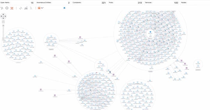
Graph Filtering
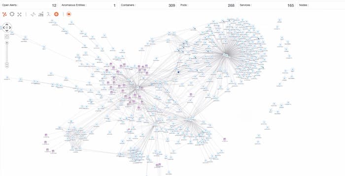
The first approach is filtering – a great way to remove clutter and reduce graph density. Time-pressed engineers can filter by namespace, node type, pod, container, or user-defined labels, to reduce a busy chart into something far more manageable.
Automated Graph Layouts
The next step is to run one of KeyLines’ automated graph layouts – detangling overlapping nodes and links to reveal chains and patterns that could otherwise go unnoticed. In this example, we’ve applied a structural layout to cluster nodes based on their shared connections.
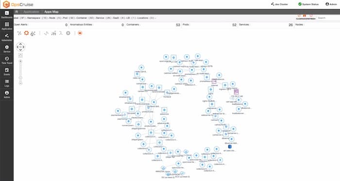
Node Combining in Data Graphs
One additional KeyLines feature, seamlessly incorporated into the Virtana OpsCruise platform, is combos. These visual groupings of nodes and links allow users to combine data based on any logic they choose. They’re a quick way to tidy duplicated data from different sources, or group components based on product or node type.
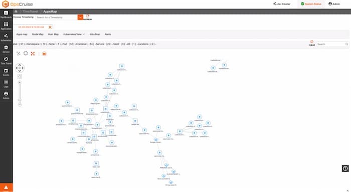
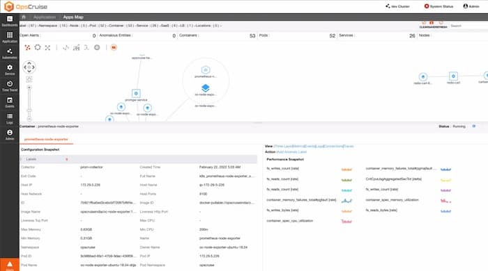
From here, users begin to ‘walk the graph’ – select nodes and links to uncover more detail. Hovering a link reveals inbound and outbound port details.
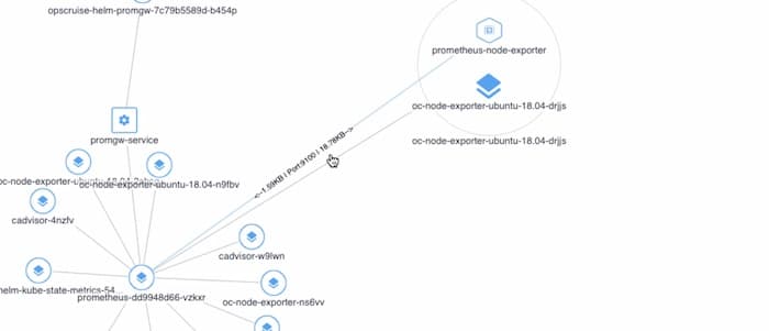
Or they can click on a node or link to quickly navigate to an entire dashboard of configuration, telemetry and performance data.
This clear and engaging visual approach is key to the platform’s success, Aloke explains:
“If something goes wrong, it’s like CSI mode. People need an overview of everything that’s happening but presented in a way that’s clear and insightful, so they can make fast and accurate inferences on what is wrong and actions needed to remedy the problem.
KeyLines drives this with a single-pane approach that scales in, out and across different levels of complexity as required. It answers the questions ‘what’s going wrong, and how can I fix it?’, so DevOps engineers can more quickly resolve issues and limit the potential fallout.”
Try it for yourself
We’ve barely scratched the surface of the Virtana OpsCruise platform here. From AI-powered event analysis to a unique ‘time travel view’ taking users back to specific points in time, there’s plenty more to explore.
No two applications are the same but, with some help from KeyLines, the Virtana OpsCruise team have created a platform that handles scale efficiently. It means DevOps teams gain a deep understanding of their Kubernetes apps in just a few minutes.
To try it for yourself, visit virtana.com.
Alternatively, if you’d learn more about graph visualization, and the KeyLines SDK, we’d be happy to help. Just get in touch.


