FREE: Start your trial today
Visualize your data! Request full access to our SDKs, demos and live-coding playgrounds.
Whether you’re managing a complex IT infrastructure or untangling relationships between companies and their subsidiaries, graph visualization is the best way to see and understand hierarchies in data.
KeyLines 8.1 and ReGraph 5.1, our graph visualization toolkits, bring new link options that make it easier than ever to navigate your tiered data.
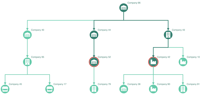
Links are a critical part of any graph visualization, representing the relationships and connections between nodes.
Our new angled link shapes create clear, orthogonal branching paths for hierarchical data like IT infrastructure maps or organizational charts. They make it easier to visualize multi-level dependencies and relationships, reducing clutter and giving a clear view of hierarchical structures.
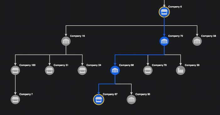
We’ve extended the way you can specify link styles to be even more flexible. You can now assign link path shapes for individual links, combining different shapes to show a variety of relationships. It’s an effective way to tell a clear and compelling story with your data.
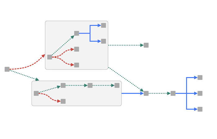
For large, multi-layered datasets, you can combine angled links with combos, our smart node grouping functionality, to control the level of detail you need to see:
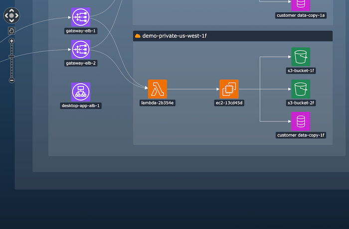
When charts get really cluttered and complex, link prioritization lets you choose which paths or connections sit above the others, making it easy to pick out a pattern of activity or a critical sequence:
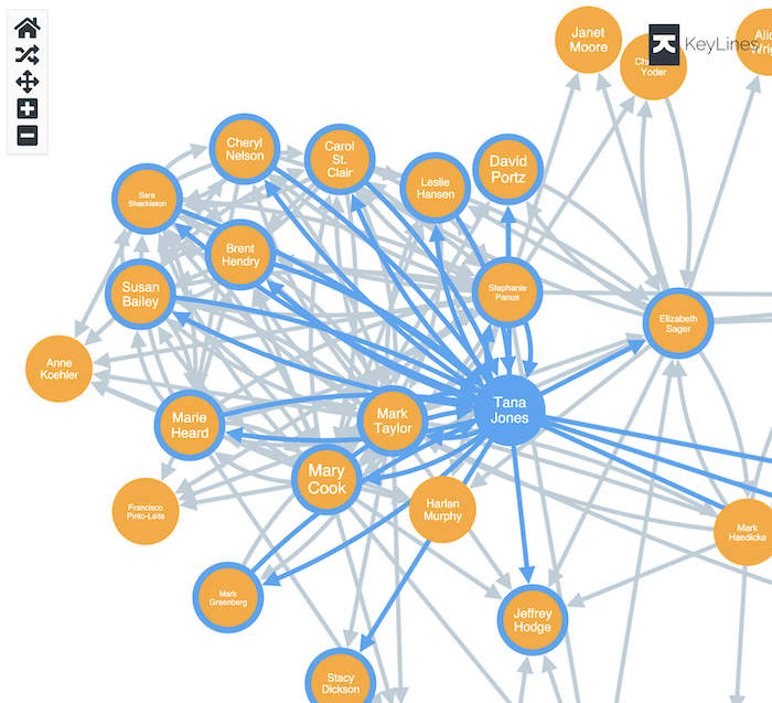
For KeyLines customers, we’ve revamped our Vue.js tutorial to give developers a strong head-start with our graph visualization toolkits:
These updates make it easier than ever to create beautiful, interactive visualizations that reveal critical insights at a glance. Whether you’re focused on technical dependencies, organizational structures, or navigating an intricate workflow, we’re here to help.