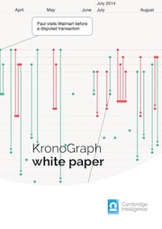
FREE: KronoGraph white paper
Our essential guide to building powerful and intuitive timeline visualization applications.
The latest updates to KronoGraph, our timeline visualization toolkit, demonstrate how to emphasize the most important elements in your dataset.
Find out how emoji options and new “ping” animations simplify the most complex timeline. They draw users’ attention directly to key events and entities so they can make quick and effective decisions based on what they see.
We’ve also created a new story for KronoGraph users, showing how to display a timeline in different viewports – for those times when screen space is limited.
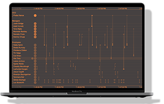
Shine a light on the most important events in your busy timeline, with KronoGraph’s customizable ping animation. It helps your users to cut through the noise and quickly spot warnings, unusual activities and other significant moments.
KronoGraph users can see more examples of ping animations in action in our new “Ping Animations” story and updated “Detection and Response” demo.
Our essential guide to building powerful and intuitive timeline visualization applications.
One of the most frequent questions we get is how to display timelines for different amounts of screen real estate. We’ve built a story to show how you can control this, giving different aspects of your timeline priority as screen space reduces.
You can prioritize discrete events over time series, or collapse multiple entities together into a single summary row – it’s up to you.
KronoGraph users can try this out in our new “Responsive Timeline” story.
We’re always working to make our data visualization toolkits as flexible as possible, with infinite styling and customization options. But what if you don’t have time to source the right graphics to label your timeline? The solution has been there all along – emojis!
Did you know that you can also incorporate any icon or symbol from the emoji library into your KronoGraph visualization? It’s a quick and easy way to add meaning to your timeline, whether you’re labeling countries with their national flags, or illustrating a supply chain with planes, trains and automobiles. Our new “Emojis” story, available to SDK users, shows you how.
If you’re already working with KeyLines or ReGraph, bring KronoGraph into your project: our unique timeline technology opens up a whole new dimension for visualization applications.
Request a free trial, and don’t forget to send us a lightbulb emoji when you realize how much it will transform your project.
Request full access to our KronoGraph SDK, demos and live-coding playground
Registered in England and Wales with Company Number 07625370 | VAT Number 113 1740 61
6-8 Hills Road, Cambridge, CB2 1JP. All material © Cambridge Intelligence .
Privacy Policy | Security Framework


