
In part 1 of this blog series, we used our data visualization toolkits to create an interactive React application and visualize a fascinating Neo4j dataset of Russian Twitter trolls. In this blog post, we’ll dig deeper into our Twitter data visualization to find patterns of behavior that reveal relationships between troll accounts.
Heatmap timeline analysis of our Twitter data visualization
For a detailed overview of the Neo4j database we’re visualizing, made available by Ben Popken and NBC News, see Neo4j timeline visualization with KronoGraph. The database consists of around 400 troll accounts, 20k hashtags and 200k tweets linked to Russian attempts to influence the 2016 presidential election.
If we tried to see this amount of data all at once, dots and arrows wouldn’t really cut it. Instead, once our Twitter data visualization reaches a certain scale, KronoGraph transitions automatically to a heatmap view. Every transition is smooth, fast and intuitive, so the data looks good at every scale.
Here’s what happens when we plot all of our Twitter data at once.
I’ve grouped the trolls by their device’s time zone to make analysis easier. (Twitter ensures that all devices posting from an account are using the same time zone.)
You can immediately spot concentrations of activity. As troll tweets increase, so does the opacity of heatmap cells: the darker the cell, the busier the troll. Red and teal indicate that the majority of tweets in that cell used hashtags or mentioned other users, respectively. If they used both, the cells are yellow.
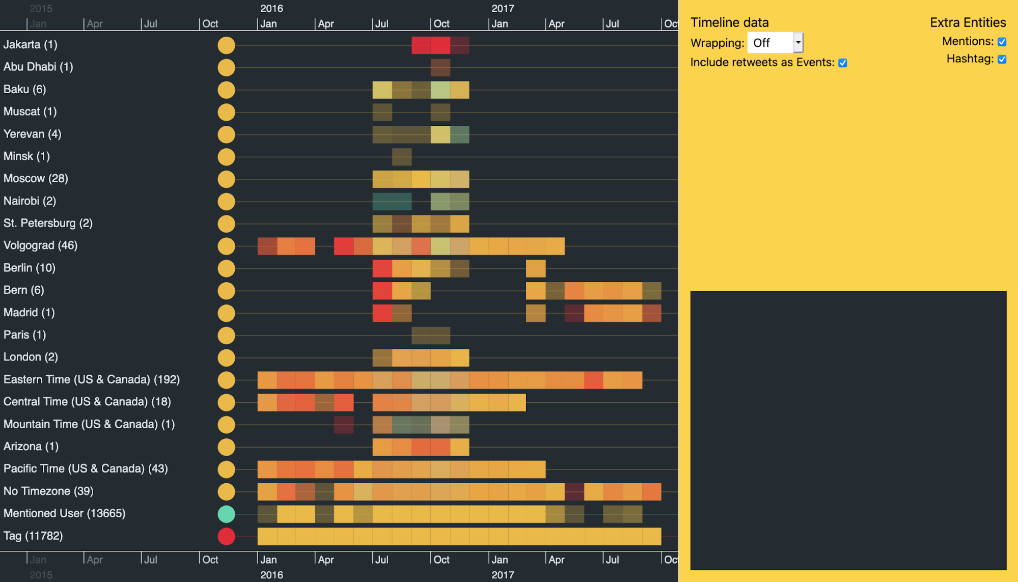
Notice the vertical band of data in the heatmap around July 2016. A lot of accounts kicked into action at a similar time, even though many had lain dormant for years.
There’s another clear band where a lot of activity stops around late November 2016, after the Presidential election. Is this because the trolls had done their jobs by then, or because Twitter suspended those accounts?
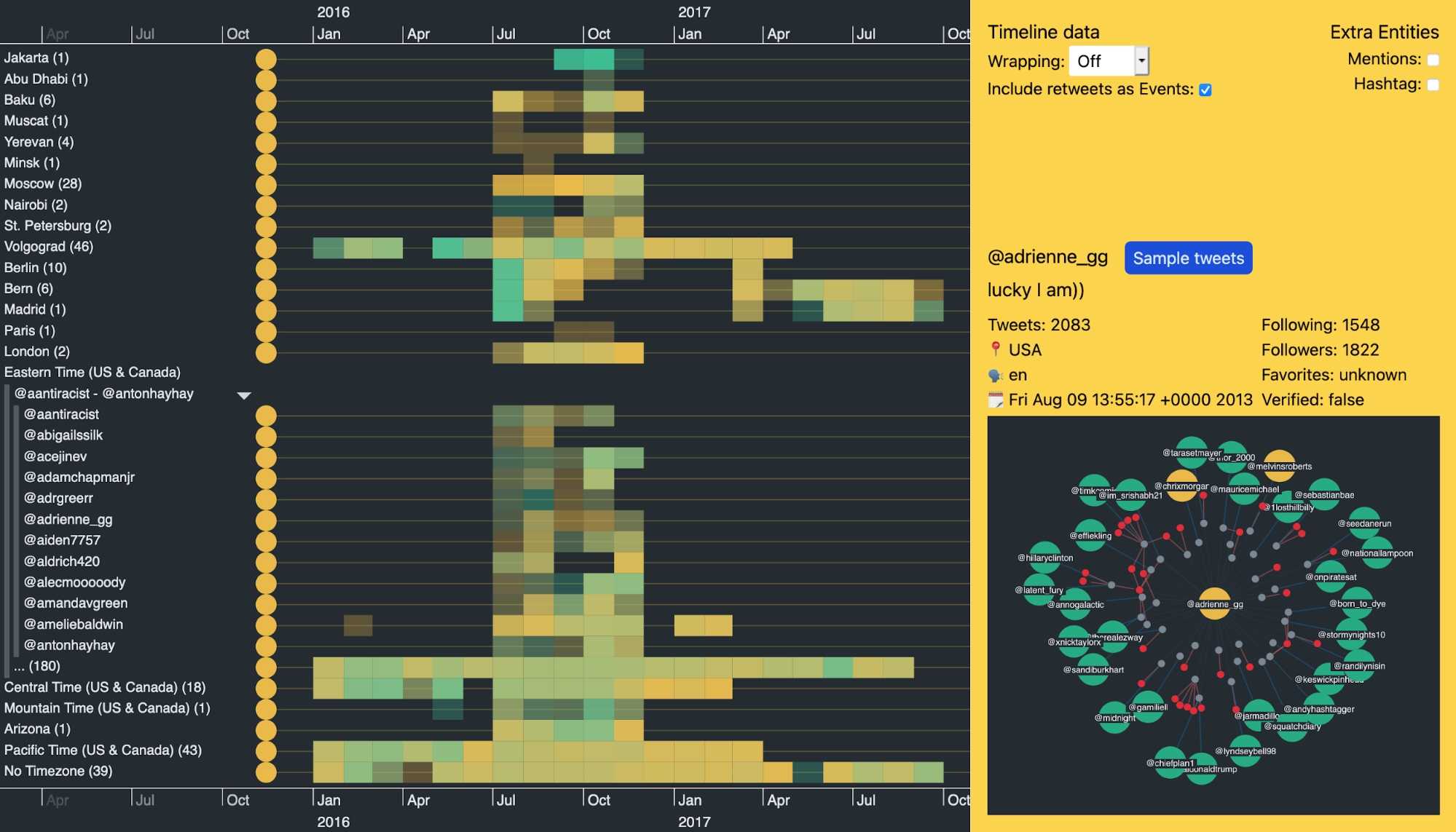
Let’s open up one of the time zone groups to see activity from individual accounts. The Eastern Time (US & Canada) group again shows strong Twitter activity in the five months leading up to the election.
While it’s interesting to view these macro patterns, there’s plenty more to look at when we zoom-in…
Focusing on key events reveals insight
Trolls often exploit world events, such as terrorist activity, in an attempt to further their own agenda.
Just before 0700 UTC on 22nd March 2016, two blasts hit Zaventem airport in Brussels, Belgium. An hour later there was another explosion at Maelbeek metro station near the EU headquarters in Brussels. The Islamic State of Iraq and the Levant (ISIL) later claimed responsibility for the attacks which killed 32 civilians and injured over 300.
If we zoom into this day in our Twitter data visualization we see three bursts of activity. The most active hashtags posted by the accounts in our dataset are #brussels, #isis, #islamistheproblem, and #stopislam.
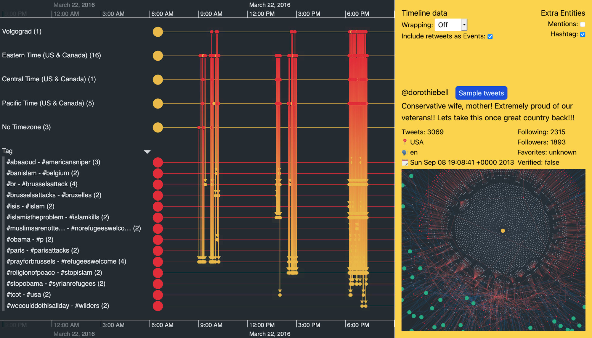
We can expand the groups of trolls to investigate individual ones. Below, I’ve used KronoGraph’s focus control to hone in on the activities of a single user called @dorothiebell. We immediately get a feel for her content by looking at the frequency of her hashtag usage that day.
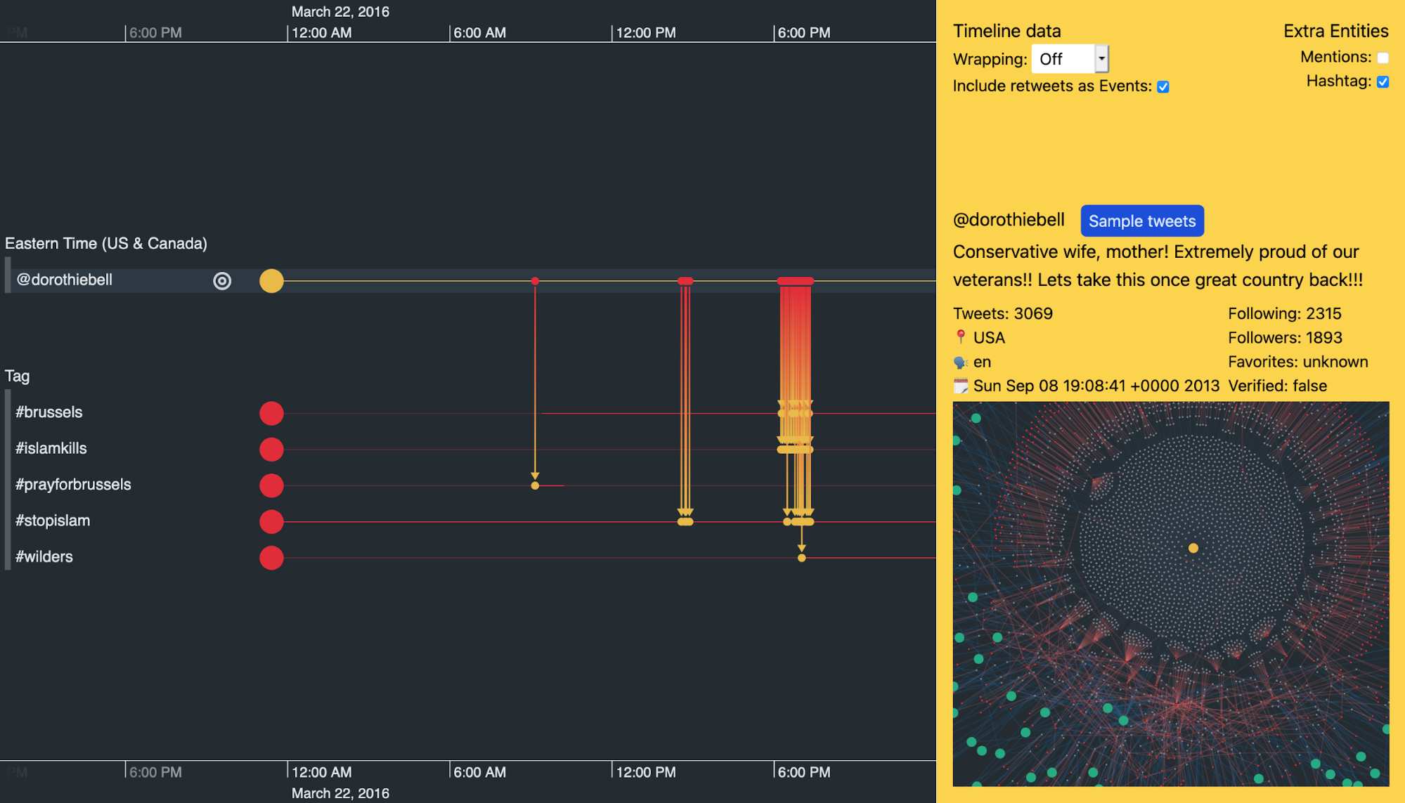
We won’t share them here, but the ‘Sample tweets’ button reveals some of the inflammatory tweets – designed to stir up anti-Islamic hatred – @dorothiebell posted on 22 March 2016 to her 1,893 followers.
Let’s try and understand more about this troll’s patterns of behavior.
Timeline analysis for investigations with scale wrapping
KronoGraph offers an alternative view of time using scale wrapping. This positions events based on part of their timestamp, such as the hour of the day or the day of the week. It means we can spot repeating patterns in the data more easily, making it clearer how activity is distributed over time. This powerful investigative technique is called pattern of life analysis.
Still analyzing @dorothiebell’s account, is there anything about her general activity that may raise suspicion?
Here, I’ve used KronoGraph’s focus control to just show me this entity’s activity, together with other trolls who’ve mentioned her or been mentioned by her. I’ve also switched to ‘hour of day’ scale wrapping to get a better idea of when she’s most active.
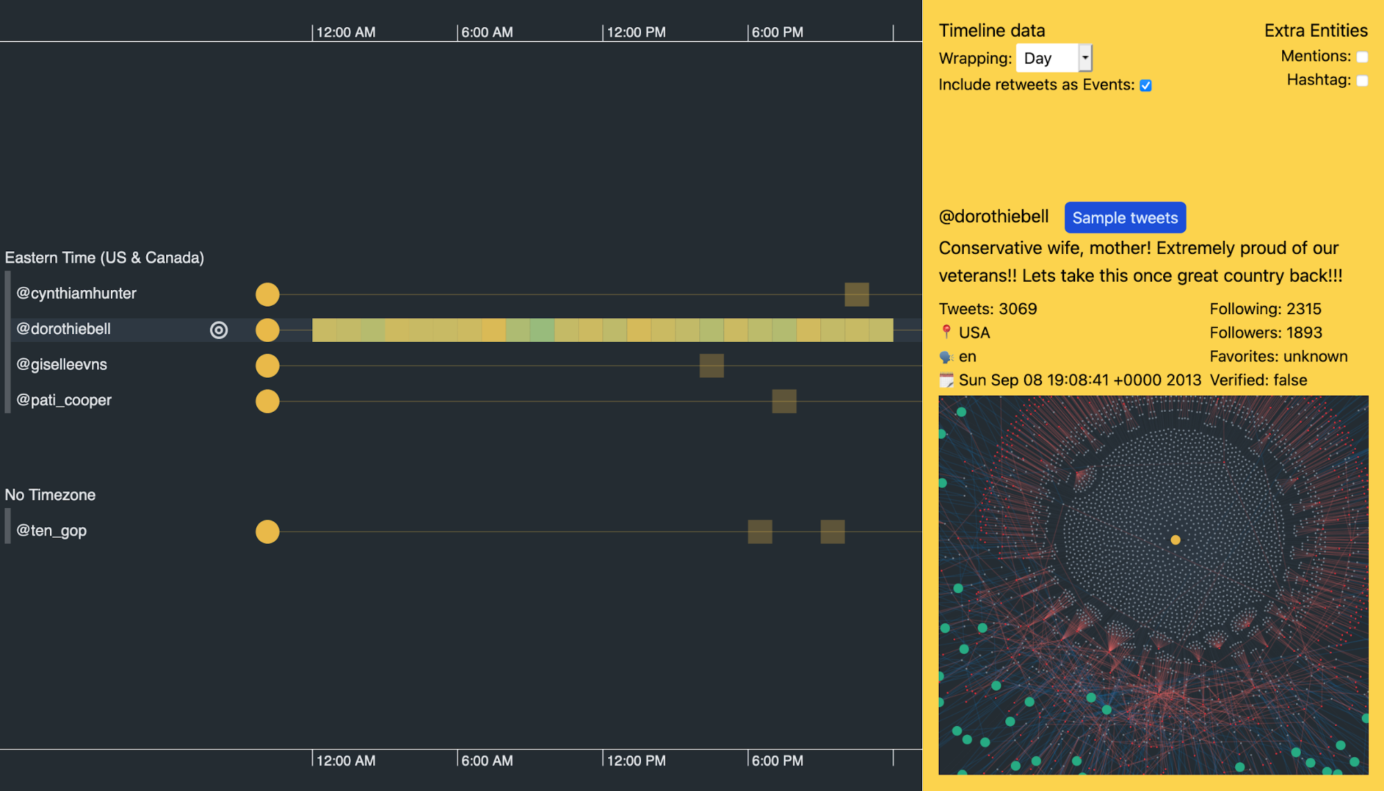
You can see how busy this user is from the heatmap of constant activity. It suggests she never sleeps.
It’s not unusual for organizations such as news outlets to tweet 24 hours a day, but @dorothiebell’s Twitter bio claims she’s a ‘conservative wife, mother’. How many Twitter users matching that profile tweet all day without a break?
This isn’t an isolated example. There are a lot of accounts in our dataset where the users are active 24/7. Suspicious, indeed.
Twitter data visualization pattern of life analysis
Given the right visualization, the human brain is great at spotting patterns in data.
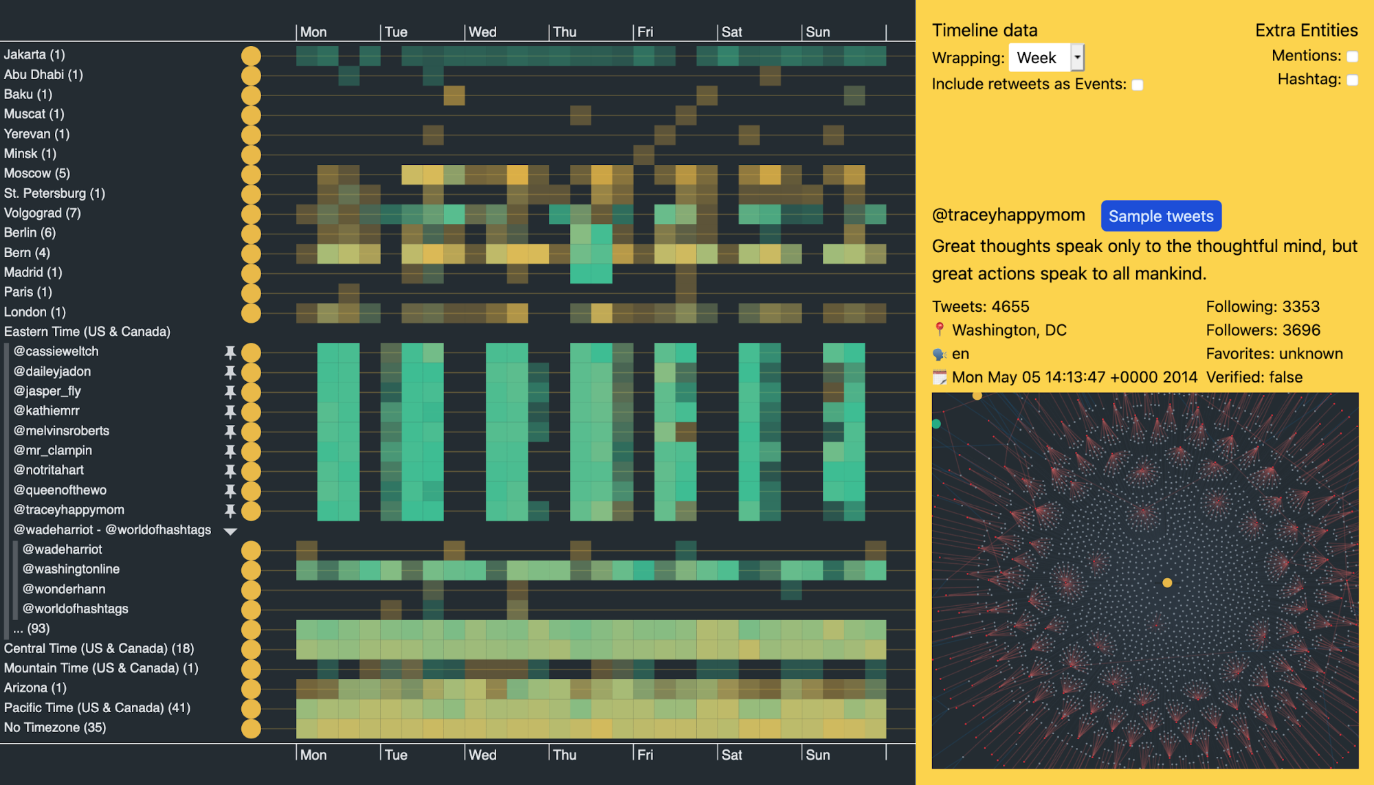
While browsing through users in the Eastern Time group, some of their activity heatmaps really stood out. I’ve used KronoGraph’s ‘pinning’ feature to pin these users in my Twitter data visualization so I can see them next to each other, making pattern comparisons clearer and easier.
It’s quite a revelation.
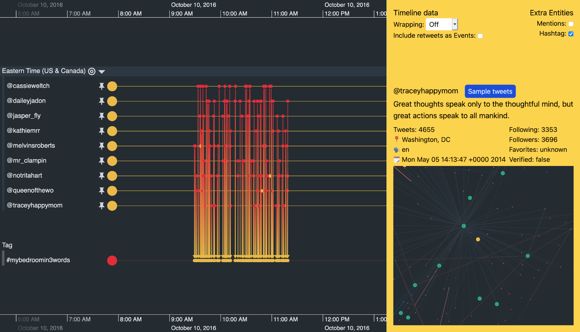
Look at the pinned accounts from @cassieweltch to @traceyhappymom in the center of the visualization. They show a remarkably similar pattern of behavior over two years of total activity.
Investigating this further, I filtered the other trolls from my data and changed the scale wrapping to show activities over a single day. Each timeline event represents one tweet.
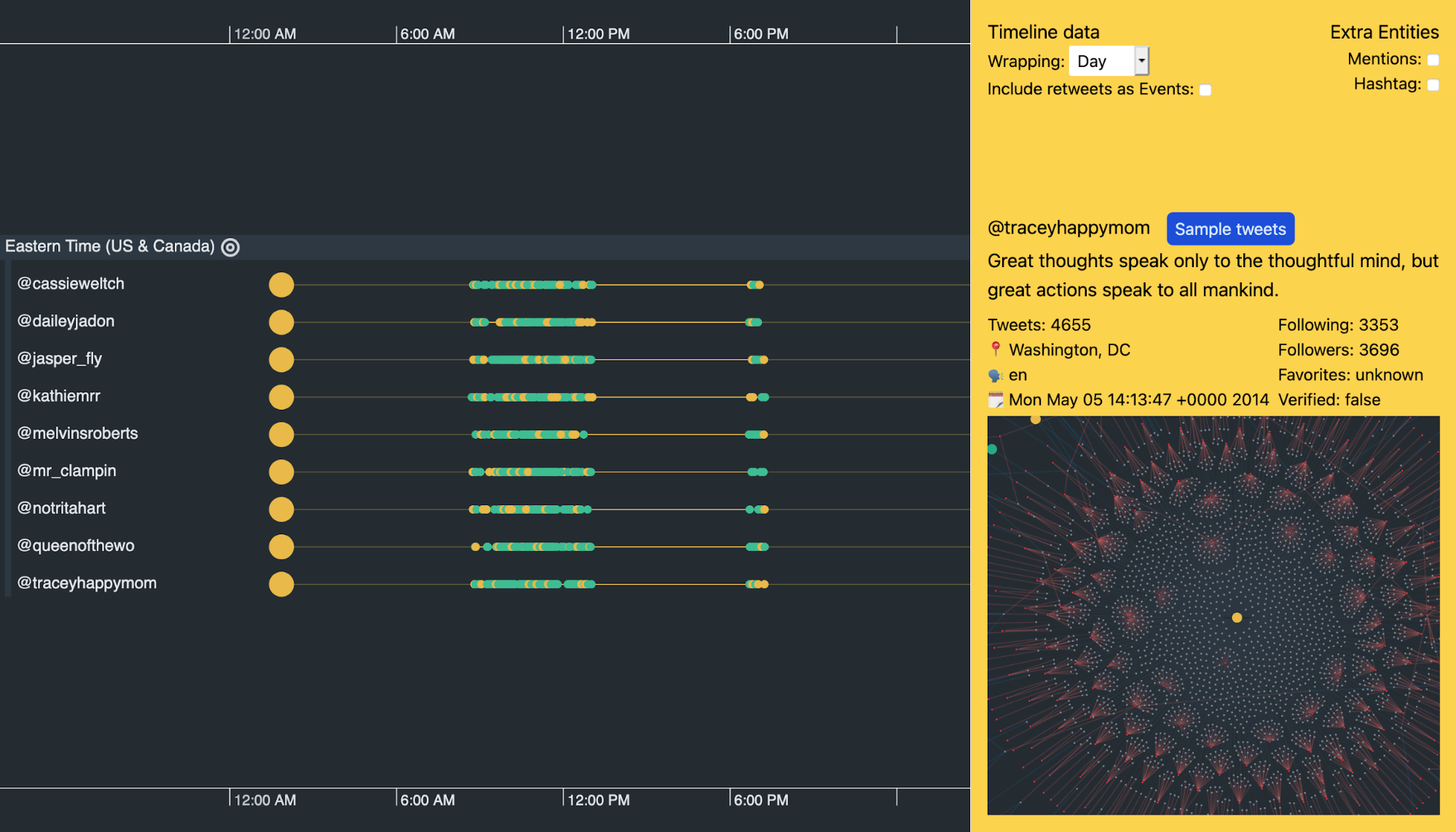
At this level we see a distinct pattern of activity. From 0830 to 1300 UTC the accounts are active, then they stop for a few hours before becoming active again for a short burst at around 1830 UTC.
This is curious enough, but the fact that in the purported time zone (Eastern Time) the activity runs from 0330 to 0800 and restarts at 1330 seems very strange. Just like our @dorothiebell account, there’s nothing in their Twitter handles or descriptions to suggest why they’d keep such irregular hours.
Hashtag usage visualized through time
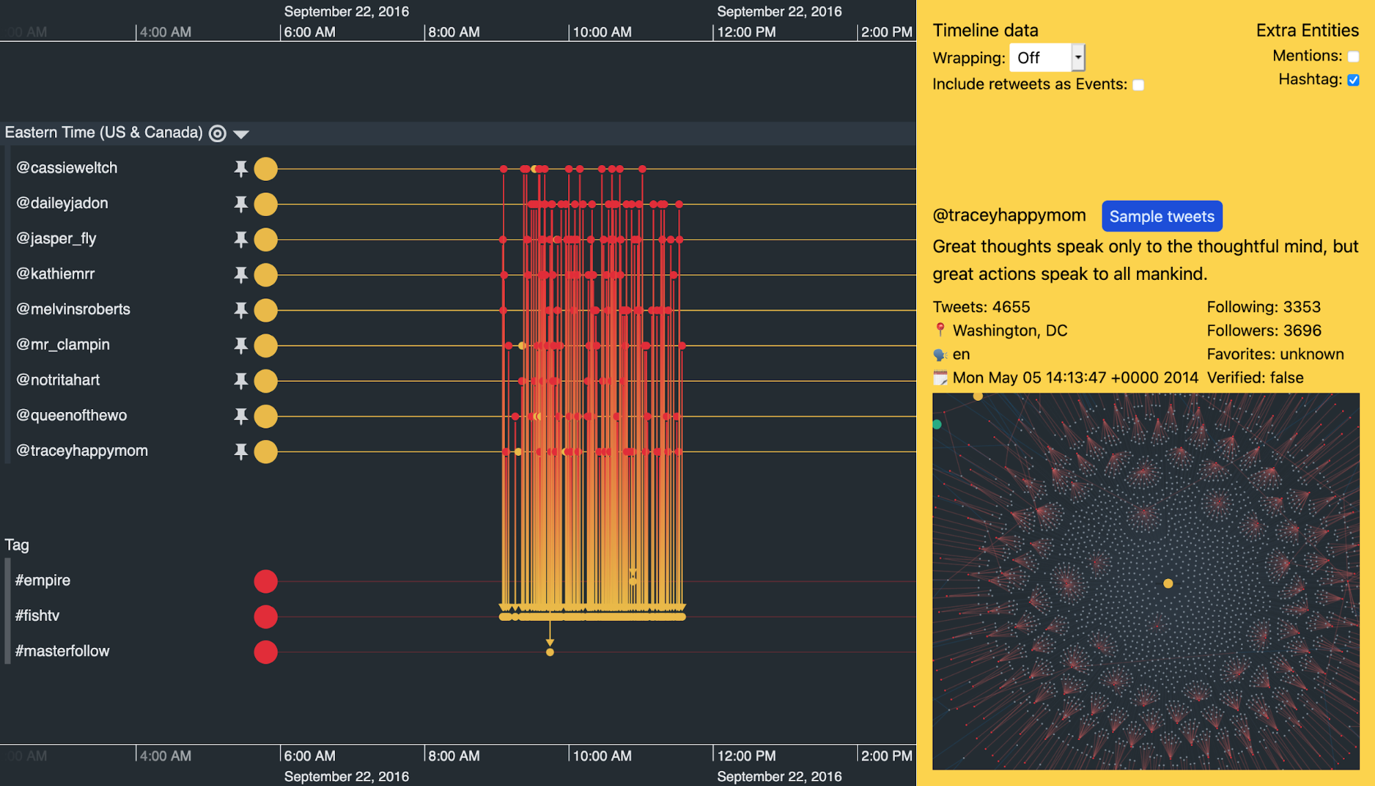
If you still doubt whether these accounts are related to each other, this next example should convince you otherwise.
I’ve turned off scale wrapping to look at the activity around November 8th 2016 – the day of the US presidential election. Not only are our nine suspicious accounts posting at similar times, they’re also using the same hashtags when they post.
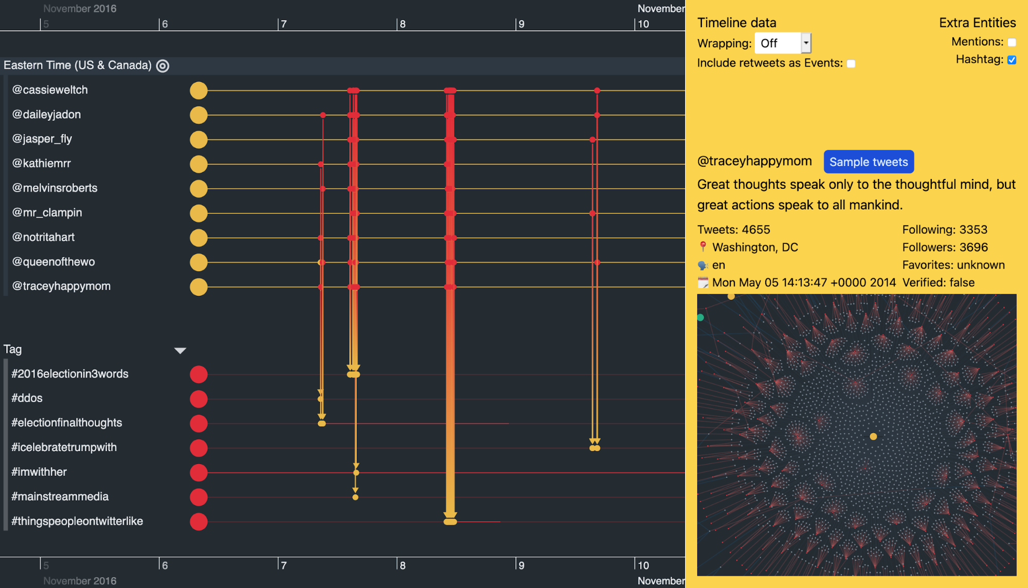
Scrolling along the timeline, we also see remarkably similar activity between these accounts on other days when there aren’t any major political events.
For example, all of the accounts kick into action and use the #mybedroomin3words hashtag multiple times in a two-hour window on October 10th. On September 22nd it was a similar story, but with the hashtag #fishtv.
Build the data visualization your users need
We’ve used KronoGraph and ReGraph to build a Neo4j visualization that brings Twitter data to life. But you can build an integrated timeline and network visualization app that reveals the patterns and behaviors hidden inside almost any kind of dataset.
We’re happy to help you get started.
Share:
