The fraud detection visualization challenge
Fraud management has changed massively in recent years, with the advance of digital technologies and AI creating new opportunities and techniques for fraudsters to commit crime faster, and with more agility.
To detect and investigate it effectively, you need to see connections – between people, accounts, transactions, and dates – and understand complex sequences of events.
That means analyzing a lot of data.
The visualization-AI intelligence cycle
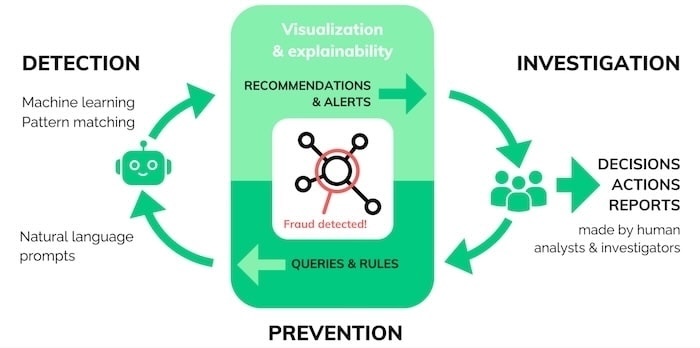
A successful fraud investigation follows the visualization-AI intelligence cycle, combining the different strengths of visual analytics, AI and human reasoning.
Detection: AI software uses machine learning and pattern recognition to make recommendations and raise alerts.
Investigation: Interactive graph visualization presents insights in a way that’s easy for human investigators to navigate, analyze, and gain actionable intelligence.
Prevention: Investigators use what they’ve learned to inform the next set of queries and rules they feed into the system.
As patterns of fraud are detected, analysts can use the new insight to update and improve their automated systems.
Detecting fraud
Fraud detection is an increasingly automated process, as analysts are often looking for familiar patterns of activity. They automatically score each case or transaction, and assign it to a category – often using machine learning to process events.
The increase in scams means a higher volume of alerts fall into the ‘unsure’ category. No matter how advanced automated fraud detection is today, a flagged transaction needs fast analytical expertise from a human investigator. Visual graph and timeline analysis makes that possible.
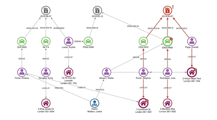
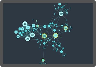
Here’s a visual graph analysis chart showing a vehicle insurance claim that’s been flagged for review. Nodes represent claims, vehicles, people, and addresses. An automatic hierarchy layout makes it easy to spot dependencies.
An unusual connection stands out right away: the witness, Everett Page, shares an address with Walter Stewart, who has a previous claim relating to the same vehicle involved in this incident.
This is enough for the analyst to flag this claim for deeper investigation.
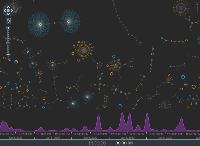
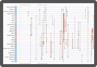
Timeline visualization adds a time dimension, making it easy to understand the sequence in which events unfolded.
This dataset contains a record of credit card transactions. We can easily pick out those which are disputed (in red) and identify the patterns around them.
Fraud management white paper
See how our link analysis and timeline visualization tools help investigators detect, investigate and prevent fraud.
Investigating fraud
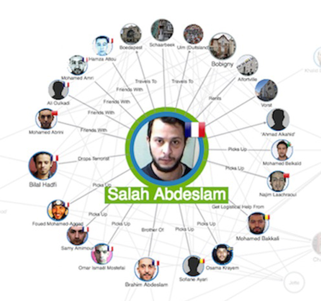
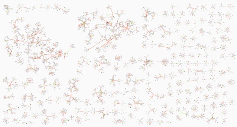
More complex cases, for example those that might involve coordinated fraud rings and organized crime, require more complex human involvement. Here, link analysis and timeline visualizations are investigation tools. They present larger volumes of data for investigators to navigate and turn into actionable intelligence.
Understanding patterns of fraud relies on the analyst’s domain knowledge and investigative skills, which are both enhanced with visual analysis.
This fictional but typical dataset includes links between nodes representing policies, policyholder details, insurance claims, vehicle damage, doctors, witnesses, and mechanics. When you visualize a lot of cases at once, it’s easy to pick out ordinary claims – they’re the Y-shaped structures dotted around the chart – from the more complex, potentially fraudulent claims.
Timeline visualization makes it easy to see how the relationships between traders developed through time.
In this insider trading example, we see Shany Keebler buying shares just before a big profit announcement. Combine that with communications data and unusual patterns start to emerge.
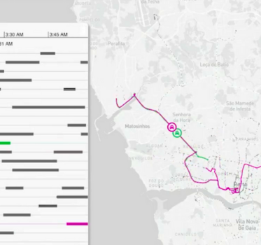
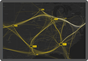
And geospatial visualization adds a powerful new dimension to investigative link analysis, combining graph layouts and adaptive behaviors that handle both geolocated and non-geolocated nodes.
Preventing fraud
The third stage of the visualization-AI intelligence cycle is prevention – where data science teams use new information to train their models. It’s also an opportunity to close loopholes or vulnerabilities in the system.
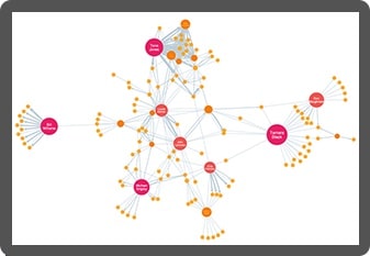
Here, link analysis provides an overview of investigation outputs and operational data from multiple silos.
Armed with a single intuitive view, data scientists can uncover patterns and trends, and recommend model and process changes to prevent future scams.
Customize your fraud detection tool
Organizations worldwide trust our link analysis and timeline visualization technologies to join the dots in their fraud detection and investigation processes. Here’s why they choose us.

See the full picture
Interact with data from across the organization in a single chart. Our products’ flexible approach means you can overcome data silos and gain insight into fraud information from multiple sources, giving you a clearer, more complete picture of events.

Visualization that scales
Our toolkits support fraud analysis at scale. Whether that means you’ve got a large and distributed team, or huge volumes of data to analyze, we’ve designed our products to scale-up to any size organization and operation.

Get answers faster
Discover more intuitive ways to understand your fraud data. Timeline and link analysis tools reveal fraud insight more effectively than other automated or manual processes, leading to faster and better decisions and fewer missed incidences of fraud.

A custom fraud detection tool
Visualization tools, custom designed for your fraud analysts and the data they need to understand, empower anyone to find insight in complex data. The result: insightful and straightforward tools that people want to use.
Want to try it for yourself?
KeyLines
The graph visualization SDK for JavaScript developers
KeyLines is your fast-track to graph visualization success on any tech stack.
ReGraph
Hassle-free graph visualization for React developers
ReGraph for React makes building state-based graph visualizations a breeze.
KronoGraph
Advanced timeline visualizations that scale quickly & easily
Build advanced interactive timeline views, customized for your applications.
MapWeave
Geospatial visualization SDK that uncovers every connection
Build apps that make geospatial connections clear and insightful.