
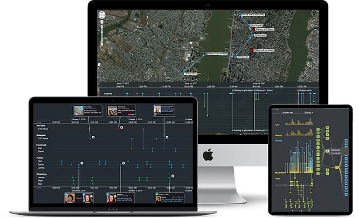
In this blog post, we use examples of suspicious credit card transactions and insider trading detection to demonstrate how timeline visualization is an effective way to fight fraud.
Whether it’s an insurance fraud scam or cryptocurrency money laundering, the discovery of an unusual connection between entities is key to detecting, stopping, and preventing financial crime.
Investigating when connections were made, evolved or broken is key to link analysis. Hundreds of organizations already use our link analysis toolkits to build interactive network visualizations, relying on our powerful time bar feature to filter and summarize time-based data.
But what if investigating the ‘when’ is key to revealing the ‘who’, ‘what’, ‘where’, ‘why’ and ‘how’?
What if you could build a fully-interactive timeline directly from your data, then use other link analysis methods to understand it better?
That’s why we built KronoGraph: our toolkit for timeline visualization.
KronoGraph timelines reveal sequences of events. They show fraud investigators when events unfolded and how they are connected, revealing a clear picture of what took place.
We think it’s a game-changer. Let’s take a look at a couple of examples based on fictional fraud data, some adapted from this Neo4j graphgist.
Investigating suspicious credit card transactions with timeline visualization
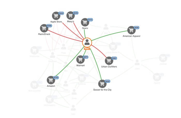
This link analysis chart shows Marc’s credit card transactions over a period of time. We can see where his card was used, and how much was spent. He’s disputing a number of transactions, shown as red links. As a fraud investigator, we’ll probably assume his card was cloned at some point.
To uncover where the card might have been cloned, an investigator needs to see the activity chronologically: which disputed transaction happened first, and where Marc did use his card before that first transaction?
That’s the insight a timeline visualization provides. Here’s an overview of Marc’s transactions, visualized as a timeline:
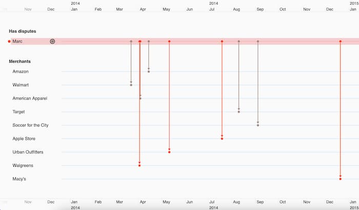
Along the top and bottom, a scale shows the timeframe of the activity we’re investigating. The entities in our data – cardholders and merchants – are on the left-hand side. The events connecting those entities represent transactions, shown in grey or red depending on whether or not they were disputed.
With this view, we can quickly spot that the first disputed transaction was at Walgreens. We’ll pin that to our timeline, making it easier to track as we add more data:
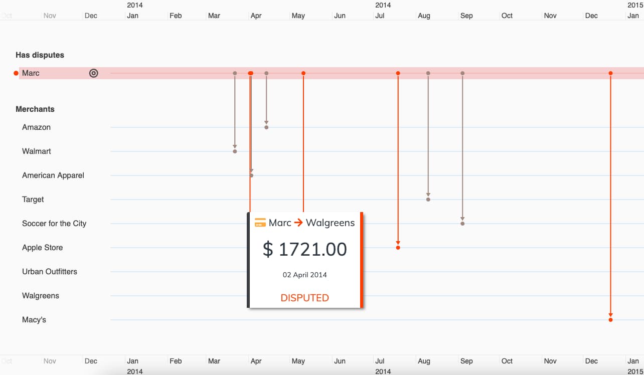
We can now dig deeper, revealing the events taking place before the disputed transaction. Let’s add more people and their transactions:
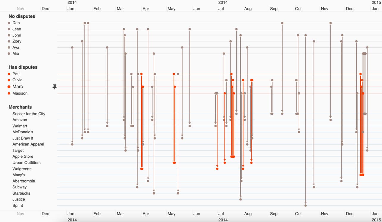
To focus on the most interesting bit of the data, we’ll filter to show only the cardholders with disputed transactions:
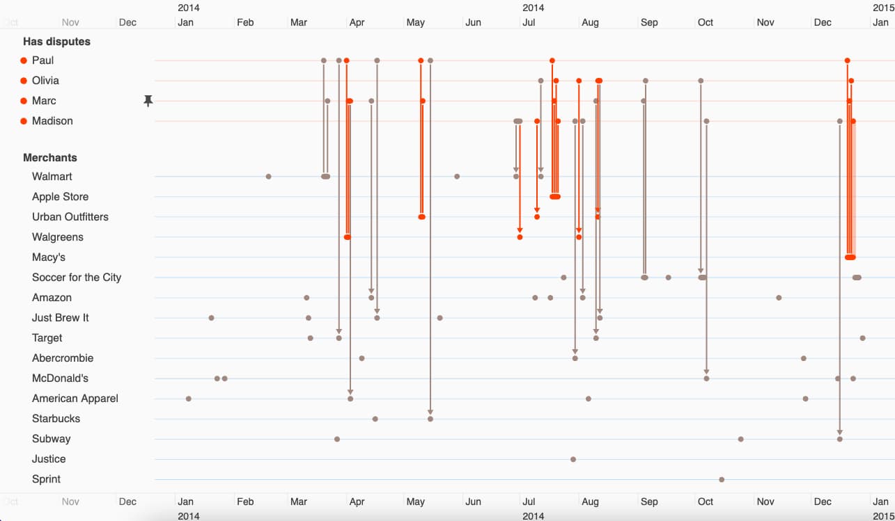
Finally, let’s zoom in again on Marc’s first disputed transaction at Walgreens. We immediately spot Paul – another cardholder with a strikingly similar payment history:
Both have high-value disputed transactions at Walgreens at around the same time. They also both visited a Walmart store a week or two before their first disputed transactions. Were their cards cloned at Walmart?
This simple example shows how KronoGraph sheds a completely fresh perspective on connected fraud data, revealing patterns in time that would otherwise be impossible to unravel.
Let’s take a look at a more complex investigation.
Timeline visualization for insider trading detection
Insider trading is a tough crime to prosecute. Investigators need to show that someone had insider information, and traded shares before that information was made public.
They need to prove a sequence of events – a perfect use case for timeline visualization!
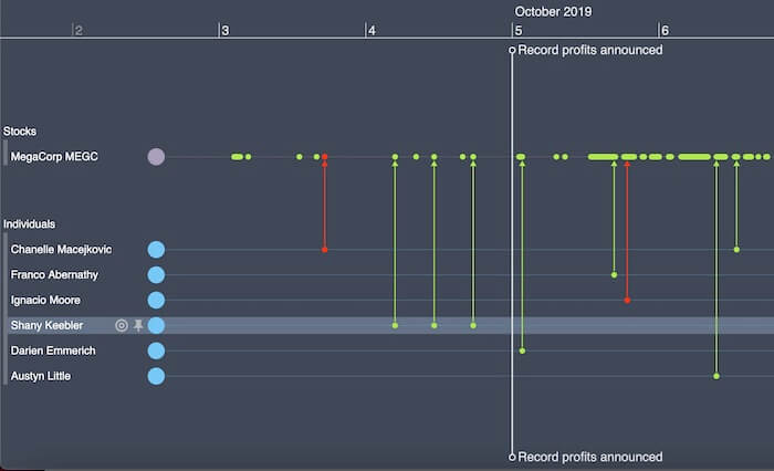
Here we’re looking at institutions trading shares in MegaCorp MEGC. We’ve added two markers showing profit-related news stories:
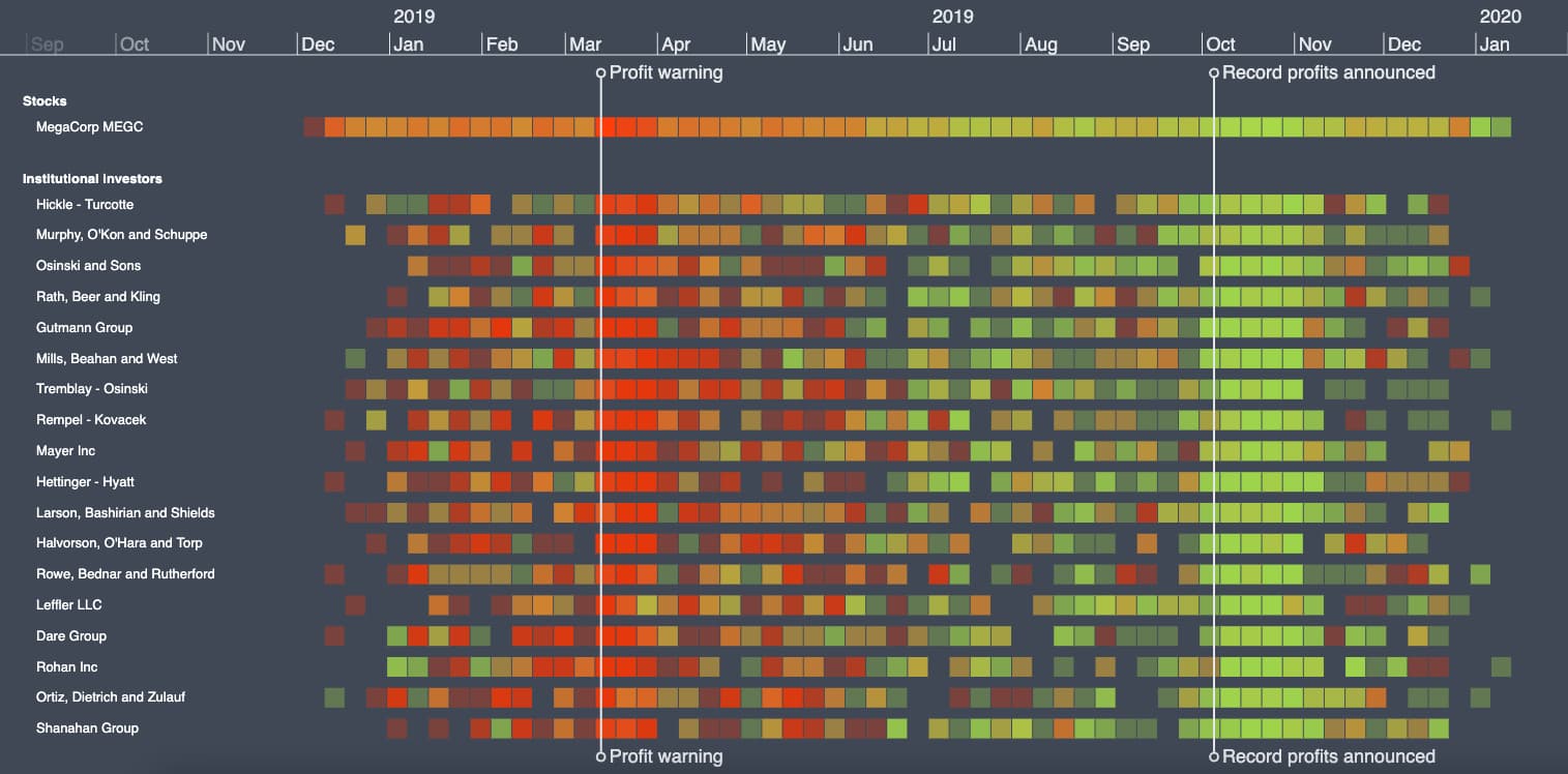
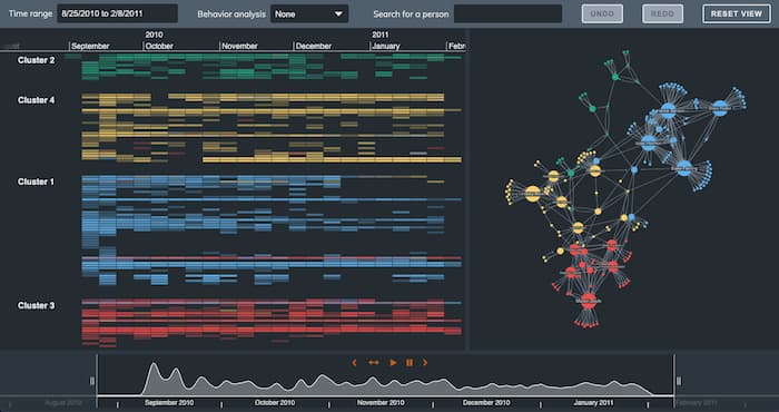
KronoGraph aggregates hundreds of thousands of transactions into a neat heatmap. We see investors dumping shares around the March profit warning, and buying them again after a record profit announcement in October.
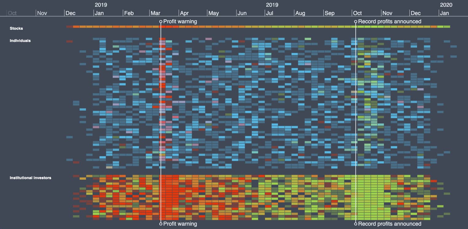
As we zoom in, the heatmap transitions smoothly to a more detailed weekly, then daily view. KronoGraph automatically handles how best to represent and display the data based on the amount of time we’re looking at. At the lowest level, we see specific trades made by different investors:
Adding individual investors to the chart, we end up with more entities than KronoGraph can usefully present on one screen. KronoGraph intelligently aggregates the data into manageable groups:
Let’s zoom into the October profit announcement to see the activity happening just before the news was made public.
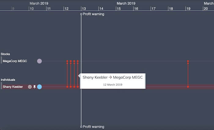
It looks like Shany Keebler was buying shares before the rest of the market:
We’ll pin Shany to make her the focus. Zooming out, we see she made some well-timed share sales just before the profit warning in March too:
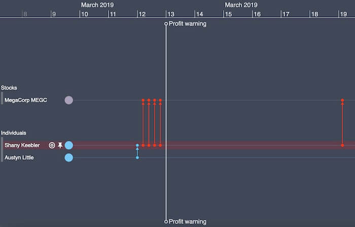
There’s nothing wrong with being a smart trader. What a fraud investigator needs to show is whether they had access to non-public information. Let’s extend our insider trading detection by overlaying court-requisitioned communications data to see who Shany was speaking to around the time she made those trades.
It looks like she had a phone call with her colleague, Austyn Little, just before selling her shares:
The same thing happened in October, too. Coincidence? Or could it be that these people are sharing information with each other?
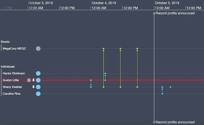
That’s a great potential lead for a fraud investigator. Time to speak to Shany and Austyn, to see what they knew.
By overlaying multiple datasets into one timeline, we get a full picture of all the events that took place, in a format that’s easy to explore, filter and understand. If we wanted to, we could also combine our timeline with a link analysis chart.
Both KeyLines for JavaScript developers and ReGraph for React developers, our link analysis toolkits, integrate seamlessly with KronoGraph. The result is a uniquely powerful data visualization tool to drive your fraud investigations.
Visualize your own fraud data
To see the power of our data visualization toolkits, you need to combine them with your own real-world data. Want to get started with smarter fraud investigations?
Share:
