The AI and data visualization challenge
As technology advances, machines are getting better at processing data, identifying patterns, implementing rules and generating recommendations to help investigations.
But we can’t trust them with business-critical decisions. Human analysts need interactive graph visualization to decipher and understand AI-generated insights, share their findings with others and plan an appropriate course of action.

For many years, businesses have been harnessing the power of AI with graph analytics to uncover insights in their connected data.
There are countless use cases, so let’s focus on the top three: anti-fraud, cybersecurity and forensic intelligence.
Visualizing AI-driven fraud insights
Anti-fraud teams are responding to surging fraud volumes by exploring data visualization and AI as fraud detection tools. It’s an effective combination for visualizing fast-paced and complex events such as blockchain transactions.
This graph visualization shows Bitcoin transactions during a period of six minutes. Transactions, inputs and outputs are represented by nodes, with links representing involvement in a transaction.
The user can interact with the time bar to explore bitcoin transactions, homing in on indicators of crypto money laundering identified by an AI tool.
Learn more in our fraud white paper
See how our fraud link analysis and timeline visualization tools help investigators detect, investigate and prevent fraud.
Detecting and visualizing cyber attack patterns
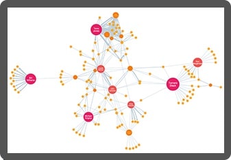
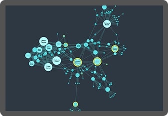
Interactive graph visualization present AI-driven insights to investigators in a way that makes it easy for them to navigate and analyze, turning it into actionable intelligence.
Machine learning excels at identifying specific behaviors, particularly known risks and threats – like fraud or cyber attack patterns that the analyst has seen before. It’s also a powerful tool for detecting new types of criminal activity.
You can combine data visualization with AI-generated alerts to get a level of speed, precision, relevance and explainability that a simple AI assistant can’t match.
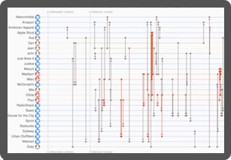
For instance, you could use a timeline visualization to interpret an alert triggered by an abnormal sequence of login activities:
Learn more in our graph visualization and AI white paper
Find out how successful businesses work with the latest graph visualization and AI technologies to make fast, business-critical decisions.
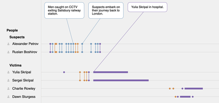
Bringing a forensic investigation to life
Analysts need to share their discoveries with decision-makers who may lack the time, expertise, or experience needed to grasp the entire investigation. Visualizations unveil the story within a dataset, equipping us with the necessary information to make important decisions or adjust our course of action.
We can use natural language generation (NLG) to highlight these narratives.
But whether narratives are machine-generated or added by users, they’re pivotal in making AI-generated insights make sense to a wider audience.
Read more about data visualization and artificial intelligence in investigations
Custom data visualization for AI-driven insight
Organizations worldwide are powering their intelligence cycles with a combination of artificial intelligence and our graph visualization technologies. Here’s why they choose us.

Understand AI-driven insights
Interactive data visualization makes it easy for human analysts to interpret AI-driven recommendations, investigate their accuracy, explain them to others, and make business-critical decisions.

Validate black-box recommendations
Many organizations use visualization to validate and understand the recommendations made by AI. Visualizing inputs and outputs makes blackbox systems more reliable, transparent and explainable.

Make faster, smarter decisions
AI tools are great at spotting or even predicting risk and threat. Data visualization gives analysts a rapid understanding of the context behind an alert, allowing them to make informed decisions on the next steps to take.

Build trust in your AI tool
Data visualization builds user confidence in your application by making complex AI processes transparent and easy to understand. It gives them an appreciation of the AI’s value and credibility.


