Google dove deeper into the world of graphs last week with their release of Cayley, a new open source graph database.
For those of us who can’t get enough of graphs (and graph databases), this is an exciting development.
Google have been strong advocates of the power of graphs for some time, but the release of a new database technology backed by the Internet giant can only further increase the visibility of this emerging field.
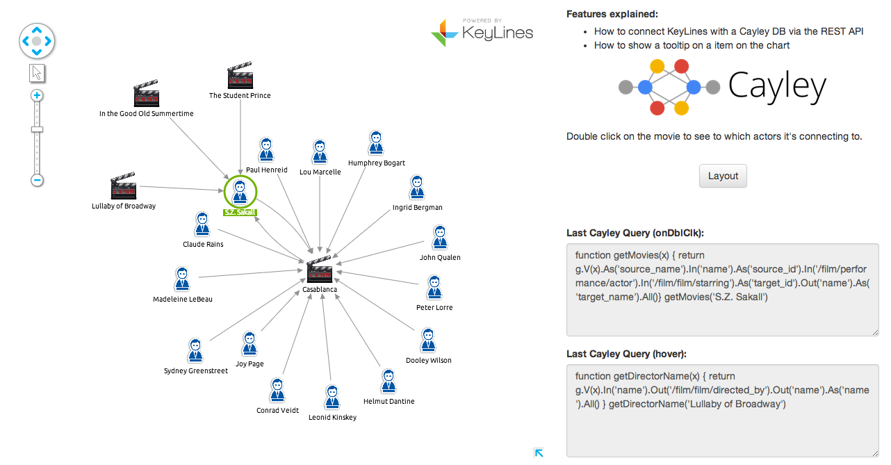
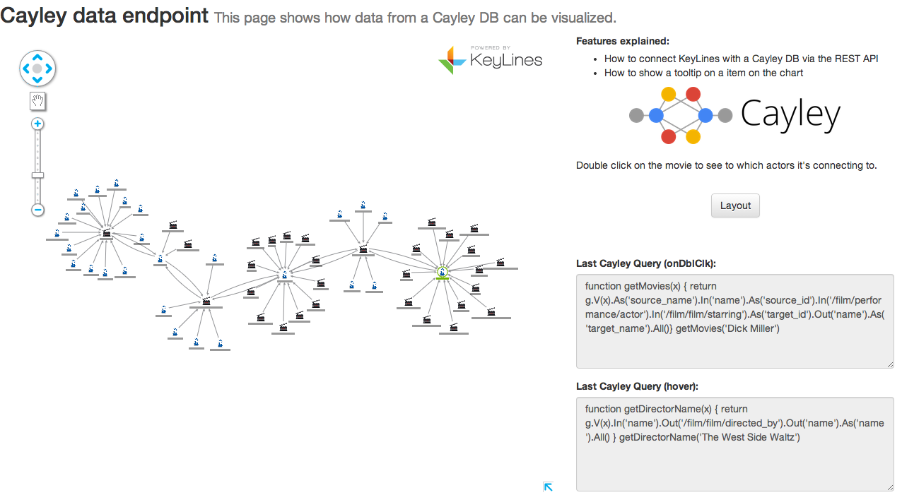
But how can we visualize Cayley? The Cayley database already has a visualization component, but it has limited functionality at the moment.
We thought we’d set our new Software Development Intern, Romain, the challenge of building a better Cayley visualization app with KeyLines (on day two of his internship!). Just a day later, he came back with a fully functioning Cayley visualization application. Here’s how he did it.
An introduction to Cayley
Cayley is a graph database. This means it’s specifically optimized to hold connected, network data. Instead of data being held as a series of tables, it’s stored in a graph model with index-free adjacency.
For network visualization tools like KeyLines, it’s a perfect fit. Users can expect high performance, lower latency and aren’t held back by the restrictions of a fixed schema.
A few more Cayley characteristics include:
- It’s written in Go – meaning it has awesome performance
- It has a RESTful API
- It’s uses a Gremlin-inspired query language
- It works with multiple backend stores, like LevelDB or MongoDB
The KeyLines / Cayley architecture
The architecture for a KeyLines application based on Cayley is pretty simple:
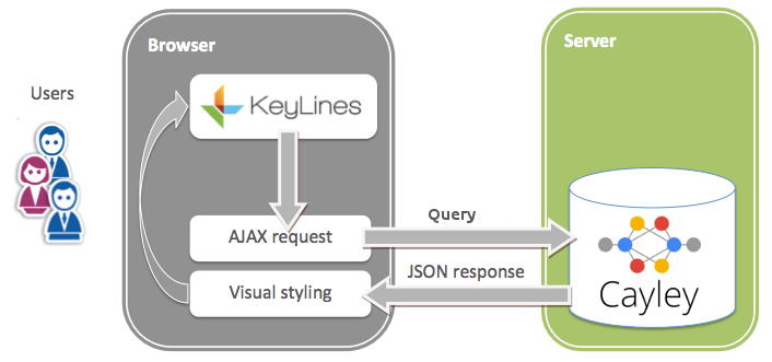
- Users interact with their KeyLines chart in a web browser
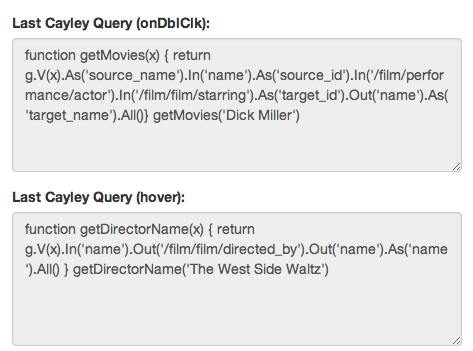
- If an interaction, e.g. click, right-click, hover, etc., requires new data to be added to the chart, a database query is raised. This is generated by KeyLines in the form of an AJAX request
- The AJAX request parsed to a Cayley query, which is sent to the Cayley database
- Cayley returns the data as a JSON object which is sent back to KeyLines
- KeyLines renders the data in the browser, using the HTML5 Canvas element or a WebGL renderer.
How to visualize the Cayley Graph Database with KeyLines
Step 1: Install Cayley
This is really straightforward. There’s step-by-step instructions that we found quick and easy to follow:
Step 2: Install KeyLines
Download the KeyLines files from the SDK site (contact us for access) then install them on your web server.
Create a simple HTML page with references to the KeyLines files and the KeyLines component in a <div>. Again, step-by-step instructions for doing this are available in the KeyLines SDK.
To give some idea of how it works, here’s a simple KeyLines “hello world”:
<!DOCTYPE html>
<html>
  <head>
    <!-- Load the KeyLines file -->
    <script src="keylines.js" type="text/javascript"></script>
  </head>
  <body>
    <!-- This is the HTML element that will be used to render the KeyLines component -->
    <div id="chartID" style="width: 400px; height: 300px;" ></div>

    <!-- This is the actual code to load KeyLines in the page -->
    <script>
      let chart;            // This will store a reference to our KeyLines chart object

      async function startKeyLines() {
        KeyLines.promisify();
        // Store a reference to the KeyLines chart object
        chart = await KeyLines.createChart('chartID');

        const items = [];
        // Use our helper functions to add the node and link definitions
        items.push(addNode('id1', 'Hello','#B9121B'));
        items.push(addNode('id2', 'World','#B9121B'));
        items.push(addLink('id1', 'id2', '', '#4C1B1B', false));

        // Load the chart with the newly defined nodes and links
        chart.load({
          type: 'LinkChart',
          items
        });
      }

      // Helper function to add a new node definition to our chart items array
      function addNode(nodeId, nodeTitle, colour) {
        return {c: colour, id: nodeId, t: nodeTitle, type: 'node', x: 100, y: 100};
      }

      // Helper function to add a new link definition to our chart items array
      function addLink(nodeId1, nodeId2, linkTitle, colour, directional) {
        return {a2: directional, c: colour, id: `${nodeId1}-${nodeId2}`, id1: nodeId1, id2: nodeId2, t: linkTitle, type: 'link'};
      }

      window.onload = startKeyLines;
    </script>
  </body>
</html>
Step 3: Call Cayley from KeyLines
Now we have our Cayley instance and KeyLines component running, we just need to call the data:
async function callCayleyAPI(query) {
  const resp = await fetch(cayleyPath, { method: 'POST', body: query });
  const json = await resp.json()
  return translateItemsToKeyLines(json);
}

function translateItemsToKeyLines(list) {
  const nodes = list.map(item => createNode(item));
  const links = list.map(item => createLink(item));
  return [...nodes, ...links];
}
Step 4: Style your data
Now we have the data in KeyLines, we need to add some functionality to help users make sense of it.
First of all, double-click a node to expand its connections:
// Bind chart events once the chart is created
chart.on('double-click', expandClickedData);

async function loadItems(items) {
 // Load and layout nicely new items
 await chart.expand(items, {fit: true, animate: true, tidy: true});
}

async function expandClickedData({id}) {
 if (id) {
   const item = chart.getItem(id);
   const query = … // prepare your query here

   // collect nodes from the REST API
   const items = callCayleyAPI(query);
   await loadItems(items)
 }
}
… Add an automated structural layout to show the structures in our data:
// bind UI events once the chart is created
document.getElementById('layoutButton').addEventListener('click', layout);

async function layout() {
    await chart.layout('organic');
}
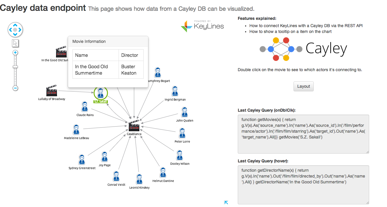
…A popover menu on hover (using Mustache):
// Bind chart events once the chart is created
chart.on('hover', popover);

function popover({id}) {
  if (id) {
    const tooltip = document.getElementById('tooltip');
    const item = chart.getItem(id);
    const {x, y} = chart.viewCoordinates(item.x, item.y);

    if (item.type === 'node') {
      // Create the HTML code that is going to fill the tooltip
      const html = Mustache.to_html(document.getElementById('tt_html').innerHtml, {
        name: item.d.name,
        director: item.d.director
      });
      // Add it to the DOM
      document.getElementById('tooltip-container').innerHtml = html;
      const top = y - tooltip.height() / 2;
      tooltip.style.left = x;
      tooltip.stle.top = top;
    }
  }
}
And we’re done!
In under a day, Romain was able to install Cayley, get started with the KeyLines toolkit and build an entire functioning application. It looks nice too.
Want to try it for yourself?
Request a free trial of the KeyLines SDK to get started building your own application for visualizing the Google Cayley Graph Database: