FREE: Start your KeyLines trial today
Visualize your data! Request full access to our KeyLines SDK, demos and live-coding playground.
This post was published some time ago.
It’s still useful, but it’s worth checking out MapWeave, our geospatial visualization SDK for a more up-to-date solution.
Our customers love the ability to visualize the geographic locations in their geospatial graph data.
KeyLines’ geospatial layout is a stylish, simple yet effective way to visualize both the locational and the connective aspects of their data.
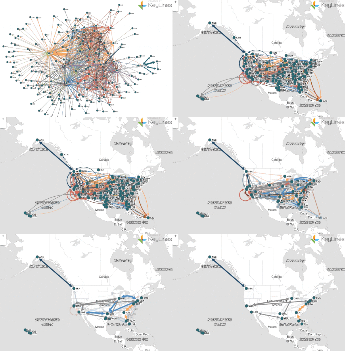
Instead of positioning nodes in a layout by their X and Y properties, they can be positioned on top of a map by their latitude and longitude, complete with links.
It works just like any other map, with pan and zoom. Users can also transition from a geospatial view to a network view with the click of a button, and incorporate other KeyLines functionality like time bar or filtering:

KeyLines uses an integration of Leaflet, a popular open source JavaScript library for mapping.
Adding support for maps in your existing applications is easy.
All you need is to include the Leaflet JavaScript library (available via the Download page in the SDK) on your webpage and provide the longitude and latitude positions for each node, e.g.
var chart = {
 type: 'LinkChart',
 items: [
   {
     id: 'node1', t: 'label', type: 'node', u: 'person.png', x: 100, y: 150,
     pos: {
       lat: 52.2022,    // Must be in range -90 to 90
       lng: 0.1282      // Must be in range -180 to 180
     }
   }
 ]
};
Now you can easily switch between the existing graph layout and the map.
One of the big attractions of Leaflet is its ability to display map tiles from any 3rd party collection. These tiles are what give the map its look, it can range anywhere from a simple overview of countries, towns, and cities to satellite imagery.
By default it is already set up to provide all the functionality you need but if you want to customize it, all you have to do is pass in the new map style settings into KeyLines and it will do the rest.

Heres an example of how to use tiles from OpenTopoMap.org:
chart.map().options({
     tiles:{
          url:'http://{s}.tile.opentopomap.org/{z}/{x}/{y}.png',
	  maxZoom: 16,
	  attribution: 'Map data: ©
	       OpenStreetMap,
	       SRTM | Map style: ©
	       OpenTopoMap
	       (CC-BY-SA)'
     }
});
It’s that simple!
Are you intrigued to find the patterns in your geospatial graph data? Register for a free trial!