In 2026, the barriers to bringing a product concept to life have never been lower. As product managers or founders, we can use LLMs to turn our wildest ideas into working prototypes in hours, giving us something tangible and real to put in front of potential customers before we’ve committed to building anything.
For some time now at Cambridge Intelligence we’ve been on a journey to ensure that our products fit into this new AI-enabled prototyping world. We’ve re-thought our documentation strategy so it can be better parsed by machines. We’ve built MCP servers, and started to learn how to interpret their usage patterns so that we can make them better from one iteration to the next.
We’ve developed methodologies to test the effectiveness of LLM-generated code, so we can be quantitative rather than qualitative about their performance. And we’ve developed design templates for tools like Figma so that the art of the possible in graph and timeline visualisation can be included as design context for early stage mockups.
But these tools can only take us so far.
Why? Because we’re in the business of building visual data interfaces – windows into the world of the complex and interconnected. We’re providing a means for human users to explore data without knowing precisely what they are looking for. And we’re the means by which machines will explain complex ideas to an audience who can never hope to be experts in everything they’re looking at.
Ultimately, we’re building user experiences. And good UX is incredibly hard to validate. It’s normally done through subjective user testing, anecdotal evidence, and conversational clues, all put together by a UX expert who’s skilled at their job.
Can a vibe-coding PM or founder hope to achieve equivalent success? It’s certainly getting easier – but it’s still a highly human process. Let’s explore why.
A vibe coding case study
To illustrate the concepts, I spent around 4-5 hours vibe coding a data visualization app that takes a file of social media photos, parses their metadata (location, timestamp and people tags), and generates geospatial visualisations of those people, their relationships, and their typical pattern of life.
For this experiment, I used:
- VSCode with GitHub Copilot in Agent mode (Claude Sonnet 4.5 as the LLM)
- Vite for build and deployment
- Mapbox and MapWeave for the geospatial visualizations
- The MapWeave MCP server for deep documentation context
Anatomy of the prompts
It took me 110 individual prompts to get a result I was happy with, and I resisted the temptation to make any direct changes to the code – everything in the final app was generated through the code assistant. When I finished, I classified each prompt as planning, UI specification, bug fixes, or data visualization design:
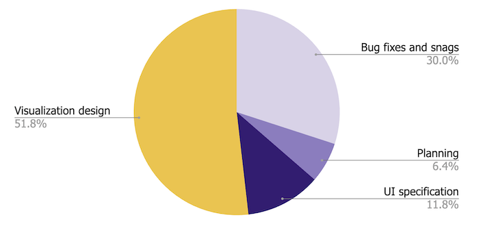
It’s probably not surprising that I spent most of my time on the data visualization – after all, that was the whole point. But let’s break down what that design actually involved.
The data visualisation UX loop
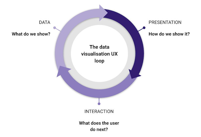
There’s an easy mistake to make when building data visualization apps: assuming the data model in your backend has to match the way it’s shown in the UI. It doesn’t.
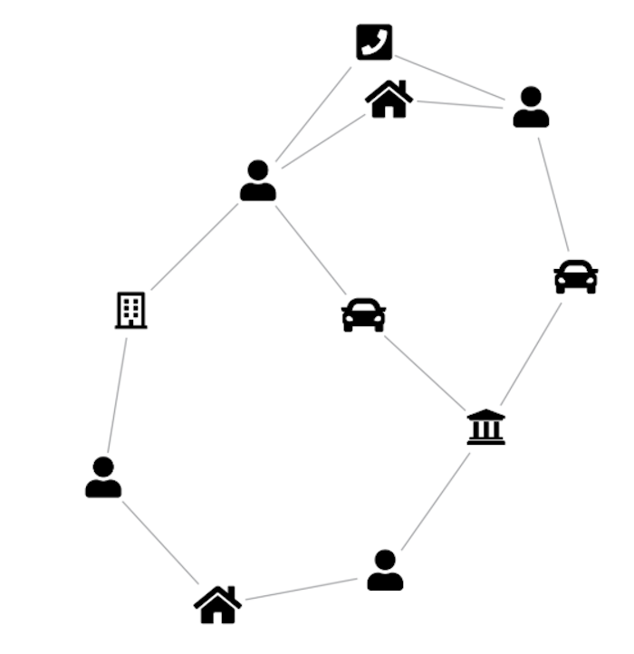
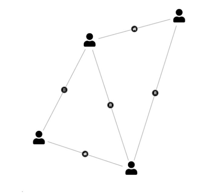
Consider a graph data store capturing relationships between people, locations, companies and vehicles. The obvious visual model is a direct representation of the graph. But if the goal is to identify people of interest, it might make much more sense to model the data differently – connecting people to each other when they share a location, vehicle, or office, and showing the nature of those connections with badges on the links.
AI code assistants are really good at transforming data, so don’t let your raw data model stop you from experimenting. Around 30% of my 57 visualization design prompts were exactly this kind of visual experiment.
The second interesting part of the UX loop is interaction design – what does the user do next? This is why it’s a cycle – when the user does something, you need to decide how that translates into a new data query, which in turn requires new decisions about the visual model. It might not be the same one you used before!
A good example: in a cyber security risk prototype, the user is presented with an organically laid out graph of the most important nodes in a complex dependency diagram. When they click a node, several things happen at once – the graph filters to show only directly connected nodes, the layout changes to a sequential dependency view, and the nodes themselves change shape and take on richer content. One interaction, three simultaneous design decisions.
This is where vibe coding gets fun, but also requires some very human qualities. Perseverance – not being afraid to throw away a visual model and start again. (AI agents don’t get frustrated with changes of mind like human developers do, so do your worst!) And empathy – putting yourself in the shoes of a user, understanding what they see at each stage, what they’re likely to do next, and what they’d expect to happen when they do.
Back to the experiment
Here are two verbatim examples of visual model prompts from my experiment:
“When the data is being loaded, scan it for identical locations. Photos with identical or similar locations should get replaced with a single multi-photo node. When the user hovers one of these nodes, the tooltip should display a count – so instead of showing the filename, it should just say ‘4 photos’”
“In the word cloud layer, add a new kind of link between people nodes: two people should be linked together if they are both tagged in at least one photo together. Let’s call them ‘friendship’ links.”
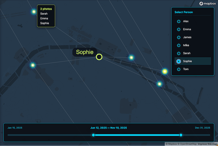
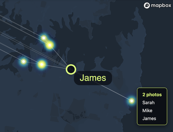
Below you can see the results. Here’s a network of photos linked to the people tagged in them – hover over a photo and you get a list of everyone tagged:
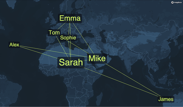
And here’s a ‘geospatial word cloud’, where two people are connected if they are tagged in at least one photo together, arranged so that people appear closest to the locations where most of their photos were taken:
Both visualisations turned out to be useful and insightful, so I left them as options for the user to choose between.
The long tail of styling
Visual model prompts weren’t the biggest drain on my time, though. The bigger share went to styling changes – simpler, more precise change requests, but high in number and requiring many iterations before I was happy.
It’s not that the AI agent was failing to do what I asked. It’s that there was a visual feedback loop I needed to be part of: looking at the outputs, critiquing them, and trying new things. A natural language UI is probably not the best way to iterate on styling. Tools like UX Pilot are trying to bridge the gap between precise design tools and text prompts, and it’s a space we’re watching with interest.
Perhaps even that’s shortsighted – LLMs are getting better at image inputs, and maybe soon we’ll simply say “look at this visualization, read Tufte, and make it more readable.” But I’m not convinced the human is leaving the design loop any time soon. By improving interoperability between design tools, coding environments, visualization libraries and LLMs, we’ll be able to shorten those loops – and it will become easier than ever to bake great UX into a concept from the outset.Where next?
Vibe coding has fundamentally changed what’s possible at the prototyping stage. What once required a full engineering team can now be explored by a single Product Manager in hours, not days. But the crux of great data visualization – deciding what to show, how to show it, and what should happen next when the user interacts with it – is where the hard work happens, and I don’t think there are many shortcuts here.
The tools will keep improving, and the loops will keep shortening. But standing in a user’s shoes with the empathy to ask “what does this person actually need to understand?” is always going to be a necessary, human part of the process.
Sign up to our newsletter to receive regular updates on all aspects of data visualization and design. If you want to vibe code something like I did, you can start a free trial of the SDKs.


