Introducing KronoGraph: a timeline analysis tool that drives investigations
KronoGraph is the first toolkit for building a chronological timeline for criminal and fraud investigations.
Join us on this webinar for a quick tour of the KronoGraph SDK. We’ll see how it works, how it untangles complex time data at scale, and why it should be a key part of your investigation toolset.
Want to try it for yourself?
KronoGraph Webinar Transcript
Prefer a written version? We’ve transcribed the webinar for you, and removed references to the EAP – KronoGraph is now generally available under license


This is a very exciting time for us at Cambridge Intelligence as we’re introducing a brand new product called KronoGraph for visualizing a chronological timeline.
We’re going to spend 30 minutes showing you a little bit about how it works and what sorts of use cases KronoGraph can be used to visualize.
So just as a way of introduction, this webinar is going to be hosted by me (pictured right) and Dan (pictured far right). So I’m Corey Lanum. I’ve been doing graph things for about two decades now, building solutions with traditional graph visualization timeline visualization, and a whole bunch of other different techniques. And I wrote a book in 2016 about graph visualization and how graph visualization can help improve projects at a practical level.
The meat of the presentation is going to be shown by Dan Williams. He is our Head of Product Management, and has helped build KronoGraph as well as Cambridge Intelligence’s other graph tools that you may already know.
So, this is our agenda. I’m going to go through:
- what a chronological timeline is
- why it’s useful under certain circumstances
- why it’s helpful to be a different view of graph data than your traditional link chart that you may already be familiar with.
Then I’m going to pass over to Dan, who’s going to show you some examples of using KronoGraph, which is a new visualization for looking at timelines. And then we’ll answer some questions.
Want to know more about KronoGraph?
Why visualize a chronological timeline?
So what we’re looking at here is a simple table.
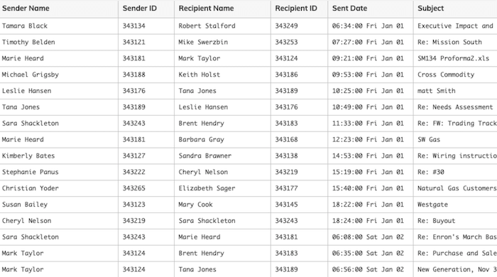
And it’s just a table of communications. Something you’re probably very familiar with. Each row in the table has a sender and a recipient, and various other things about the communication. In this case, it’s emails, so a subject line, the actual body of the email, and so on. And that can be visualized in a number of different ways.
So in a traditional node-link chart, you may want to look at who’s communicating with whom, and the pattern associated with those. But what we’ve discovered after having done traditional graph visualization for a number of years, is that a lot of data that is rendered in a graph format also has what you’ll see in the second to the last column, there is a date/timestamp associated with it. And that date/timestamp adds an entirely new dimension to the data.
In this case, looking at communications, we may not necessarily want to understand just who’s talking to whom else, but understand when those communications happened, and look at those patterns over time.
So what happens when you have graph data with connections that has a date-time associated with it? Now, almost always, the date-time is associated with the link, not the nodes. So in this case, it’s not that the sender or the recipient themselves have any sort of date-time, but the communication sent between them: the email itself has a date/timestamp. So when we want to interrogate and investigate that data, we need a way of understanding how those patterns show themselves over time.
So this is not a new issue. Certainly looking at data over time is something that people have been doing for many decades. And there are a bunch of different techniques that have been around for a long time.
Alternatives to a chronological timeline
So these are just some other examples of ways that people have looked at timelines in the past:
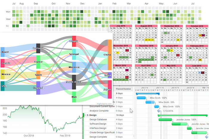
So your traditional calendar view, that you see over there on the right, is helpful for showing active days. For example, you see four days, five days in December, where green things were happening, and three days in August, where yellow things were happening. And that probably means something to whoever’s looking at this data. But that doesn’t understand or show you any connections between the events that you’re looking at on the calendar. How might the green and the yellow things be interacting with one another?
At the top there, we’re looking at more of a heatmap. So trying to understand when events are clustered in time, when you might see a distinct density of events over the course of a few days, a few months, however long you might be looking at and when you might see less active events. But again, while that might give you a sense of what activity or what patterns of time, what ranges of time you might want to zoom in on, it doesn’t actually show you any attempt to see how those things might be linked to one another.
Now, down there at the bottom right, we see a traditional Gantt chart, which is something that’s been used in project management for quite a while. And you’re starting to get a sense of how things might be linked because you have these projects, or these phases of the projects. And then you have dependencies between them. So Mike Smith can’t start on the documents system until he’s completed the analytic system, for example, and so there’s a dependency or a link between those, but it’s a very hierarchical view. You have x happened, then y happened, and z happened, when in reality, if you’re investigating data, then you have a lot of back and forth between various events. It’s not just strictly that one flows after another.
And then there at the bottom left, you see what an example of a stock ticker where you’re tracking something’s value over time. But again, you’re not really able to understand causality or connections between items, you’re just looking at a single item’s value.
So none of these are particularly the right way of investigating connected data over time. And that’s why we created a new product called KronoGraph, which shows a new way of interacting with and understanding this kind of data. So I’m going to hand over to Dan, who’s going to take over here and show you KronoGraph, some examples of where we’ve taken some different data sets that have a time element, and how KronoGraph can be helpful at showing the patterns of those data.
Okay, thanks, Corey – welcome everyone. Thanks for joining. The plan today is I’m going to show you a few examples of the use cases for KronoGraph.
Chronological timeline: credit card fraud
Hopefully, you can see my screen here. This is the site that you’ll get access to, just like our other products, ReGraph and KeyLines. KronoGraph is a toolkit that lets you build chronological timelines into your products. It’s a JavaScript toolkit, it works for both React and plain JavaScript. And I’m going to show you some things that are built with KronoGraph to give you an idea of the possible use cases.
So to start with something really basic before we get on to the cool, visual stuff. We’ll start with a credit card fraud example. But before we do that, just to look at the most simple possible timeline you can imagine:
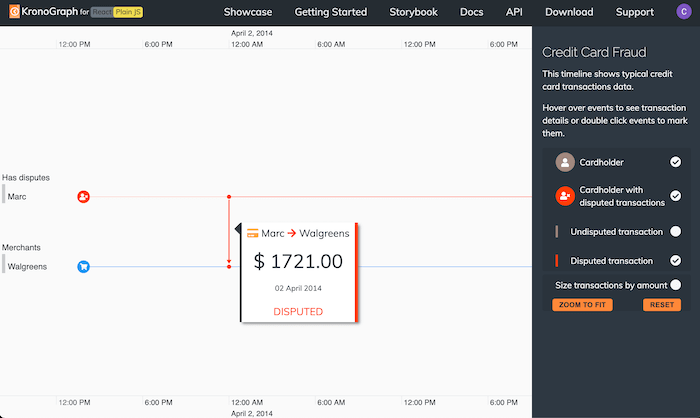
This is a single event in time. What we’re looking at here, in this case is a credit card transaction. There’s a lot of information visible here on the screen – it’s basically telling us that somebody called Mark has spent some money in Walgreens. In fact, he spent an awful lot of money in Walgreens. I don’t think most people spend that amount of money. And Mark is disputing that transaction – he’s saying that wasn’t me – and it has a date, 2nd April 2014.
So this is what we call an event. Events are what appear on our chronological timeline. And events often, not always, but often refer to specific entities – “people” and “stores” – in this case Mark and Walgreens, this is an event which connects Mark and Walgreens at a specific point in time.
So once we start loading multiple events, that’s when things get interesting.
If I just zoom out here, we can see some other events going on on Mark’s timeline, another disputed transaction here. And if I filter in all of Mark’s normal day to day credit card usage, we see even more data appearing. As you can see, KronoGraph is adapting to the data that we’re loading in. And it’s nicely animating between states, we’re seeing a more sensible view in this case of Mark’s spending activity.
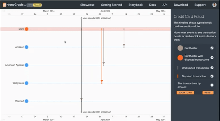
So in this case, we’re going to look at a use case around credit card fraud investigation. Mark claims that this wasn’t him, he didn’t spend this money. So we might want to try and understand what are the patterns of behavior around this transaction? And can we learn anything about what might have caused this to happen? So one thing we can say is, well, let’s have a look at what Mark was doing around about the time he had this transaction.
And we can see Mark isn’t actually using his credit card much at all. He’s only used it once anywhere close to that fraudulent transaction where he spent quite a lot of money at Walmart. I’m going to pin that transaction to my timeline – kind of like my personal timeline here at the top when I’m tracking that event because it’s interesting to me. What I can now do is bring in some more data, and I’ve got data on a lot more people.
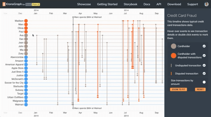
You can see the chronological timeline is starting to get a bit more crowded now. We have a bunch of different credit card holders. Some of them are flagged in red because they have disputed transactions, and I can just hide the others. And we can see some people who’ve got disputes, and it’s very easy to spot. Another person here, Paul, who has a very similar pattern to Mark. You can see close together on the timeline, both of these people have reported disputed transactions at Walgreens around about the same time, one day apart. So there might be a connection between these.
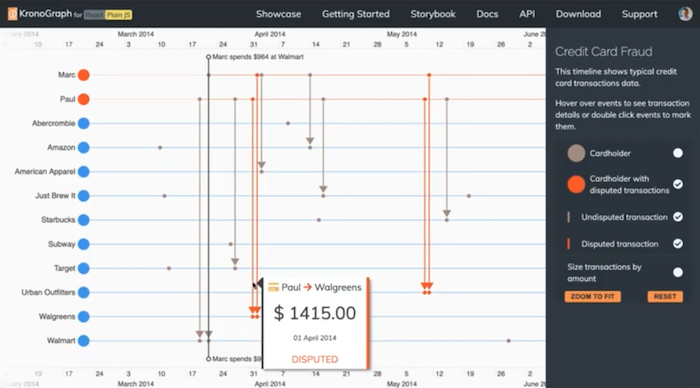
And if I zoom in a little bit, I can see what else was Paul doing around this time. And I can see Paul as well spent a lot of money at Walmart, very similar times to when Mark did his. So we might conclude that there’s perhaps something in common here, and maybe credit cards are being cloned at Walmart. It’s a simple fictional example, but I wanted to use that to give you an idea of the basics of KronoGraph. We’ve loaded some simple transaction data, and already we’re starting to recognize behaviors and spot sequences of events that would have been very, very difficult to spot had we just tried to look at this as as a network graph, or had we just eyeballed these transactions as a long the list.
KronoGraph lets us create these timelines. It lets us interact with them, zoom, pan, and it lets us focus on individual players in the chronological timeline. And it lets us pivot the data around and build up views or sequences that we want to investigate.
[For more information about fraud, read our blog post: Insider fraud detection with timeline visualization]
Chronological timeline: insider trading
Let’s quickly move on to a slightly larger, more realistic example.
Instead of just a few 10s of transactions, what if we have 1000s, or 10s, of 1000s, or even millions?
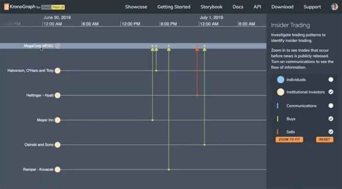
This is an example of some share trading data. We’re just looking at one fictional stock company called MegaCorp. We’re looking at share trades – these are organizations/investors who have bought or sold shares in this company. As I zoom out, we’re going to bring in more and more data.
At each level of zoom, you see the view starting to get a little bit more crowded. And as we get to the point where there’s really not enough room to display these transactions, what KronoGraph does is it intelligently aggregates the information so that there’s something sensible at each point. So at this level, there’s really not any point in showing the individual transactions, but we can show them as little rectangles, red for sells and green for buys. And as we zoom out further, even those transactions themselves start to merge together, and we get a general sense of the activity on each day.
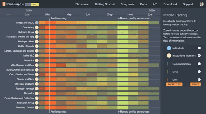
This particular day was mostly a selling day for this company. And this day was mostly a buying day for this company. And as we zoom out further, we can start to see trends throughout the year, I can now start to see a huge amount of buying across the board from these companies after some record profits were announced.
There’s a lot of selling across the board and general negative sentiment in the company in the months leading up to that profit warning. This is a meaningful view. Even though I’ve got 1000s of events on the screen, I’ve got a meaningful view and I can learn something from this level. And if I need to zoom in, I can.
In this case, we’re looking at the insider trading investigation. If I bring in some individual share traders, we get to the point where it’s not even possible to display everyone by name because we have too many people.
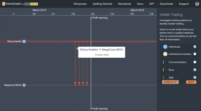
So again, KronoGraph has aggregated that information. I can see here, just a row summarizing those individual investors. But what I can do is take away the companies, and as I zoom in, KronoGraph will again open up this group and show me individual traders. And now I can get to the level of information I want: who is buying shares just before the profits were announced? And are they perhaps suspicious? Can we detect patterns of activity such as this person here, who seems to also be dumping a load of shares before a profit warning went into the news.
Again, being able to zoom in from both a very high-level view of overall sentiment, and then switch to a view of individual trades is really powerful. It’s something that KronoGraph does really well. All we’ve done is loaded this data and KronoGraph has handled how to represent it and how best to display it given the amount of time that you’re looking at.
See what KronoGraph can do for your use case
Chronological timeline: Cyber security network traffic analysis
So we’ve looked at a couple of financial fraud examples. We think KronoGraph is applicable to a whole variety of industries – there are many people on the webinar today joining from a number of different industries. So I wanted to give you a little tour of just a few other use cases to maybe inspire you as to what can be done with these chronological timelines.
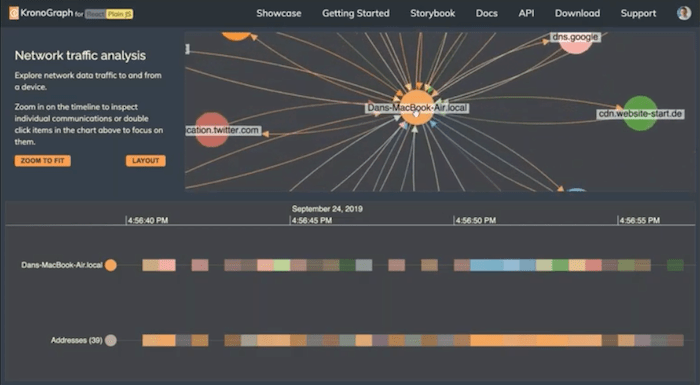
I’m going to look next at a completely different example from the cyber security world. Here we’re looking at network traffic analysis. So we’re looking at packets of data sent, in this case, genuine data from my laptop. I left it running for not very long – you can see on the timeline, it’s about 15 seconds of my laptop’s network card doing things. And already we can see on the top here quite a lot of activity.
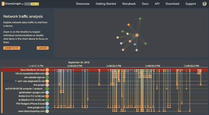
So what we’re seeing on the top is KeyLines or ReGraph – one of our graph visualization products. And we’re looking at the connections between my laptop and the various other addresses it goes to. And if I find one that’s interesting to me, in this case, this particular website, I could double click it here and ask KronoGraph to show me just a timeline of my interaction with that other website.
So although the KronoGraph can be used standalone, it works really well side-by-side with a graph view. I can explore both the connectivity and the top view and the individual sequences of events in the bottom. For example, I might want to know what else was my computer doing while it was talking to this particular website. And so I can use the chart to pivot around, bringing the wider picture. And then I can start to have a look at the individual addresses which my computer went to.
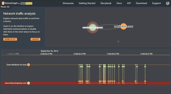
I can see that just the act of going to one website triggered a whole avalanche of other activity on my machine going to CDNs to load content for the site, or looking up the site using a DNS server. This is probably me going to Google to find the site that I went to before I actually went there, and moving from one to the other. Being able to interact between the chart and the chronological timeline is a really powerful way of seeing two sides of the same data.
In the cyber security world, we could be looking at some kind of incident forensics, analyzing what happened during the course of a cyber attack. But we can use the same techniques in other walks of life to we can use it in social network analysis, or intelligence investigations, where we’re looking at connections between people and their communications.
Chronological timeline: telephone communication analysis
In this example, I have a network, again using our graph visualization tools to show a network of people and their telephone communications.
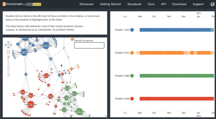
Networks are fantastic for doing things like showing me who are the clusters. So we’ve used our graph toolkits’ analysis module to identify four clusters, the blue, the red, the green, and the orange. And I’ve passed that information into the timeline on the right. So we can look at the chronological timelines of the individual clusters.
So if we were to look at this orange cluster here, we could drill down into the individual communications of the people in that group. And again, as I hover over nodes in the chart, I can see them in the timeline on the right. Or if I hover over people in the timeline, I see them in the chart. And this allows me to really understand this network in a way that I couldn’t do with a network alone. For example, if we look at this person here, and looking at the charts, she seems like quite a key player.
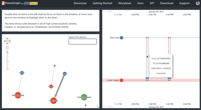
She bridges a lot of these groups, she’s a kind of a bridge between the green group and the red group and the orange group. If I focus on our individual timeline, I start to see how that activity played out, I can see in fact, she really only spends a lot of time talking to one person in that green group. Most of the time, she’s not really connected to that group at all. And her connections to the red group are limited to one very short burst of activity. It looks like she sent AB for zero duration probably text messages to someone in that red group, and never got anything in return. So in fact, by delving into the chronological timeline, we learned that this person actually probably is not a very good bridge between these two organizations. But by looking at the chart alone, we wouldn’t have seen that and we might have been led to believe that this person was more influential than they actually are.
So by having these two views together – a chronological timeline view and network visualization – you really unlock a lot of insight into what’s going on in networks and communications datasets.
So we’ve looked at fraud investigation, we looked very quickly at cyber security and communications analysis. I realise this is a very quick lightning tour, but hopefully it’s inspirational.
Chronological timeline: law enforcement & crime investigation
The last example I wanted to look at was a law enforcement crime investigation use case. And I wanted to show it partly because it gives you an idea of the power of combining multiple datasets together into a single timeline.
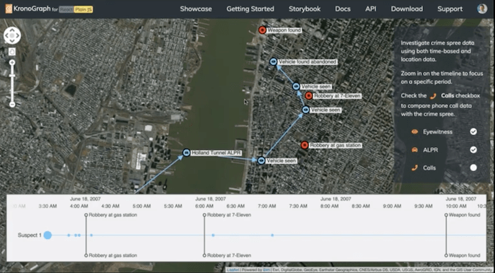
The thing all time datasets have in common is that time axis. No matter what the dataset is, no matter how different it is, because they all have that timestamp in common, it means you can overlay them on the same chronological timeline and learn really interesting things. This is really important in the intelligence and law enforcement community where you’re getting data from multiple data sources, and it’s often only coming together at the point of the investigator looking at it and trying to piece together what happened. In this example, we’ve got data representing some kind of crime spree.
Someone has stolen a vehicle and they’ve driven on some kind of rampage through Manhattan. (Fictional data, of course.) We’ve put these observations, these witness statements, people saying “I saw the vehicle” or people finding this vehicle abandoned, we’ve put those on a map using KeyLines. But if I double-click on these events on the timeline, I can move through this sequence of events and see it playing out on the map. Where this becomes really powerful is then if I were to load another dataset in here – totally different dataset – which is a dataset of telephone call records, which we’ve obtained as part of the investigation. And now I can see who this person was calling and overlay those calls on the same timeline as this crime.
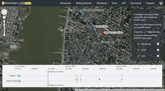
So I can look, for example, at around about the time that this person was suspected of committing a robbery. We know roughly where the person was because we can see which of these observations happened within the time window we’re looking at. But we can also see these outgoing phone calls. We can see that our suspect called this number 1, 2, 3, 4 times during a very short period, during this crime. So we’ve got a lot of information about what was going on simultaneously. We might want to investigate the owner of this phone to see what part they played in things. And by seeing that data overlaid in the kind of background story of what’s been going on from other data sources, you get a very powerful way of understanding, in this case, a crime but understanding any datasets any kind of investigation, forensic analysis of cyber attack or crime, or fraud. It’s a very, very powerful way of doing things.
I think we’ll move on to the Q&A. But basically, as Corey said, if you want to try KronoGraph out, it’s full of great documentation, and it’s full of example code snippets that help you understand how to build a chronological timeline. So I think I’ll leave it there. Just a reminder that if I haven’t covered your use case, today, I mentioned only the first three use cases, in this long list of use cases we’ve identified, you may not even be on this list and have some ideas, we’d love to talk to you and find out how we can develop this product to meet your use case.
Q&A session
Great. Thank you, Dan. So we had a few questions come in over the questions panels, so I’m going to try to take those as we go.
Can KronoGraph also display relationships between events within an entity?
So I think I’m not quite sure I totally understand this question, so feel free to reach out to me afterwards if I don’t answer it the way you’re expecting. But I think the answer is that links go between multiple entities or between no entities. So you could have an event that, as Dan pinned up there, just shows a timestamp or something happened, but it’s not linked to any entity, or just linked to a single entity are linked to multiple entities. So if you wanted to show interactions within a single entity, I think probably the way to show that in KronoGraph would be to split that into two. But there may be other ways. So definitely, you can reach out to me or Dan after the fact and discuss exactly what you’re aiming to do. And we can see whether KronoGraph is a good fit. Go ahead, Dan.
I was just going to add another example of that is where you might have something that can be an event that could also be considered an entity. So a good example of that is social media where somebody makes a post: the person might be the entity, the post might be the event. But if someone else then likes that post, you have an event which kind of refers to another event. So it is something we’ve been experimenting with. There are lots of different ways of showing it. You can link events to each other, but you can also pivot where one minute the people are the entities, the next minute the social media posts are the entities and you can get some really interesting views there. So yeah, definitely keen to discuss that use case with you offline.
Yeah, as Dan said, that’s something we’re experimenting with now.
Can KronoGraph show event duration?
And the answer is yes, we do have, just like in KeyLines, events can either be an instant in time. Most of the examples that Dan showed were events that took place at a specific instant, but we do have the ability to have a start and an end time. So that’s what Dan is showing you now.
Yeah, simple example here, of the Gantt chart variety. But again, we’re very interested in the kind of data you have, and the goal is to be able to visualize exactly what that data represents. So this is one way you might show duration with a solid bar.
Next question: how KronoGraph might work with a graph?
So KronoGraph is designed to work alongside either of our traditional node-link chart visualization tools: KeyLines, and ReGraph. To do so we have two different aspects to our API. So we have both a timeline visualization React-focused API and a JavaScript-focused API. So if you’re using KronoGraph alongside ReGraph, you’re most likely going to want to use the React side of the API. And Dan’s showing you the difference there. The ultimate underlying functionality between the two is the same. It’s just how you build your tool with it.
[For details of how to integrate with a Neo4j database, see: Neo4j timeline visualization with KronoGraph]
What about performance?
So one of the interesting things that we’ve learned over the past several years of building graph tools is that the idea of wanting to start with a large volume of data and then filter down to a smaller volume is really powerful. And it’s incredibly common to – that’s just what most people want to do. And one of the things about KronoGraph that makes it particularly apt for very large volumes of data is that you don’t actually have to render any individual data elements.
So you saw in Dan’s example, where he was very far zoomed out and was showing a lot of time and a lot of events, we turned the view from looking at the individual events themselves into more of a heatmap view. And the benefit of that is that you get very, very good performance when you don’t have to draw tens of thousands, or hundreds of thousands of things on the screen all at the same time, but just represent them with the density of a color of the block on the chronological timeline. So I would say that the performance is very, very good. And it’s really limited only by the amount of data that you pass to it and the amount of memory that you can hold in the browser. But that’s usually well in excess of what it’s helpful to show in KronoGraph anyway.
What format does KronoGraph use to ingest the data?
So we talked about the React versus the JavaScript APIs. In both of those cases, the actual data model itself has a JSON object, it’s just slightly differently structured, depending on which one you’ve chosen. But Dan is showing it to you now. It’s basically just a dictionary of the entities, the events and the interactions between them.
Yeah, it’s a very simple data model. It’s not quite the same as the KeyLines or ReGraph data model deliberately, because the model is much more flexible. As Corey said, you can have events which connect ten nodes together or none. So it’s not quite a graph. It’s very easy to switch from one to the other, though. And it’s exactly the same data format, whether you’re using the react or the JavaScript version of KronoGraph.
What are the data privacy aspects?
So like our other tools, KronoGraph is deployed to you. We give you the library, and you build it and bundle it into your application and then deploy it off to your end users, either as a hosted solution or as an on-premise solution. So there’s no dependency back on our site or anything like that. We don’t host the library ourselves. So the data never is seen by us and so that’s entirely within your control.
So that was the final question I had. So definitely feel free to reach out to us. You can fill out the form if you’re interested in trying it. If you have any questions for Dan or me specifically, then our emails are at the beginning of this presentation.
Thank you very much!