We’re excited to announce that we’ve just released version 2.0 of KronoGraph, our visualization tool for timeline analysis. It marks the next generation of visual timeline analytics – a compelling new way to explore events through time.
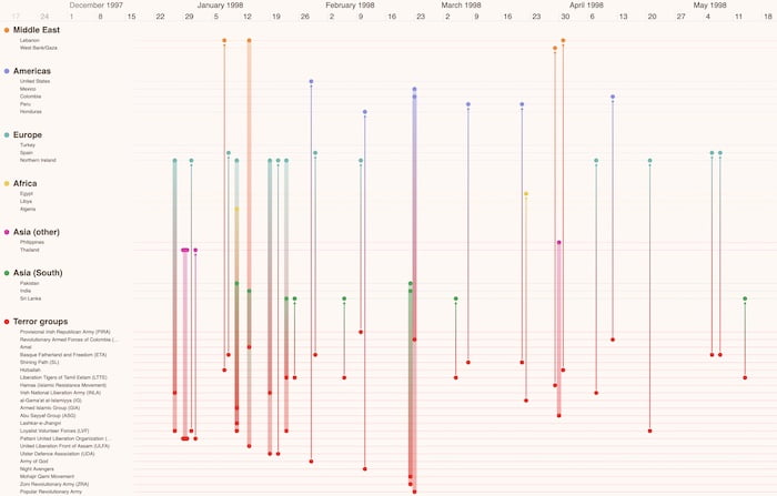
KronoGraph 2.0 features the unique ability to see thousands of timelines in a single visualization, making even the largest time-based datasets easy to navigate.
With KronoGraph 2.0, users benefit from seeing their entire dataset while also visualizing key individual timelines that need immediate attention. Spotting patterns and highlighting events of interest in complex visualizations has never been easier. And thanks to its unique intuitive design, the interactions for focusing on details in the data and ignoring the noise feel familiar right away.
Whatever your investigators work on – cyber security, fraud detection, law enforcement or other use cases – the volume of connected events they need to understand is vast. A high-level view of their data is a strong starting point, but when they’re seeking insights hidden inside thousands of data timelines, how can they be sure they’re not missing what’s important? They need an interactive way to drill down into the detail without losing sight of the big picture.
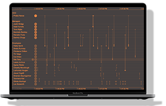
Only KronoGraph 2.0 lets users combine thousands of timelines into a single visualization. With the innovative new ‘lens’, they can inspect the individual timelines they’re interested in without losing context – no more collapsing data into ‘summary rows’. An intuitive scrollbar makes analyzing the details smooth and effective, so users don’t miss a thing. And once the detailed analysis is done, users can seamlessly return to a comprehensive overview of their timelines.
We’ve also introduced glyphs as a great way to color-code labels or draw attention to alerts deep in the data.

Cambridge Intelligence founder and CEO, Joe Parry, recognizes this KronoGraph milestone:
We’ve watched timeline analytics establish itself as an essential technique of successful visualization tools. We’re proud that KronoGraph helped pave the way for this, powering web apps in use cases as varied as AI and fraud detection.
When users asked for a way to focus on individual details and visualize their entire datasets simultaneously, the team worked hard on this intuitive solution which ticks every box.
To get started, KronoGraph users simply hover over the timeline to reveal the lens icon. Once opened, the lens reveals a larger view of those entities they’re interested in. Users can effortlessly scroll timelines, bringing areas of interest into focus, while also retaining an overview of the larger dataset.
KronoGraph’s Product Manager, Matt Latham, explains what makes the latest features a game-changer in the world of visual analytics:
Our most successful graph visualization toolkit customers know how important it is to include a specialist tool dedicated to timeline analysis in their applications. The latest features represent a huge step up for KronoGraph, giving users an essential way to hone in on those hard-to-find insights without losing sight of the big picture.
The response from customers so far has been fantastic. Huge thanks to everyone who previewed KronoGraph 2.0 and gave valuable feedback that helped us get it right.
Webinar: see KronoGraph 2.0 in action
Join Matt Latham, KronoGraph’s Product Manager, for a tour of this latest major release. He presents the latest features through a series of demos to help you get the most out of KronoGraph 2.0.

What’s new in KronoGraph 2.0?
See the lens view, glyphs and more in this 20-minute video


