Get ready to tell the story of your complex data – our latest major releases mark a big leap forward in the evolution of data visualization. KeyLines, ReGraph and KronoGraph charts now support an annotations layer, so users can showcase the narratives in their data to anyone, in any format.
Explainable data narratives, powered by annotations
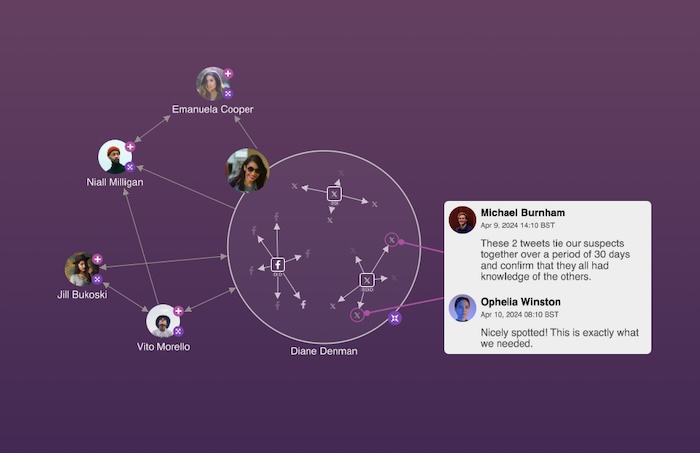
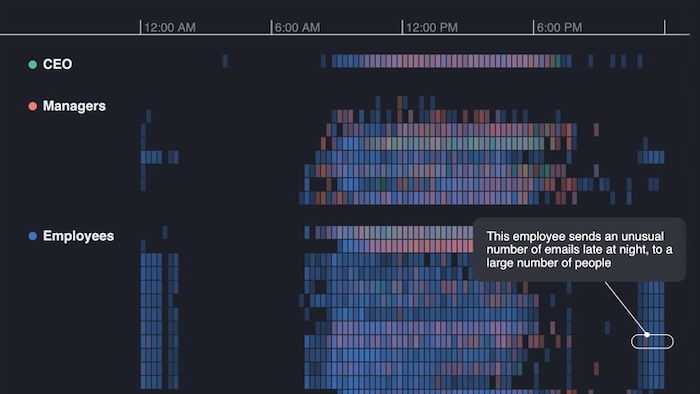
Analysts and investigators need to uncover insights in their data. They apply expertise and knowledge to complex data visualizations to interpret connections, answer difficult questions, and explain alerts generated by their visual analysis apps. This is how they extract the data’s narrative: the underlying story that explains what’s going on.
Now, analysts and investigators can use annotations to provide those explanations without having to leave the chart.
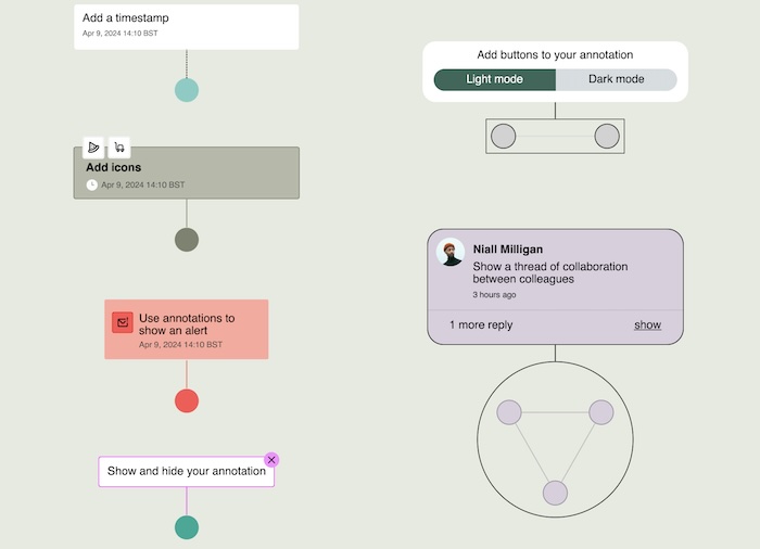
If the detail exists in the source data already, annotations can be automatically imported into a chart as a separate layer. Alternatively, analysts and investigators can add them to the chart’s annotations layer as long-form text descriptions.
However they’re brought in, annotations fit neatly alongside other chart items in your graph and timeline visualizations. They also stay visible at all times, no matter how far the viewer zooms out – something that’s crucial when working with huge datasets. Combined with near-infinite customization options, it’s easy to make annotations stand out to give prominence to the key activities in your data.
Fully flexible, analysts and investigators can turn off individual annotations, or the entire annotations layer, when they need to focus solely on chart items.
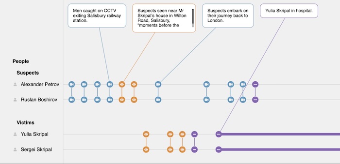
Annotations: Bring out the story in your data
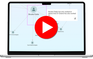
Find out how to share the story behind your connected data more easily than ever in this short video
Support for collaborative workflows
We designed annotations to fit seamlessly into existing workflows and make data insights accessible to all. As a collaborative tool, they let teammates share findings, contribute expertise and develop the narrative.
You can customize those edit options if, for example, those annotations were imported with the data and represent a single source of truth that should be preserved.
Make data accessible and understandable
Sharing and understanding data narratives is important for case notes, legal evidence, reports to stakeholders, team collaborations and more. You can export annotations as part of your timeline and graph visualizations – as interactive charts or high-resolution images – ready for compliance documents, team presentations, courtroom submissions or any other output.
The result is a joined-up analysis and reporting experience that powers faster, better-informed decisions.
Combining machine intelligence with human understanding
Annotations remove ambiguity and make complex connected data explainable. Every use case benefits, particularly those working with AI and machine-generated information.
For example, in an alert management process, AI is great at revealing ‘which’ alert or node or event requires further investigation, but it’s not so good at explaining ‘why’. Annotations means human experts can add important contextual information to that AI-powered output.
Give context to your data insights
KeyLines 8.0, ReGraph 5.0 and KronoGraph 3.0 are available now to all customers and evaluators, with showcase demos and fully-documented examples to help you get started with the annotations layer.
Find out what’s possible with your data – sign up for a free trial today.
FREE: Start your trial today
Visualize your data! Request full access to our SDKs, demos and live-coding playgrounds.


