FREE: Law enforcement white paper
The ultimate guide to investigating crime, analyzing results and sharing insights using data visualization.
It’s no secret that both civilian and sworn law enforcement employees work with a lot of data. Historically this was limited to a back-room crime or intelligence analysis scenario, but increasingly ‘big data’ is found throughout law enforcement processes, including:
Incident Reporting; in North America this is typically covered by Computer Aided Dispatch (CAD) and Records Management Systems (RMS). Other parts of the world tend to use dedicated systems for recording and processing data from phone calls or anonymous tips. These can even be Customer Relationship Management (CRM) solutions tailored for a law enforcement environment.
Uniform Crime Reporting; the United States and Canada have the “nationwide, cooperative statistical effort” of UCR. Law enforcement agencies at all levels voluntarily report crime statistics to the FBI or Statistics Canada. Sharing this data helps compare agencies and trace crime trends year on year.
Operational Data; every large organization has to manage this. In law enforcement, the data can cover scheduling, vehicle logs, payroll, expenses, and records of legally-mandated training courses taken by officers.
Production Orders; this is often cellphone data from telecommunications companies in North America. The orders detail the duration, frequency, and means of communication between relevant parties. Analysts typically use them to produce visualizations for situational awareness.
Automated License Plate Readers (ALPR); agencies across the world are using ALPR to apply optical character recognition (OCR) to photographs of vehicles. OCR extracts the plate number in a computer-readable form so that analysts can make connections between registered owners, vehicles and their location at the time of an incident.
Dashboard/Body-worn cameras; police services handle the scale of real “Big Data” in the form of recordings and metadata from dashboard and body-worn cameras. Collecting and retaining data at this scale poses significant storage and retrieval challenges.
In this blog post, we’ll explore two examples of graph and timeline visualization in action in the law enforcement domain.
The ultimate guide to investigating crime, analyzing results and sharing insights using data visualization.
Our first example shows graph visualization as part of a crime analysis application. This approach is typically incident-driven; we start from one incident and expand outwards to explore relevant connected nodes and events.
Here’s a simple data model for this type of analysis. It features data typically found in a records management system (RMS):
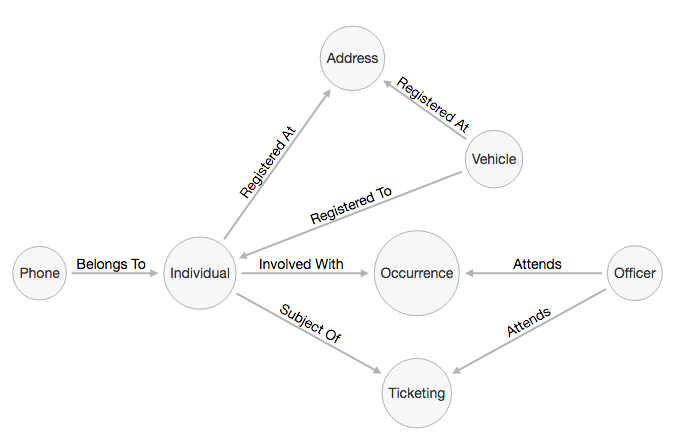
This isn’t necessarily the complete picture. We could extend the graph visualization to include additional data, like convictions, gang membership connections or relationships between officers and vehicles. But let’s keep this chart clear and simple.
The most important nodes in this network are Occurrence and Ticketing. These are definitive events that took place at a specific point in time. They often reveal vital information for analysts such as unstructured narratives that can help understand criminal intent.
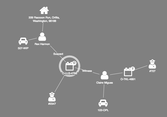
Here’s the same data model visualized as a graph visualization:
Want to learn more?
See how law enforcement agencies use graph technologies to solve crime
We’ve chosen basic icons for each node. Another option is to display mugshots taken from the RMS as images for each individual. Familiar visuals are a great way to make icons instantly recognizable, but you should use them cautiously to prevent large charts from looking like a sea of faces.
To keep track of the event we’re investigating, we’ve added a halo to the ‘Occurrence’ node. This makes it easier to spot when we add additional nodes of interest.
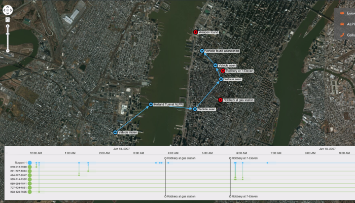
We can take this approach a step further by adding timeline visualization. This reveals the sequence in which events occurred, as well as how they’re connected.
As an alternative to incident-driven visualization, we also use graph and timeline visualization to answer broader, and potentially more complex, questions about crime trends and characteristics. These could include:
These queries are trivial to execute against a standard graph database (such as Neo4j), a traditional relational database management system (such as Microsoft SQL), or even just using spreadsheets, if you prefer. All are compatible with our data visualization tools.
If we run a query to find occurrences containing “liquor store” and “witness”, here’s how it looks as a graph:
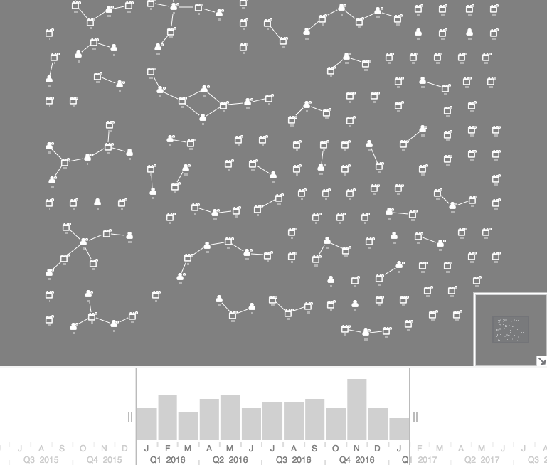
You can see occurrences and individuals shown in both the graph visualization chart and time bar. The time bar breaks down the times of each occurrence, so you can filter the chart by occurrence or by time range.
This view shows us that some node clusters contain witnesses of multiple occurrences – these are likely to be liquor store workers. We can also see many incidents have occurred without witnesses. This seems strange and could be a quirk in classification by officers that needs further exploration.
We can plot some or all nodes against a map, then apply clever filtering and styling options to the occurrence locations:
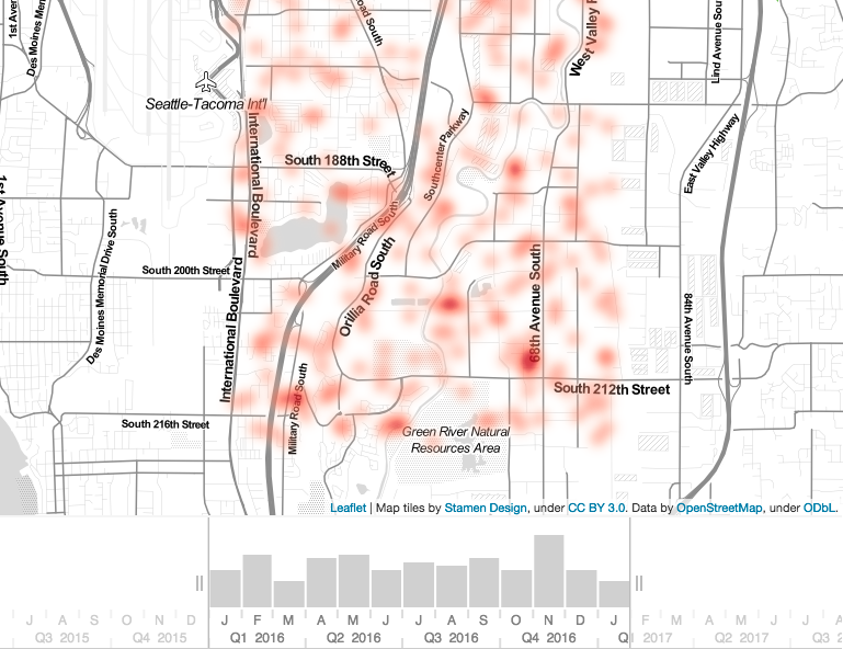
Instead of nodes and links we’re showing a heatmap. When we search for “liquor store”, we now get a clearer view of potential crime hotspots.
It’s clear where events have taken place, and again, the time bar lets us slice the visualization by date and time. This is useful information for officer dispatch or analysis purposes. For example, liquor store crimes committed outside those hotspots at unusual times may represent outliers that need further investigation.
This post focused on a small subset of the data available to law enforcement, specifically CAD and RMS data. Advanced timeline and graph visualization helps to provide a holistic view of crimes at both an event-level and trend-level that help analysts and officers fight crimes more efficiently.
If you’d like to learn more about our data visualization toolkits, get in touch or request a free trial account.
Visualize your data! Request full access to our SDKs, demos and live-coding playgrounds.
Registered in England and Wales with Company Number 07625370 | VAT Number 113 1740 61
6-8 Hills Road, Cambridge, CB2 1JP. All material © Cambridge Intelligence .
Privacy Policy | Security Framework


