If you need to visualize your graph data, the quick and dirty approach is to throw all the data together on a chart and hope for the best. If you’ve ever done this, you’ll already know that you rarely end up with a clear, well-constructed, insightful visualization. You’ll also know how much time and effort is required to fix it.
In this blog post, we’ll provide tips on how Cambridge Intelligence products can help you create good-quality visualizations of connected data. It won’t cover everything, but it’ll give you some useful guidelines for your next project.
We are going to explore some data about the interconnected nature of the individuals involved in the 2015 Paris terrorist attacks. The dataset is taken from an interactive article produced by the Belgian newspaper, De Standaard. The original authors use d3.js to create a graph visualization and use interactivity to provide node detail:
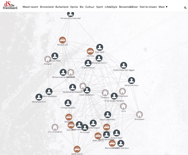
Just loading the data into the visualization gives good results, but let’s see how we can improve the layouts and interactivity. We’ll follow a similar approach as Rik Van Bruggen in his three-part blog series: Exploring the Paris Terrorist Attack Network.
Don’t feel obliged to use all data provided to you
The data for our visualization is available in a JSON format, so the nodes and links are already defined. JSON is a good choice for graph visualizations because it’s transparent, amenable, and there’s minimal data transformation required.
It’s tempting to take advantage of every node and link defined in our JSON source, but is it necessary to use every field found on each entry? It’s worth pausing to consider what information you’re trying to convey with your visualization. Ask yourself: what are the “minimum viable elements” needed to tell your story?
In this example, we want to show the connections between individuals and places. We don’t need to show the names, nationality and date of birth of the person nodes, so these can stay in our data source.
Don’t be afraid to exclude whole node types from your visualization. We’ve decided to exclude Vehicle nodes because we don’t think they help, and they add clutter to the screen. This may mean that users miss important connections, but it’s better to be conservative on the number of node types for the sake of clarity. It’s easier to add content to a visualization that’s manageable.
So here’s our first iteration of the visualization:
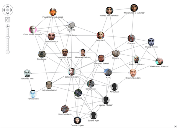
You’ll notice that we’ve configured the nodes to show photos. For a cleaner more consistent look, we’ve also ‘cut out’ circles from their original images. The default standard layout does a good job of spacing the nodes out more clearly.
Be selective with visual and interaction techniques
With minimal additional configuration, we can highlight particular data points of interest. We can also configure an interactive environment for users to explore the data in their browser.
You may be tempted to over-design your visualization by using every available visual and interactivity technique. Again, take a step back and select only what you need to tell the story. Less is definitely more.
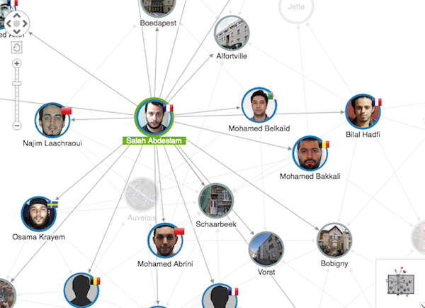
In the next iteration of our chart, we’ve made a few minor configuration changes:
- mapped the nationality data to flag glyphs displayed at the top right of each node
- added subtle color borders to distinguish between location and people entities
- bound the ”click” event on a chart to a “focus on node” function so that when a user selects a node, that node is highlighted along with the other nodes connected to it
- added a green highlight to distinguish a selected node.
Feel free to use auxiliary data sources
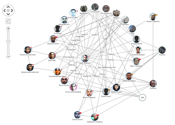
Having played around with our visualization, it seems that we’re missing some key context. We can see connections between individuals and locations, but there’s no information about the nature of their relationship.
When you’re working with a new dataset, look out for additional auxiliary data sources that can enhance the story you’re trying to tell, such as:
- geocoding addresses with latitude and longitude information for geospatial visualization
- open-source intelligence (OSINT) data sources.
In part two of his blog series, Rik created a Google sheet containing information about the relationships between nodes. In the next iteration of our chart, we’ve copied these details and added them as link labels. We’ve also used the radial layout, which shows Salah Abdeslam in the center of the network as the most connected node on the chart.
Use the properties of the graph to improve your visualization
Finally, don’t forget that you can use graph analytics to further enhance your new network. For example, using centrality metrics you can understand social network behaviors. You can apply visual styles based on these metrics to resize nodes according to their relative importance in the network. In the latest iteration of our visualization, we’ve applied the “betweenness” metric to node size:
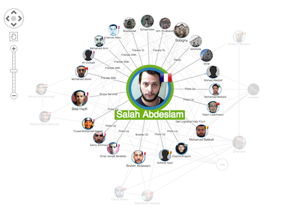
This visualization is just a starting point. We can keep making improvements and adding interaction or contextual menus, depending on the data, your users and the story you need to tell.
Try it yourself
We’ve helped hundreds of customers make sense of their complex graph data with interactive visualization tools. Contact us to find out more, or request a trial to get started.


