Discover MapWeave
The revolutionary geospatial visualization SDK that uncovers every connection.
I recently explored network digital twin visualization with KeyLines, showing why it’s essential for monitoring critical infrastructure networks. The headlines since then have only reinforced that need: major power outages across Spain and Portugal, and growing cyber threats to UK infrastructure.
The case for connected data visualization is clear. Now let’s get technical. In this post, I’ll show you how to build a production-ready infrastructure monitoring system by enhancing my original network twin with timeline and geospatial visualization.
I’ll also enrich the data by expanding the model to secondary sites in the distribution network – bringing in 1000s of additional nodes. And I’ll refresh it with the latest “live” outage data, as well as historical outage data for the past 4 years.
My network twin uses power infrastructure data from the open source UK Power Networks data catalogue. This catalogue provides datasets for each hierarchical layer of the power networks across the East of England, from grid supply points (GSPs, also known as super grid transformers), right down to secondary sites (for example, the ground-based or pole-mounted transformer in your post code). I filtered these datasets on just the Eastern Power Network (EPN, which covers the region of East Anglia) and then exported them in geojson format.
Using the approximate layout of the super high voltage transmission lines as provided by the National Power Grid, I superimposed the EPN GSPs on the transmission line layer using QGIS, then manually built a top level network of these nodes and lines in json format.
Using mainly the geopandas python library, I wrote a data pipeline which built up the network in a MapWeave-friendly json format, using transformer (node) IDs, names and even coverage polygons and their intersections with child nodes. This last part was necessary because the UKPN datasets don’t reference their parent nodes consistently across the different levels of hierarchy.
UKPN also shares live and historical datasets. Their live faults dataset doesn’t map to specific grid nodes, but rather to affected postcodes, so I had to use these to map outages to secondary sites in my python data pipeline. For the historical outages, I used their extra high voltage outages dataset, which reports outages back to 2021, down to the Primary Substation level.
I built my digital twin app using MapWeave’s Mapbox adapter, which enabled me to use Mapbox basemap styles and satellite imagery, and access the powerful Map object methods (more on this later).
I built a basic html/css switch that enables me to switch between a vector basemap layer and a satellite layer:
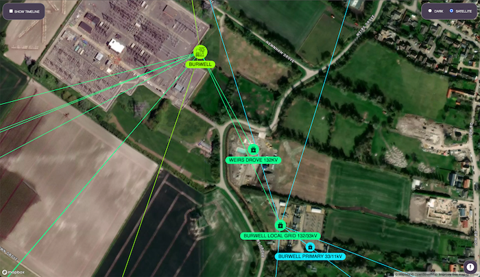
The satellite layer is great for confirming the accuracy of the network node positions. Here’s a screenshot of my local GSP and the immediate downstream grid and primary substations:
For visualizing geospatial data, the MapWeave SDK offers a number of different layer types: NetworkLayer, ObservationsLayer, and GeoJsonLayer. The natural choice for my power network was the NetworkLayer, which at its simplest takes a json definition of nodes and the links that connect them, similar to the KeyLines product.
As you can see in the above screenshot, I used node colours, sizes and icons to differentiate the various substation types. The MapWeave API makes this really easy, and provides several styling options for nodes, links and labels.
A key decision I had to make early on was on how to visualize the network at the various zoom levels. MapWeave performantly handles the visualization of my entire power network twin – around 8000 nodes and links. It even has handy features to deconflict labels, and adaptively change size and opacity of nodes as you zoom in on them.
However, I didn’t see the need to show localized nodes like the secondary sites when looking at the entire region. Instead, I wanted to limit the visualization to only the most relevant infrastructure at any given view.
I opted to gradually reveal lower hierarchies of the power network as I zoom in on them. At the highest level, only the GSPs would be visible. And to ensure that even these would be rendered nicely even when zooming very far out, I used the built-in proximity combine feature:
MapWeave has a whole host of interaction events that you can tap into. For this reveal-on-zoom behaviour, I used the mapweave.view() method, which lets you both set and get the viewport, to get the current zoom level. I used this with the built-in mapweave.on(“view-change”) event to reveal more detailed network layers of my power grid each time a specified zoom level is passed.
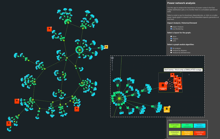
Your mileage may vary, but popular opinion dictates that a ‘true’ digital twin should be coupled to its physical counterpart. An easy way for me to do this was to include live power outages. Because I’m lazy, I only pulled a snapshot of the live outage data, as this was enough for the purpose of my demo. But if you try this for real, UKPN has APIs which you can query regularly for the latest outage data.
To surface the outages in my app, I built a small, collapsable html/css list which could also double up as a means of focusing the map on the issues:
According to their metadata, many of the reported “live” issues affected 0 or 1 customers, so I filtered the outages to only focus on those which affected multiple customers and which were reported in postcodes covered by distribution networks in my twin. You can see the resulting 4 outages above, with the 3 red ones being “unplanned”, and the yellow one “planned”.
Given the issues were reported at the postcode (secondary site node) level, one would have to do a lot of zooming and panning around these large infrastructure networks to actually find the affected nodes. To avoid this UX nightmare, I explored two different techniques to guide the user to the issues.
The most satisfying technique was to automatically pan and zoom in on the problem nodes by clicking on one of the issues in the list:
This was very easy to implement. MapWeave comes with powerful native zoom-to-fit capabilities, so I just needed to calculate (based on the affected nodes) the min and max lat/longs of the region I wanted to focus on. MapWeave then creates this very nice non-linear transition, and you can fine-tune that along with a variety of other parameters to achieve the optimum transition.
The other way I went about guiding the user to the outages was by figuring out the parent hierarchy of the issue nodes (our built-in graph centrality algorithms are really handy for this) and using the MapWeave networkLayer node styling to give them colored borders. You can use these color indicators to quickly navigate and zoom in on the issues:
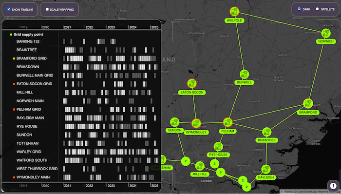
As well as the live outages, I wanted to see any historical outage data for the nodes in my infrastructure network. Importantly, I didn’t just want to see some aggregation of outages over time (like a simple timeseries), but rather a detailed breakdown of outages against the affected substations, as a function of time. In this way I could quickly detect any historical outage patterns across the network.
I could potentially also conduct pattern analyses such as which days of the week/months of the year outages tend to be reported most. To this end, I integrated my map visualization app with KronoGraph.
I wanted this visualization to be optional, so I created a basic html/css toggle to show/hide the KronoGraph timeline:
The timeline shows me the past 4 years of reported outages for the network nodes which are in the viewport (the outlined section on the right half of the app). By getting the current zoom level central lat/long from mapweave.view(), I can continuously determine which nodes are visible in the app viewport using the “on-view-change” MapWeave event:
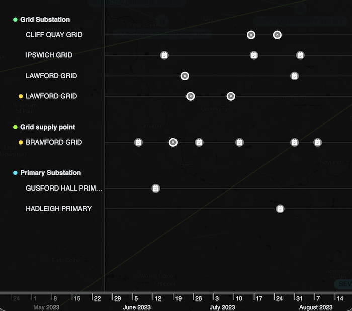
Using a combination of KronoGraph entity groups and glyphs, I can easily identify the hierarchy level of each substation (entity) on the timeline. I used red and yellow glyphs to identify the parents of nodes with outages (just like the coloured borders I used on the map nodes, yellow in the below example):
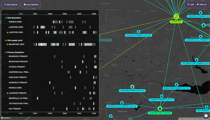
Zooming into the timeline, I can see the dates when outages were first reported for each substation and, using KronoGraph’s event styling APIs, I distinguish between planned (calendar icon) and unplanned (x) outages using font icons and custom coloring:
Just like MapWeave, KronoGraph detects a whole array of different events (hover, click, time range change, etc.). I wanted to make it really easy to select a node/entity on either interface and to see the corresponding counterpart clearly on the other. On the KronoGraph side, the user can easily filter the timeline to a single entity using the focus feature and, using the associated timeline.on(“focus”) event, I can extract the id of the focused substation and pass it over to MapWeave networkLayer foreground API like so:
Using the mapweave.on(“click”) event handler, I was able to do the same in reverse, grabbing the id of the substation which the user selected, passing it to the foreground API and also to the KronoGraph timeline.focus() method. This kind of interactivity is key to helping users navigate multiple data visualizations of complex datasets.
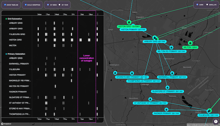
Finally, I was really keen to try using KronoGraph’s unique scale wrapping capability to detect any patterns in the outages. Scale wrapping still visualizes all the entities and events on the timeline, but it changes the scale to span a repeat unit of time (e.g. day, week, month, etc.) rather than along the typical linear date/time scale.
To enable scale wrapping, I created a simple toggle which would appear whenever the timeline was enabled. I added a couple of radio buttons to change the scale-by unit, which again would only appear if scale wrapping was enabled. Other than the code for these buttons and their interactions, it just takes a single line of JS to enable this really powerful feature:
Looking at the timeline scale-wrapped by week, we can see the outage events in Cambridge, broken down by day of the week. While events were reported across each day of the week, there are visibly fewer reports on Saturdays and Sundays. Given the vast majority of the reported outages were planned, presumably to accommodate some proactive maintenance work, it’s no surprise that they should be planned to take place during conventional working days.
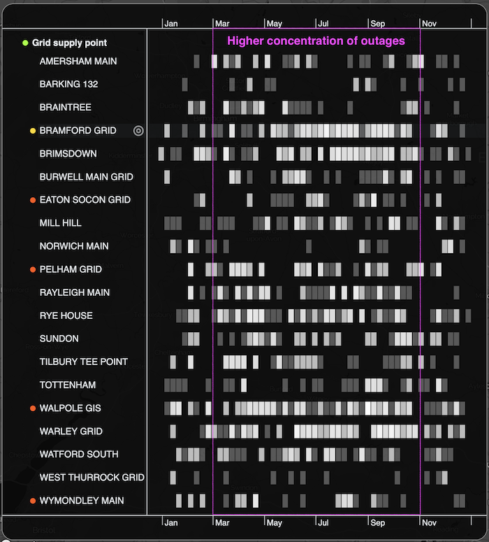
Looking at the timeline scale-wrapped by year, we can see the outage events at the GSP (regional) level, broken down by months of the year. Again, while outages are reported across the infrastructure network throughout the year, it appears that there’s an increase in outages during the warmer months (from March to end of October). Again, this is to be expected as warmer months tend to experience higher electricity demand due to air conditioning and industrial cooling systems. Sagging powerlines, constricting electricity flow, and overheating transformers also play a role.
Although I’ve been working with Cambridge Intelligence products for a year now, it still blows my mind that a non-engineer, JavaScript newbie like me can build data visualization apps like this so easily. Using MapWeave and KronoGraph, I was able to build:
And all in under 300 lines of (badly written!) JavaScript.
But as you might have already guessed, I’m not done! There are a ton of MapWeave features (like the Observations and GeoJson layers) that I’ve yet to explore, and I’ve also started working on a version of this app which integrates with KeyLines, combining the geospatial perspective with KeyLines graph layouts and centrality algorithms.
So stay tuned, and please don’t hesitate to reach out to us if you want to take your critical infrastructure network visualization to the next level.
The revolutionary geospatial visualization SDK that uncovers every connection.