FREE: Visualizing cyber security threats
The ultimate guide to keeping networks, systems and IT infrastructure safe using data visualization.
In this blog post, we’ll explore the benefits to cyber security analysts of using graph visualization and malware investigation tools.
Cyber security analysts have a tough job. IP information, server logs, communications records: the data they need to understand is big, complex, and generated every millisecond. If they don’t do it well, important alerts get missed, the risk of malware attacks increases, network vulnerabilities are exploited and post-attack forensics lack insight.
Data visualization is the best way to uncover the vital threat information lying hidden amongst rows and rows of tabular information.
We’re all used to seeing cyber security data visualized in movies or on TV. Often the visualizations are big, beautiful – and scary.

In the real world, looking good isn’t enough. The visualizations have to reveal crucial insight
Rather watch a video?
This blog post is also available as an on-demand webinar.
A lot of the data cyber security analysts need to understand is complex and low-level. It’s difficult to comprehend visually.
To understand and explain this data, analysts need engaging visualizations. We see three key stages in the cyber security lifecycle where visualization is especially important.
Let’s take a look.
The ultimate guide to keeping networks, systems and IT infrastructure safe using data visualization.
Cyber threat intelligence is information describing the cyber threat landscape. There’s no shortage of it available – the challenge is understanding and communicating it.
Here we’re looking at data about different malware threats and the vulnerabilities they exploit. Visualizing this as a set of connected entities, we can build up an interactive threat landscape that’s clear and simple to understand.
We’re visualizing attack vectors and targeted organizations. With this insight, organizations can see the threats affecting others in their sector, assess their own vulnerabilities and define their own preventative measures.
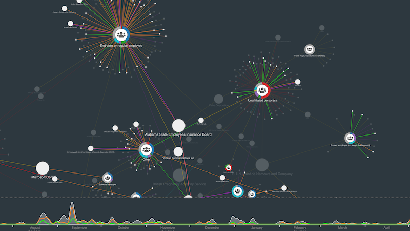
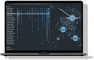
As well as preparing for future attacks or breaches, cyber analysts need to understand threats they face in real-time. This often means detangling complex ‘hairballs’ of data so analysts and their colleagues can get clear insight.
Here’s a high-level representation of a network that uses aggregated views (our combos node-grouping function). Analysts interact with combo nodes to dig deeper into the network and reveal detail on-demand.
Overlaying the network on a map or diagram gives analysts a clear understanding of what’s happening, quickly.
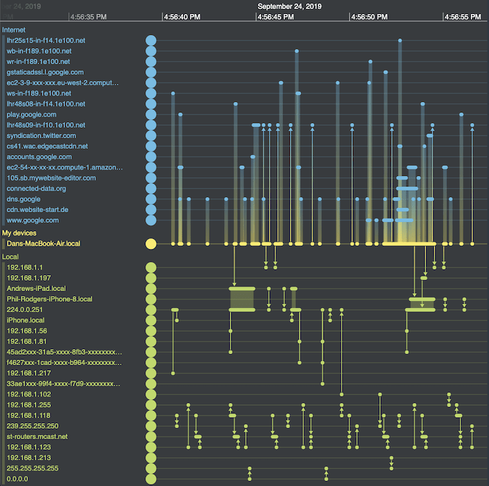
When performing an investigation, the cyber analyst wants to understand the who, where, what, how and when of an incident. Graph visualization helps with all of those dimensions, but there are specific techniques to make sense of the ‘when’.
Most cyber data has some kind of time element to it. Here we’re looking at the spread of a piece of malware over time. By ‘playing back’ this information through time, we immediately understand its behavior in a way that we could never achieve by reviewing a set of security logs.
We can go even deeper with our malware investigation tool. Building a timeline visualization directly from your data lets you analyze precisely when malware events occurred and how they unfolded.
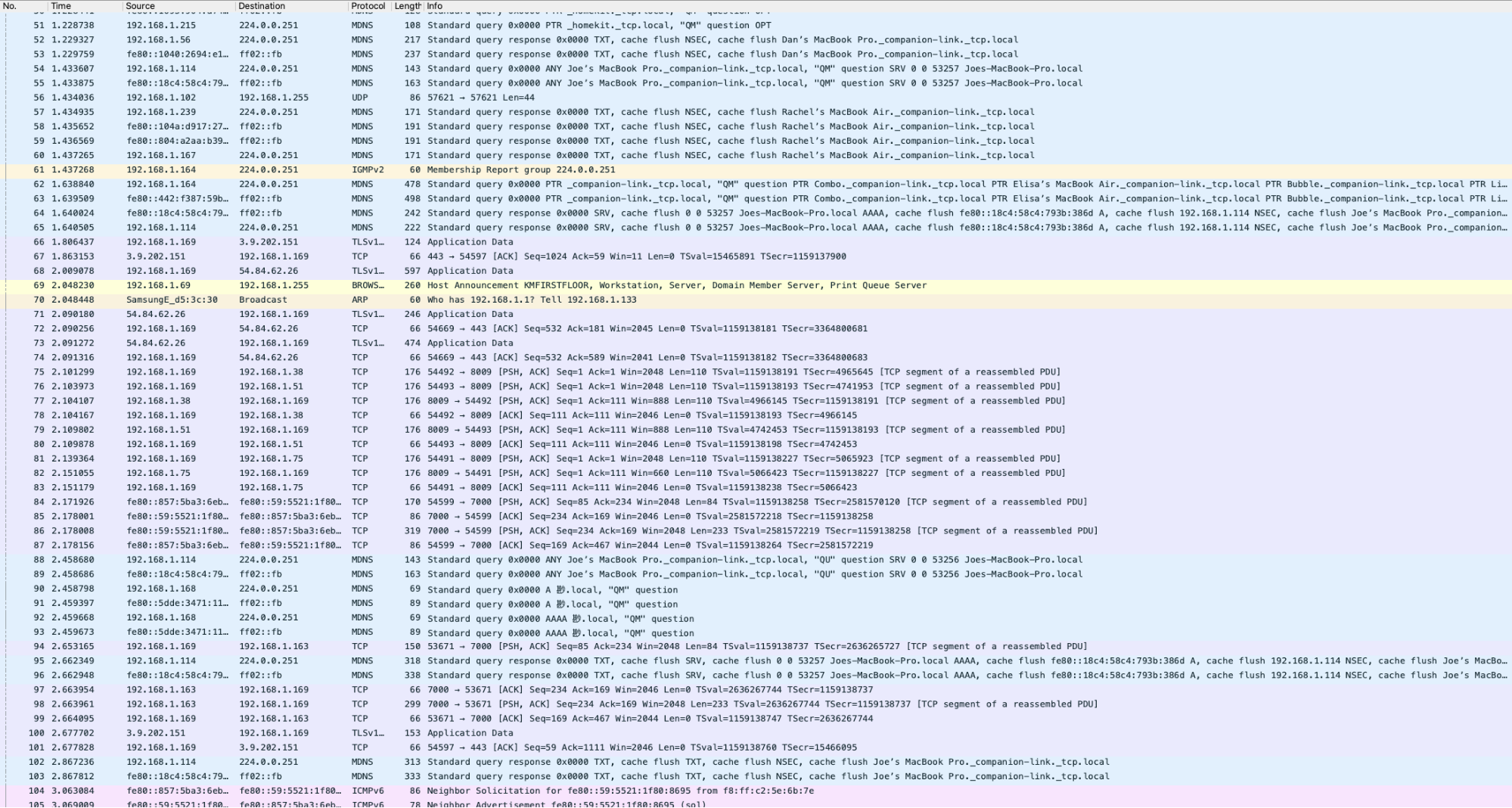
Here’s a timeline visualization investigating network traffic and possible malware attacks built using KronoGraph – our timeline investigation toolkit. It shows packets sent from a laptop to other websites, revealing a forensically detailed sequence of events.
If we integrate KronoGraph with our graph visualization toolkits, we combine timeline analysis with network analysis, enhancing our malware investigation tools with two powerful views of the same data.
In order to understand cyber security threats, you need to visualize them. The data simply isn’t user-friendly without visualization.
You can learn more about the visualizations shared in this post, and some extra examples not covered, in my webinar data visualization techniques for cyber security analysts.
If you’d like to try them yourself, or have your own cyber security data to visualize, request a free trial account for our graph visualization toolkits.
Visualize your data! Request full access to our SDKs, demos and live-coding playgrounds.
This post was originally published some time ago. It’s still popular, so we’ve updated it with fresh content to keep it useful and relevant.
Registered in England and Wales with Company Number 07625370 | VAT Number 113 1740 61
6-8 Hills Road, Cambridge, CB2 1JP. All material © Cambridge Intelligence .
Privacy Policy | Security Framework


