FREE: Start your KronoGraph trial today
Request full access to our KronoGraph SDK, demos and live-coding playground
Crime investigations demand analysis of huge amounts of complex data – forensic evidence, geographic locations, details of suspects, victims and witnesses, reports by law enforcement officers, CCTV footage and more. The best way to make sense of this data is to visualize it all in one place in a fully interactive way. In this blog post, we use crime data visualization to demonstrate how best to display multiple sources of information about events that took place over disparate time periods in a real UK Counter Terrorism Police investigation.
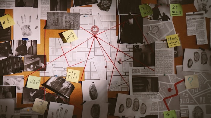
We’re all familiar with how criminal investigations are depicted in the movies or on TV. Detectives create an evidence board of information from different sources, marking connections with string. There’s usually a time-based element too, so the order of events is clear.
In reality, investigators and law enforcement analysts do rely on visualizing data to help them understand criminal activity, but in a much more efficient and effective way.
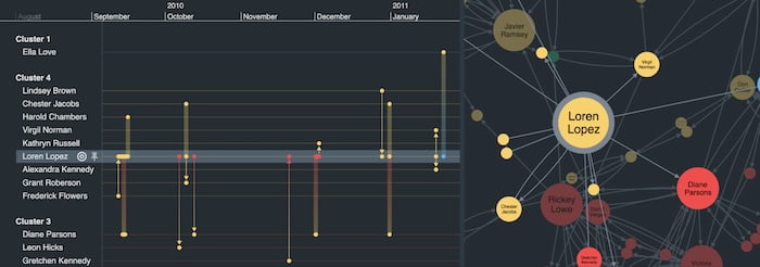
Graph and timeline visualization apps turn huge datasets from various sources into interactive networks and timelines of connected events. The interactivity is key here: investigators can dig into individual events to find out more, or zoom out to get a complete overview of the entire dataset. Once they’ve revealed insights, they can export high-res views to share with those who need to access and understand the data.
Our time-based crime data visualization uses KronoGraph, our timeline analytics tool, to show how flexible timescales compress time when it isn’t important, and expand time when the detail really matters. To help us do this, we’ll focus on events around the 2018 poisoning of Sergei and Yulia Skripal.
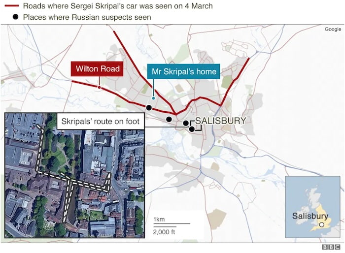
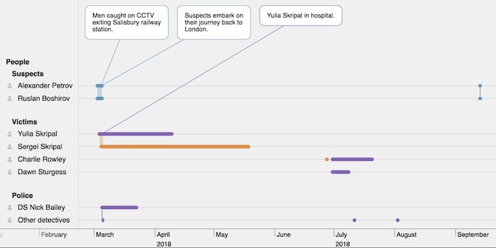
On 4th March 2018, former Russian military officer and British double agent Sergei Skripal and his daughter Yulia were found unconscious on a public bench in Salisbury, south west England. They’d been poisoned with Novichok, a nerve agent later discovered on Sergei’s front door. Both spent weeks in a critical condition in hospital, as did police officer Nick Bailey who’d visited Sergei’s house as part of the investigation.
On 30th June 2018 in nearby Amesbury, two British citizens – Charlie Rowley and Dawn Sturgess – were also poisoned by Novichok, after Dawn sprayed what she believed to be perfume from a bottle Charlie had found in a public litter bin. Rowley remained in a critical condition for weeks, but Sturgess tragically died.
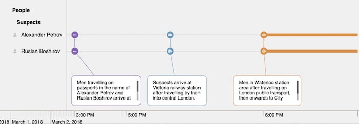
After analyzing CCTV, border entry data and witness reports, investigators identified two Russian nationals – Alexander Petrov and Rusian Boshirov – suspected of carrying out the nerve agent attack on Sergei Skripal, then discarding the Novichok’s container, later found by Rowley. They left the UK shortly after Sergei and Yulia’s murder attempt, and later claimed on Russian TV that they had nothing to do with the poisonings, and were merely sightseeing in Salisbury at the time.
You can imagine the challenge of gathering data to analyze every individual event in this investigation’s timeline. Our crime data visualization focuses on 6 months of events that connect suspects, victims and police officers to give a clearer understanding of what happened when. Those events include:
Events in a criminal investigation often follow an irregular cadence. There could be bursts of activity over a few minutes followed by long stretches of inactivity, resulting in an uneven spread of data across the timeline. Investigators need a way to examine events that occurred weeks, months or even years later alongside those earlier bursts.
In our crime data visualization, notice how multiple events at the start of March appear as summarized connections between suspects Petrov and Boshirov. But investigators want the ability to distinguish between individual events that occurred in quick succession, and have the space to add further visual indicators to them, such as annotations or font icons. At the same time, they also want to visualize what happened on this timeline much later in September.
KronoGraph achieves this using a nonlinear time scale. With this scale turned on, events are spaced evenly across the timeline. There are no event summaries: each event stands out in its own right, while the event that happened much later is still visible.
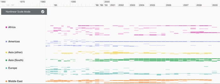
For longer data periods, you’d also see the variation in the nonlinear time scale more clearly. In this example of global terrorist activity spanning almost 60 years, look at how much space is taken up by data for the years between 2005-08, compared with the years between 1980-85. This shows at a glance that there were significantly more terrorist attacks in the later time range. KronoGraph handles this automatically by giving those busier years more space across the timeline.
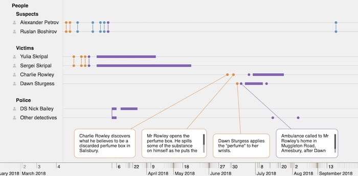
The nonlinear time scale makes the best use of available screen space, so users can maximize real estate for the most important moments in data without using up space on quiet areas. This also makes more room on the timeline for greater details about key events. You’ll have noticed the annotations above and below the timeline with links to specific events. This adds important context to the data, bringing out the narrative when it matters.
In this crime data visualization, annotations formed part of the original dataset, so they’re brought into the timeline automatically. We’ve configured KronoGraph so users can close them to focus on other annotations or different parts of the timeline, but they can’t edit, add or delete annotations, to prevent tampering with the investigator’s source of truth.
We’ve looked at the ‘who’ and ‘when’ questions with our event timeline already, and annotations have helped us to answer the ‘what’ question. Now we can investigate the ‘where’ in more detail.
We can bring in additional data on the prime locations associated with these events: London, Salisbury and Amesbury.
Again, by interacting with the timeline and focusing on our suspects’ activities, we get a clear idea of their movements shortly before the poisoning happened.
A non-linear time scale helps users manage their screen real estate efficiently without losing sight of the entire dataset. It puts the focus firmly on the most important aspect of an investigation: the data itself and how best to present it over time.
Investigators can then export their crime data visualizations – complete with annotations – as reports to share with colleagues, stakeholders, or anyone else who needs easy, understandable access to the details of an investigation.
If you’re keen to see your own data visualized as a timeline, request a free trial.
Request full access to our KronoGraph SDK, demos and live-coding playground
Registered in England and Wales with Company Number 07625370 | VAT Number 113 1740 61
6-8 Hills Road, Cambridge, CB2 1JP. All material © Cambridge Intelligence .
Privacy Policy | Security Framework


