FREE: Visualizing cyber security threats
The ultimate guide to keeping networks, systems and IT infrastructure safe using data visualization.
The cyber security software industry is a crowded space. Have you ever walked the exhibition floor of a conference like RSA? If so, you’ll know there are hundreds of new and existing products, offering unique cyber security analysis tools in an attempt to get noticed.
Although it’s never a good idea to put visual gimmicks over genuine insight, a successful cyber product does need to stand out from the crowd.
The good news is that you can have the best of both worlds – our toolkits are entirely customizable plus they make it easy to craft insightful, interactive data visualizations without coding from scratch.
Using examples from the cyber security world, this blog focuses on six customization areas available in KeyLines and ReGraph to bring your cyber data to life:
After we’ve seen them in action, we’ll also take a quick look at how our latest toolkit, KronoGraph, gives users of cyber security analysis tools the power to drive investigations with effective incident response timeline analysis.
The humble dendrogram is a staple of many cyber applications because of the way it organizes complex relationships into intuitive tree structures. Our recently-introduced curved links feature, coupled with a sequential layout and a simple, understated ‘glyph node’, let you generate a classic dendrogram with a couple of simple styling properties in your data.
Here’s an extract of the KeyLines API presented using this technique.
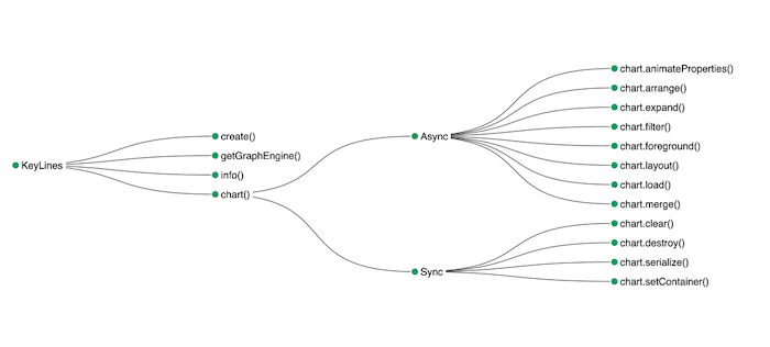
It’s effective and adds clarity to the data. It’s simple too – you can get one up and running with KeyLines or ReGraph in minutes. But would it stand out in the exhibition hall at RSA? We can do better!
Let’s build on the dendrogram idea by adding:
It’s a few more lines of code, but delivers serious impact.
It’s important for the cyber industry to keep evolving and learning how to stay at least one step ahead of cyber criminals. Part of this learning process involves creating a common language for describing a cyber crime and breaking it down into its constituent parts.
One example of this is the Mitre ATT&CK framework. This useful knowledge base outlines the tactics and techniques used by cyber threat actors.
The ultimate guide to keeping networks, systems and IT infrastructure safe using data visualization.
For this blog I built a simple visual device to show analysts how an attack fits into the context of the ATT&CK framework.
I start by creating nodes for each of the ATT&CK techniques, and building a custom layout which arranges them by the framework’s methodology.
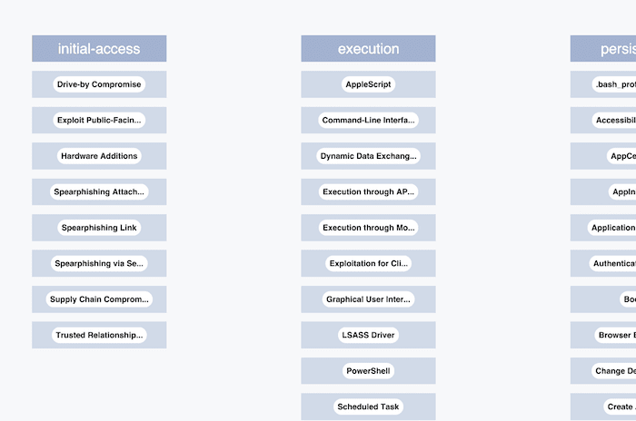
I’ve chosen a muted, less distracting color scheme for these nodes because the framework will give background context to a specific cyber attack of interest.
Now I’ll choose a bold color palette which has consistent saturation and value but varies its hue from yellow to red as you move from left to right across the framework columns. I can highlight particular techniques used by an adversary of interest, using this color scheme to make them stand out. Again, curved links with a gradient make the visualization come alive.
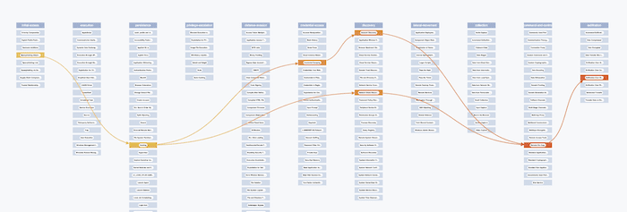
Now for the wow factor. Adding animation gives users the ability to toggle between a concise network representation of a particular attack and a contextualized diagram of how it fits into the ATT&CK framework.
I’ve animated this in multiple steps: first, curve the links and run the custom layout on the chosen subset of data. Then fade in the full ATT&CK matrix. Chaining animations together in this way is a powerful technique to add memorable impact without confusing users with too much simultaneous movement.
Check out our webinar on building high-performance, beautiful and insightful cyber security dataviz tools
Finally, let’s apply all these cyber security analysis tools to a real world example.
Earlier this year, cyber security solutions provider, Binary Defense, published this article on how the Emotet trojan can attack and traverse wi-fi networks.
I wanted to see how easy it is to use KeyLines to produce a similar visualization. Here’s what I came up with, using:
The result is elegant and slick. It shows you the full range of styling flexibility our toolkits can offer.
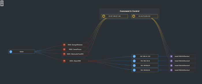
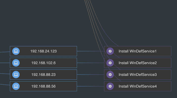
Here’s a closer look:
Every cyber security incident happens at a point in time. Identifying when they occurred and how they’re connected is key to incident response analysis.
KronoGraph, our timeline visualization SDK, is an essential tool for cyber analysts who need to carry out full forensic analysis of how a security breach unfolded. This timeline visualization example takes a deep dive into the chronology of events to reveal which websites were accessed by Dan’s MacBook Air.
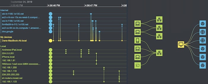
For an even more powerful tool, you can integrate KronoGraph with our graph visualization toolkits to carry out network analysis and timeline analysis at the same time. The network view – complete with the customizations we’ve talked about in this post – lets you explore data connections, while the timelines bring sequences of events to life.
We’d love to rise to the challenge of visualizing anything your product design team can throw at us!
You can try KeyLines and ReGraph yourself. Our experts are on hand to support your evaluation and help you turn your concepts into eye-catching reality.
Registered in England and Wales with Company Number 07625370 | VAT Number 113 1740 61
6-8 Hills Road, Cambridge, CB2 1JP. All material © Cambridge Intelligence .
Privacy Policy | Security Framework


