In our final graph visualization toolkits update this year (and this decade), we’ve added further improvements to the time bar, and delivered greater layout packing options.
We’ve also given ReGraph developers their very own playground, and KeyLines developers a demo facelift.
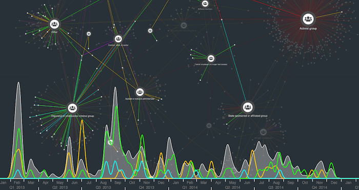
Time bar: area plot selection lines
In our last update, we introduced histogram bar area plots for a more fluid display of what’s happening in your data. This time, we’ve given area plot selection lines the smooth treatment too.
Selection lines show values of items selected on the chart, so analysts can instantly identify and compare patterns of activity.
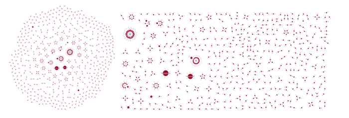
Packing options
The packing algorithm handles networks containing groups of disconnected nodes. It arranges these groups in just the right place so they don’t overlap or appear too far apart.
Circular and rectangular packing options were always available in organic layout. Now you can achieve the look you want by using packing in standard, structural, radial and hierarchy layouts too.
The ReGraph playground
We’re excited to launch ReGraph’s new live-coding environment designed for rapid prototyping and sharing code more easily.
With the ReGraph Playground, you can play around with any of the code examples on the ReGraph SDK site. Once you’re ready to show colleagues your ideas, just share the hyperlink.
KeyLines makeover
You’ll notice a fresh new look to our KeyLines SDK, particularly the demo pages. The interactive chart controls, viewable source code and useful descriptions are still there, but we’ve simplified the page design so it’s easier to focus on the resources you’re interested in.
Do you like the new style? If you can spare a minute, please let us know what you think.
Ready to get started?
The best way to find out if KeyLines or ReGraph is right for your visualization project is to give them a go yourself.
Simply request a free trial today or get in touch so we can help bring your connected data to life.


