FREE: Start your trial today
Visualize your data! Request full access to our SDKs, demos and live-coding playgrounds.
As AI hype stabilizes, we’re seeing human-AI workflows adopted across domains where the volume of data makes human-only analysis impractical. Machine learning models can surface patterns in millions of transactions, flag anomalies in patient records, or identify supply chain vulnerabilities at speeds no team can match. But when those anomalies point to fraud, when those patient flags suggest misdiagnosis, when those vulnerabilities could halt production – the decision of what to do next can’t be delegated to an algorithm. Business-critical decisions still require human judgment, not because AI lacks capability, but because humans bear the accountability.
This is especially true in domains like fraud detection, cybersecurity and intelligence. If analysts can’t see how an AI system reached its conclusions, or if they struggle to validate its outputs, adoption slows and trust breaks down. In regulated environments especially, opaque “black box” insights are not enough.
That’s why explainability and transparency matter as much as accuracy. Analysts need to understand what AI is doing, test its outputs, and stay confident that they remain in control.
Dashboards, audit trails, and visualization are examples of tools that aim to make AI more explainable. Graph visualization is especially powerful because it reveals the connections and context behind machine outputs. Below, we’ll look at how visualization strengthens confidence in AI applications – from making automated processes transparent to helping security and fraud teams reduce alert fatigue.
Today’s investigation platforms might benefit from AI to support automated processes like entity resolution and data cleansing. These steps are essential for preparing inputs at scale, but they’re often hidden from view.
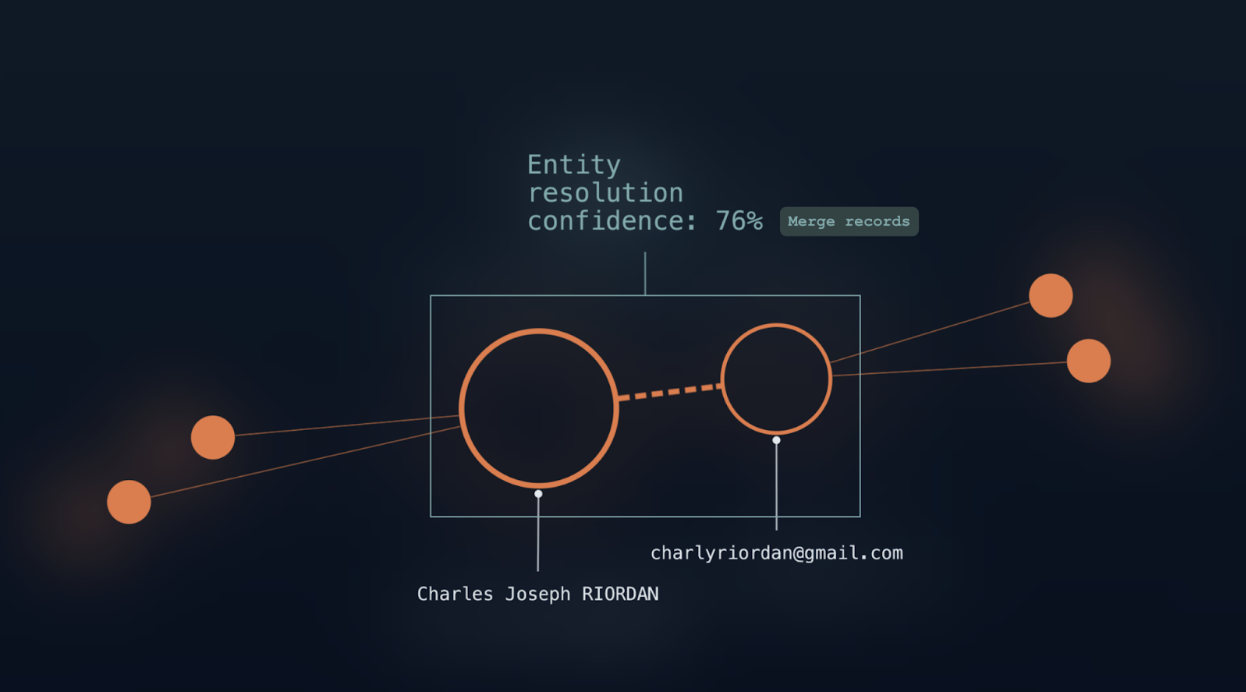
For example, records can be merged or anomalies can be corrected automatically. When this happens without oversight, analysts can be left wondering whether they can trust what the system is feeding its models.
That trust is fragile. A single, incorrect merge – combining two people who share a name but have no real connection, for example – can undermine confidence in the entire system. This is where graph visualization adds value.
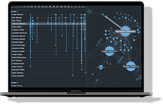
Instead of leaving automated data preparation as a black box, graph visualization presents its outcomes in a form analysts can interrogate. They can see which entities have been linked, explore where confidence levels are higher or lower, and spot anomalies that may need correction. Instead of taking the system’s word for it, they gain the ability to validate results and to step in when adjustments are needed.
This approach reflects a “human-in-the-loop” model where automation handles scale and speed, but people have visibility and remain in control. For fraud investigators, that might mean reviewing how customer identities are merged to reduce false positives. In intelligence analysis, it might involve validating how different data sources are linked before they feed into a larger model. In both cases, graph visualization provides the clarity analysts need to trust automated recommendations and confidently act on AI-driven insights.
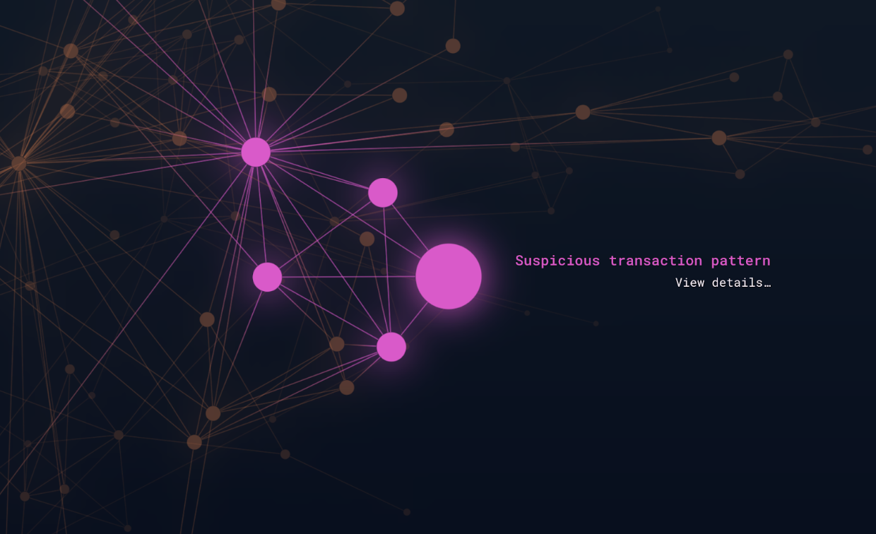
Machine learning models excel at spotting anomalies and classifying patterns across huge datasets. In fraud detection, for example, they can highlight unusual transaction flows and in national security, they can flag atypical communication patterns. But in highly regulated environments, flagging a suspicious pattern isn’t sufficient: you need to be able to explain it. Analysts must be able to trace the reasoning and present evidence that stands up to scrutiny.
A machine may be fast at raising alerts, but graph visualization is what makes those alerts defensible. Graph views allow investigators to follow the trail step-by-step, mapping the entities involved, tracing how they connect, and showing how a flagged pattern emerged. A workflow like this begins with a system-generated signal, but becomes a narrative that analysts can investigate and communicate.
This transparency is critical in compliance-heavy sectors like financial services. For example, an investigator working on an anti-money laundering (AML) case might need to show how multiple shell companies ultimately link back to the same beneficiary. A model may have flagged the structure as unusual, but it’s graph visualization that makes the story explainable – whether to regulators, auditors, or even in court.
By combining AI’s speed at detecting anomalies with graph visualization’s ability to put them in context, investigations become faster, clearer, and easier to justify. Instead of relying on unexplained alerts, analysts can show why a pattern is significant and how it should be addressed.
AI techniques like natural language processing (NLP) and entity or relationship extraction are powerful time-savers. They can scan millions of documents, highlight key names, places, and organizations, and build connections that would take human teams months to process manually. For analysts, these capabilities promise huge efficiency gains, but automation alone isn’t enough.
Algorithms sometimes mislabel entities, miss context, or draw connections that don’t make sense to subject-matter experts. If analysts can’t review and validate these outputs, trust in the system breaks down and workflows fail to leverage the respective capabilities of machines and humans.
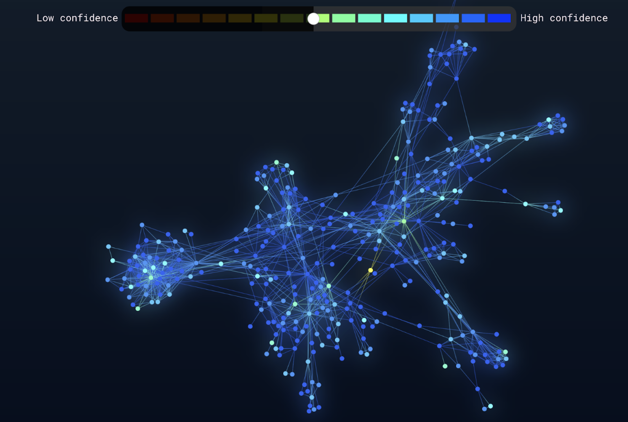
Graph visualization instills confidence by making AI-extracted entities and relationships interactive. Instead of reading through tables or lists, analysts can style and filter a graph view based on confidence levels – seeing how entities connect, drilling into details, and correcting mistakes as they appear. For example, a network view of extracted locations from intelligence reports can reveal whether AI has misgrouped incidents or overlooked a crucial link between events.
This again reflects a human-in-the-loop approach, but with a focus on interpretation rather than correction. Automation accelerates the heavy lifting of scanning documents, while analysts decode what the results actually mean. For an intelligence team, that might involve reviewing whether events linked to the same location point to a genuine threat. In compliance, it could mean assessing whether extracted contract clauses are material to an investigation. Graph visualization gives analysts the final word – turning raw extractions into insight that can be trusted.
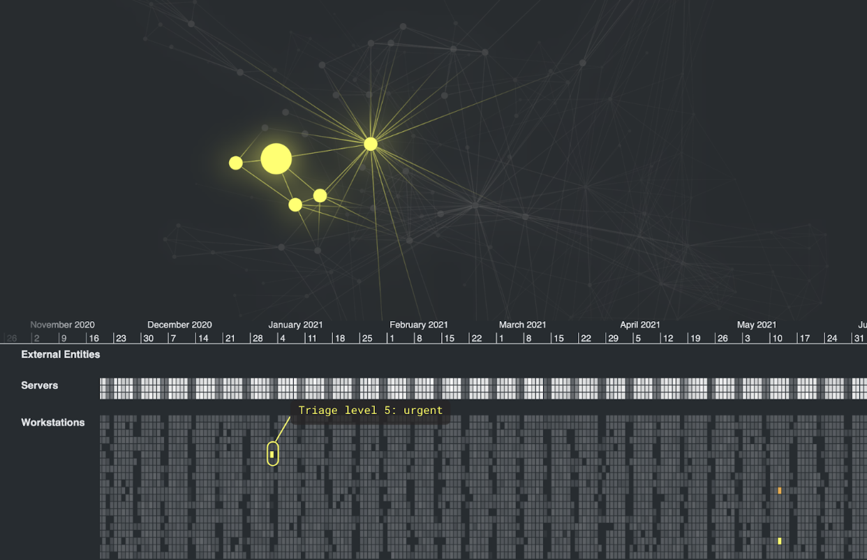
One of the biggest challenges in cybersecurity and security operations centers (SOCs) is alert fatigue. AI and machine learning systems can generate thousands of alerts a day, flagging anomalies across networks, endpoints, and user behavior. But with so many warnings, many of them false-positives or low-priority signals, analysts struggle to triage and identify which ones truly matter. Critical threats risk being missed in the noise.
Cybersecurity companies walk a difficult line between overwhelming their end users, and over-simplifying the problem – a single alert rarely tells the whole story. Graph visualization shows how warnings fit together, whether they point to an isolated anomaly or the first stage of a coordinated attack. A graph view of the network might reveal that dozens of seemingly separate alerts all trace back to a single compromised device. A timeline view could show how alerts unfold in sequence, helping analysts distinguish between routine background activity from a genuine incident in progress.
By making relationships visible, graph visualization turns overwhelming alert volumes into interpretable patterns and helps analysts prioritize, to focus on the incidents that matter and respond quickly to real threats.
Across fraud detection, cybersecurity, and intelligence, one theme is clear: AI only delivers value when people can trust it. Visualization plays a critical role in making that trust possible. It helps analysts interpret outputs, validate recommendations, and keep control of decisions even as AI accelerates their work.
AI on its own can flag anomalies, classify patterns, and surface recommendations, but without context, those outputs are often hard to trust or act upon. Graph visualization provides the missing piece: it turns AI’s speed and scale into insights that are transparent, interpretable, and ready for decision-making.
It’s the combination of AI and graph visualization that makes a cohesive human-AI workflow possible. Analysts benefit from the scale of automation while retaining the ability to validate, investigate, and explain results. For organizations working in high-stakes areas like fraud detection, cybersecurity, and intelligence, that combination builds into a trusted, day-to-day decision support system.
Visualize your data! Request full access to our SDKs, demos and live-coding playgrounds.
Registered in England and Wales with Company Number 07625370 | VAT Number 113 1740 61
6-8 Hills Road, Cambridge, CB2 1JP. All material © Cambridge Intelligence .
Privacy Policy | Security Framework


