Annotations: Bring out the story in your data
Check out this short video to see data storytelling in action.
At every stage of an investigation workflow, the analysts need to understand the underlying story – or narrative – of the data they’re working with. Interactive data visualization has always been an essential tool for this, presenting information in a way that makes it easier to reveal hidden threats, unusual patterns and significant outliers.
Once an analyst understands that data narrative, they need to explain it to teammates, stakeholders and others. That’s not always easy, especially if they’re working with data at scale, tackling a vast threat landscape, or trying to make sense of complex AI technology output. How do you make the underlying story of thousands of nodes and links accessible to a wider audience? And how do you do it in a way that fits with your team’s investigation workflow?
Introducing the annotations layer.
This layer, available across all three data visualization toolkits, gives analysts and investigators the power to add the data’s narrative to the chart itself, making it easier to share findings, contribute expertise and draw attention to what’s important. Presenting your data’s narrative as annotations brings the clarity, speed, and context collaborators and decision-makers need at every stage of an investigation, from the initial alert to the final recommendation.
Let’s see how annotations make your visual data analysis tool indispensable throughout an analyst’s workflow, from detection to investigation and prevention stages.
In complex threat intelligence investigations, analysts and investigators may spend months or years managing terabytes of data from many different sources. It’s not something they can do manually. They rely on alert systems – increasingly powered by AI-powered machine learning – to spot patterns, reveal actionable insights and make recommendations.
An auto-generated alert is great at flagging when an incident happened, but doesn’t necessarily explain why it happened, or what it means. But when the alert is enhanced with a text-based annotation, it gives richer context. The result is a deeper understanding of the data, which helps to set priorities and make decisions faster.
This example is from the cybersecurity world, but the same principles apply to any investigation using an alert system. AI output overlays the information on a cloud network infrastructure graph – built using the KeyLines SDK – to create timely and accurate alerts.
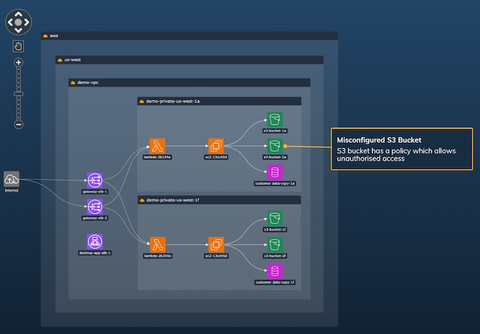
A suspicious event has automatically triggered an alert and accompanying annotation about a misconfigured bucket in part of the network. Through intuitive interactions, the data visualization immediately reveals the context and source of the problem.
Machine learning technology, combined with annotations, can also flag unusual patterns of behavior. This timeline visualization – built using the KronoGraph SDK – shows data from an insider trading investigation at a fictitious organization called MegaCorp. Two automatically-generated annotations draw attention to share transactions before two significant profit announcements. Is this insider trading?
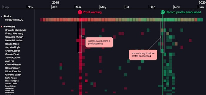
The investigation now focuses on those individuals who made suspiciously-timed share trades. What do Mertie Wintheiser’s activities tell us? Did they ditch shares before bad news would cause a drop in their value? Or buy them at a lower price to sell after the record profits announcement?
We can add new insights to both graph and timeline visualizations as annotations, share those additional explanations with the team, and take snapshots for reports. We’ll focus on collaboration techniques next.
When the workflow moves to the investigation stage, annotations are just as effective. Teams are no longer fishing around for suspicious patterns – they’re focused on activities that have already been identified, and digging deeper into the narrative.
Collaboration and clear communication is key: the priority is to keep team members and stakeholders aligned and informed about the latest insights.
Annotations are an effective way to handle collaboration between analysts on graph-based investigations. They elevate an investigation workflow and increase the efficiency and visibility of information sharing.
This example shows how a team uses their graph visualization and analysis tool at the investigation stage of their workflow. They monitor activity on Facebook and X social media accounts to reveal patterns of behavior between persons of interest.
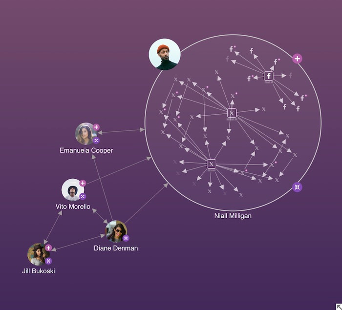
Analysts often work within a wider team, and each brings unique expertise to the investigation. The insights they reveal were typically shared in reports or comments external to the visualization, so collaborators would have to go outside the visualization application to find them. But not anymore.
Analysts and investigators can now record insights at the point of need, using annotations or long-form text additions. These on-chart, interactive elements draw attention to the most interesting parts of the network.
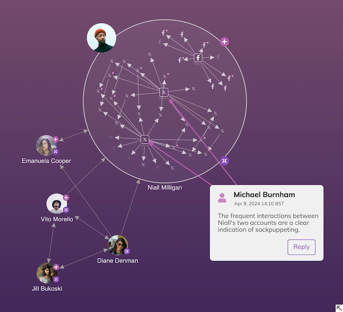
In busy investigations with multiple contributors, you’ll want to make sure annotations don’t crowd the visualization or overwhelm chart users. For a better experience, users can show individual insights when they need them, or hide them when they don’t. They can even take this one step further by turning off the entire annotations layer and work on a ‘graph only’ visualization.
The workflow’s prevention stage relies on understanding new information to inform future investigations and make system, process and infrastructure changes that reduce future risks. For automated tools, it’s an opportunity to train and calibrate existing models to spot patterns, trends and outliers.
Annotations aren’t just for those in the team with access to data visualization tools. A complete investigation workflow means sharing and understanding data narratives more widely. That narrative is important for external materials, such as case notes, legal evidence, compliance documentation, reports to stakeholders and more.
You can export annotations as part of timeline and graph visualizations – as high-resolution images – ready to share with anyone who needs to see them.
This example application analyzes corporate fraud. The team has been asked to keep stakeholders updated as the investigation develops, so they can share best practice with others. The graph visualization is the primary resource for managing the entire investigation process, streamlining the workflow to speed us toward actionable insights.
Earlier workflow stages identified Brooke Fields as a key suspect, so the graph visualization centers around them, and the network of companies they’re associated with. From here, we can examine other companies and directors connected to the person of interest, and spot suspicious patterns.
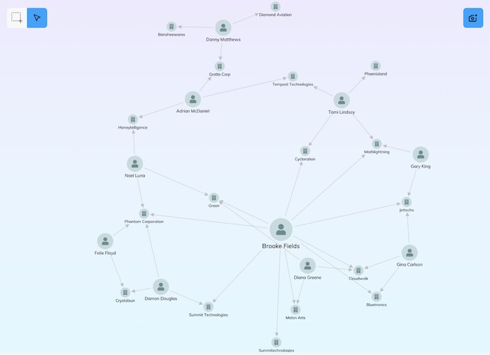
A colleague analyzing Securities and Exchange Commission (SEC) data finds out that our suspect is connected to a dissolved company. They use an annotation to add this to the chart.
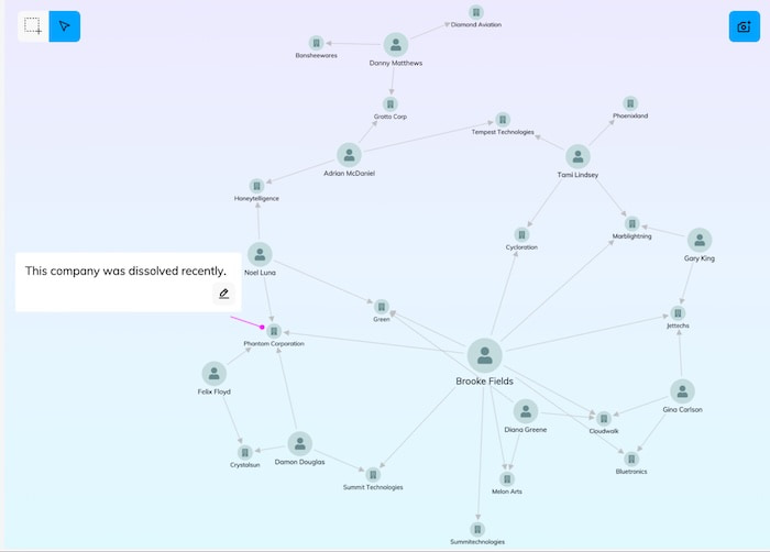
Automatic annotations, such as AI-driven output, might need human intervention before they can be shared as facts. AI output isn’t always easy to understand, so the team can use annotations to articulate and make them explainable.
As we carry out analysis, we add important information to the chart as annotations, and make our insight instantly available to chart collaborators. We spot that another individual, Diana Greene, has worked for three of the same companies as Brooke Fields.
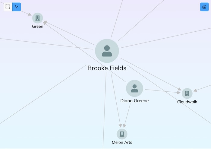
This is worth recording, so we create an annotation.
We’re ready to share these latest findings with stakeholders by generating a snapshot for a new report.
The snapshot is ready to download right away, and add to the stakeholder report. As the investigation develops, it’s reloaded so that the team can add further insights.
The annotations layer marks a step change in how investigators analyze, collaborate and share the story of their connected data. It brings easy data storytelling to graph and timeline visualizations, and makes your most complex information accessible, understandable and valuable.
If you’re new to data visualization, now’s a great time to get started. Request a free trial today.