The basic aim of graph visualization is to help users understand their connected data and find actionable insight. It’s the most effective way to bring your data to life, revealing patterns and connections that would be difficult to find in millions of rows of raw data. A good automatic graph layout lets even the most inexperienced user tell the story behind their data, before they start their detailed analysis. That story will evolve as they deepen their exploration, but knowing where to start saves time and makes their job much easier.
Let’s take a tour of the different automatic graph layout options our customers use to make sense of their complex connected data. We’ll see how they work, and when they’re most useful. We’ll also take a more detailed “under the hood” look at our powerful Organic layout, to discover how it makes visualizations easy to understand and beautiful to look at.
Force-directed layouts
When dealing with huge, complex networks of connected data, you need an automatic graph layout that can reveal the underlying structure of every connected component.
Force-directed layouts are great for this. They run physical simulations on the network to minimize overlaps in the graph, distributing nodes and links, and organizing items so that links are of a similar length. At the same time, they identify connected subnetworks and carefully position those too, making it easy to compare clusters of nodes in different parts of the network.
They’re a reliable all-rounder for any type or size of dataset, because the focus is on finding patterns and symmetries. But there’s always a trade-off between speed and quality. The result looks great, but you have to wait for the algorithm to find the ‘ideal’ result and stop iterating.
How does a force-directed layout work?
There are three physical forces involved in positioning the nodes and links in force-directed organic layout:- Repulsion
- Springs
- Network energy
In the model, nodes are treated like charged particles that produce a repulsive force that moves them apart.
This force is inversely proportional to the square of the distance between them – so if they are close together, a strong force moves them apart, but if they are far apart then it only has a weak effect.
Next, the springs ‘pull’ the nodes closer. Each spring has a certain natural length (controlled by the tightness layout option). If the spring is ‘stretched’, it will pull the node closer to the link end. If the spring is loose, the node is pushed away from the link end.
Finally, we add some energy to the system by setting each node to move in a random direction.
The layout simulates this system until the nodes settle in a stable configuration. It happens fast, so this animation shows us repeatedly rerunning the organic layout to give you some idea about performance.
Organic layout
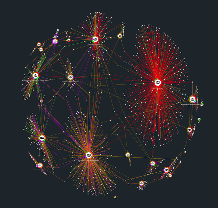
Our organic layout is our solution to the “speed vs quality” force-directed challenge. It’s great for any network type, and it’s particularly good for larger datasets.
When a user first opens a visualization, they usually want a clear overview of the dataset. They want to see structures and patterns that guide them to the specific nodes and clusters they need to investigate further.
The organic layout uses the principles of force-directed layouts to make these underlying structures easy to spot, by:
- reducing node and link overlap
- minimizing white space
- spacing out different components, to expose clusters
The organic layout automatically adapts when items are added, changed or removed from the chart. We’ve spent a lot of effort carefully balancing the physics, so nodes move as much as they need to and no more. That means it’s easier for users to spot network changes over time without losing their mental map of where nodes exist.
What about singleton nodes?
Good question. Singleton nodes have repulsive force and energy, but no springs – so surely they simply fly from the chart?
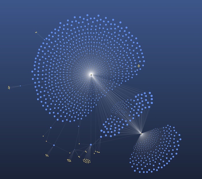
The organic layout algorithm considers each group of disconnected nodes separately and runs the algorithm on each group in isolation. A packing algorithm then takes all the disconnected groups and packs them together on the chart without leaving any large gaps.
That results in charts like this:
Notice how multiple components are arranged in a circular pattern with larger components at the center – there’s the “organic” feel that gives the layout its name.
How does organic layout deal with dynamic networks?
The organic layout can adapt automatically to items added, changed or removed from the chart. It uses less energy than a full layout, so nodes move as much as they need to and no more.
That means it’s easier to spot network changes over time without users losing their mental map of where nodes exist:
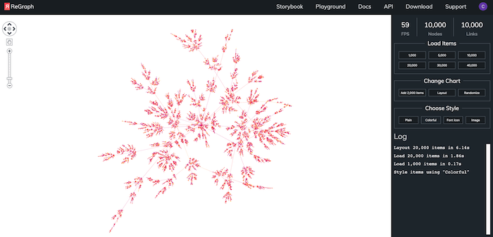
What about performance?
Optimal performance has driven every aspect of organic layout development. It’s around 5-10 times faster than our old standard layout, with the most impressive performance improvements for visualizations featuring over 1,000 nodes and links.
Typically, you’d need to run your automatic graph layout on a back-end to get this level of performance. Our toolkits make it an attractive, interactive front-end feature.
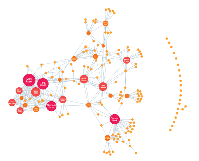
Structural layout
This is our other force-directed layout. Instead of running the simulation of the three forces (repulsion, springs and energy) straight off, structural layout first groups nodes together according to the structure of the network. Once the nodes connected with the same set of nodes are grouped together, the force-directed algorithm runs operating on the groups instead of on individual nodes.
This positions each group of structurally similar nodes together, which reveals the graph’s composition. It’s a great way to find node communities:
Our other layouts
Force-directed layouts aren’t the only option in our graph visualization toolkits. They do a great job of revealing the overall network shape, but when you need specific insight into hierarchies, clusters or other structures in your data, you’ll find our other layouts more helpful.
Sequential layout
This automatic graph layout is designed to display data that contains a clear sequence of distinct levels of nodes, or where information flows from one level to another.
Sequential layout examines link directions across the network and calculates which nodes belong to what level automatically. The biggest challenge is to minimize the number of crossed links between nodes at different levels. To do this, the algorithm places each node at the average position of its neighbors in adjacent levels, and then it swaps nodes in each level to reduce the number of link crossings.
If there are links between nodes in the same adjacent level, a third stage called ‘offsetting’ curves links above or below the nodes in between the connected nodes to avoid drawing behind them.
Once the nodes have been ordered in sequence, they’re distributed within each level to get the best-looking result for your data. You can choose to position them relative to each other based on connecting links, at regular intervals for a more symmetrical view, or stretched across the available width for networks with a lot of diagrammatic structure.
The stacking option makes it easy to visualize broader structures in sequential layouts. Stacking creates compact views of each tier at a much more readable zoom level, and saves space by pulling neighboring nodes into neat grids. Find out more about the stacking function
Radial layout
The radial layout offers another way to structure layers of data. While sequential layout places nodes in distinct tiers, radial layout places layers in concentric rings, with the hierarchy’s ‘top’ node at the center.
This can be a great way to show dependency chains between generations of nodes. It’s particularly useful if your data contains many child nodes for each parent.
Lens layout
Here’s another automatic graph layout that uses a circular pattern, but this time nodes are arranged according to connection density. Highly-connected nodes are positioned at the center of the network, and nodes with fewer connections are pushed to the edges.
The result is an attractive ‘fisheye’ lens effect that’s great for discovering the key nodes in large networks.
Visualize your own connected data
If you have connected data and would like to visualize it for yourself, simply register for a free trial


