FREE: Start your KronoGraph trial today
Request full access to our KronoGraph SDK, demos and live-coding playground
In this blog post, I’ll show how effective log data visualization improves your enterprise observability workflows. You’ll see how KronoGraph, our timeline visualization SDK, can work alongside your log table, or replace it entirely.
The DevOps engineers, IT teams and sysadmins who manage an organization’s log data have a tough job on their hands. Every application, node, container or component can pump out millions of logs on a daily basis. And you can’t ignore them, because there could be important information inside.
Observability platforms manage the issue by aggregating enterprise logs, monitoring systems and reporting performance metrics in a single dashboard. They offer AI-powered, intelligent alerting, rapid data collection from 3rd party systems, plus support for different persistence solutions and cloud platforms.
Yet many observability platforms’ data log visualization components aren’t up to scratch. How easy is it to spot patterns in error logs? How quickly can you get to a problem’s root cause? An infinitely-paginated log table won’t help. Neither will a time series or bar chart which only shows aggregated counts of logs.
The good news is that there are visualization tools and techniques that deliver a much better user experience.
Timeline visualization can look at hours of data across millions of logs from hundreds of entities, instantly revealing problem entities and supporting root cause analysis.
When you’re investigating an incident, you rarely know which entity is responsible for what errors. You may need to look into the details of many logs, one at a time, just to discover fundamental things like which entity generated the log. It’s painstaking and time consuming work, particularly when you need to quickly figure out when issues occurred across multiple entities so you can get operations back on track.
With KronoGraph log data visualization, observing log sources becomes instantaneous.
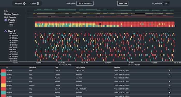
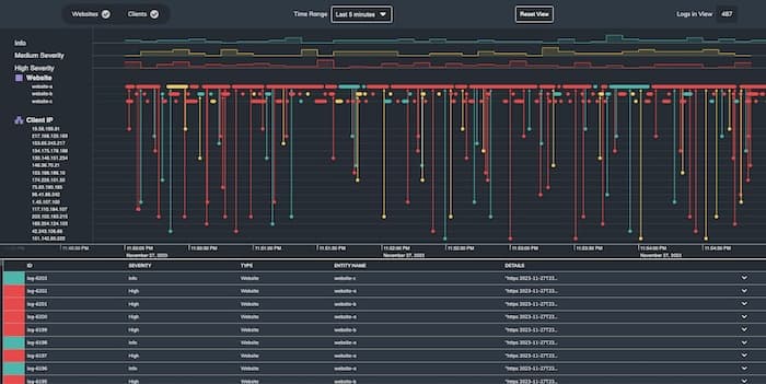
In this example, we visualize the logs (colored by severity) generated by three websites over a five-minute period. The timeline in the top half of the screen shows event data (in this case logs) for website and client IP entities.
Notice how we can zoom in to see logs that could be just nanoseconds apart, or zoom out to see much longer timeframes. We can choose to filter different log types, so I can instantly isolate the log events from clients making requests on the sites.
KronoGraph was built from the ground up with scalability in mind. It scales to millions of events across hundreds of entities, managing the best way to display data at every zoom level. This makes it uniquely suited to data log visualization at an enterprise level.
This example shows how KronoGraph handles large amounts of event data by seamlessly transitioning from individual events into event summaries, and ultimately into heatmap cells. This happens automatically, but you can set the threshold at which events are aggregated into those heatmap cells.
The KronoGraph heatmap works particularly well for log data visualization because we can customize heatmap cell colors and prioritize them by log parameters. In our examples, high severity (red events) take priority when aggregated, so that even when a heatmap cell summarizing 100 logs has just one high severity log, it’s still colored red.
With this technique, enterprise observability solutions make important logs stand out from the rest of the data, focusing on events that need immediate attention.
KronoGraph also scales vertically to visualize hundreds of entities using the lens view. This lets you scroll through the entire dataset – no matter how large – but keeps the entire heatmap visible, so you always know where you are in the wider context of the data. When there’s limited screen real estate, KronoGraph packs entities into data-driven groups.
Successful log data analysis means identifying which entities are causing or reporting issues, and understanding the wider context in which it’s happening. Visualizing that context in enterprise-level networks isn’t easy for most observability platforms, but a specialist visual time analytics tool like KronoGraph can handle it.
Developers can customize every interaction the analyst needs for their investigative workflows. In this demo, if we click on a log event, we see an animated ping effect, the event is highlighted in the timeline, and details about that log are displayed in the log table at the bottom of the screen.
In the next example, we click a row in the log table to drive selection of that log event on the timeline above it.
It’s also possible to reveal details about events without leaving the heatmap view. In this example, red and yellow heatmap cells represent logs flagged by machine learning algorithms for further analysis. When we select one, we reveal the underlying log, together with a tooltip of useful information.
These interactions make it easier to find patterns and anomalies in the context of the wider dataset. Let’s explore why that’s important to enterprise observability.
Root cause analysis is an essential technique for enterprise observability. If a high-priority log event triggers, teams must act fast to understand how, where and when the problem occurred. Traceability is key – what events led up to it? What was the impact?
In this example, we see a whole bunch of alerts from various clients and websites. To start our investigation, we look at what happened in the five minutes before the alerts triggered across the websites, and see which clients communicated with them. There are errors all over the place, but individually, none of them reveal the root cause. We’ll need to go back further in time.
When we look at activity 30 minutes before the problems started, we see how the issue seems to start with website-a.
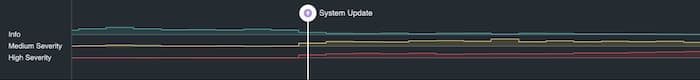
When we go back further still to look at an hour of data, we spot a marker showing a system update. This is where all our troubles started.
Notice the KronoGraph’s time series charts visible above the timeline, showing peaks and troughs in key values over time. They summarize the number of medium and high severity logs before and after the system update.
KronoGraph handles vast, real-world datasets without compromising performance. As a timeline visualization component, you can easily embed it in your existing observability platforms and give users the advanced investigation tool they need.
We’ve covered many of KronoGraph’s log analysis techniques, but there are others including support for pattern of life analysis and the ability to add narratives to highlight key events using annotations.
Ready to use our timeline visualization SDK? Request a free trial today.
Request full access to our KronoGraph SDK, demos and live-coding playground
Registered in England and Wales with Company Number 07625370 | VAT Number 113 1740 61
6-8 Hills Road, Cambridge, CB2 1JP. All material © Cambridge Intelligence .
Privacy Policy | Security Framework


