This blog post explores how KronoGraph, our visual time-based analysis toolkit, helps every analyst find the answers they need. We’ll visualize timeline data with KronoGraph’s lens capability: a unique way to navigate data, no matter how large the datasets. We think it’ll change your timeline analysis techniques for good.
Who needs to visualize time-based analysis?
Investigators working in every data visualization use case face the same problem: So. Much. Data. And most of it has a time dimension.
Think how many events happen every millisecond on a busy IT network, or how many call records require analysis after a major crime.
Visualization is the right way to make sense of big data (find out how in five steps to tackle big graph data visualization). But even after back-end filtering and aggregation to get rid of noise, many visualized timeline datasets remain huge. And investigators need to navigate easily through every event and connection to find patterns and uncover threats.
Here’s the challenge: they want to see everything at once.
And here’s the second challenge: they want to take a closer look at what’s important BUT STILL see everything at once.
Impossible? Not any more.
We’ll focus on two scenarios here – an investigation into terrorist activity, and analysis of call data records – but the same principles apply to every use case that deals with huge datasets. We’ll explore KronoGraph’s unique ability to see thousands of timelines in a single visualization while also focusing on the key items of interest.
Using the lens to drill down into terrorist investigations
This KronoGraph web app analyzes 40,000 events between 1968-2009 from the RAND Database of Worldwide Terrorism Incidents. The data originated in CSV format, but navigating that CSV data to find events affecting a particular country during a specific timeframe would take significant effort.
When we visualize the dataset with KronoGraph, we get an immediate sense of its scope and shape.
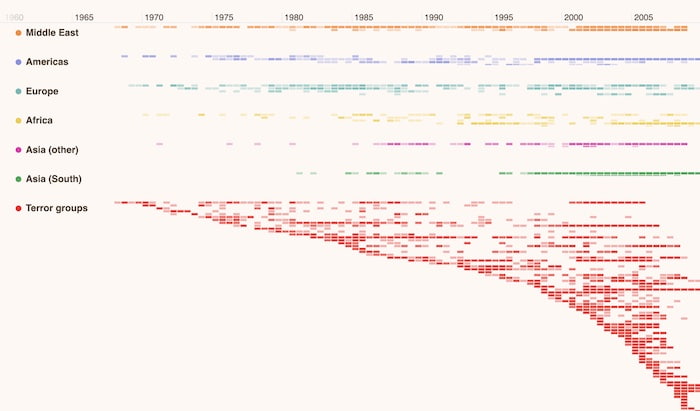
We’re looking at 40,000 events in a single view. On the left-hand side are groups for each continent, plus a separate terror group. Glyphs – those color-coded dots to the left of each group name – make it easy to spot which part of the heatmap refers to each group.
Let’s focus on a specific area of interest. We want to know which African country saw a noticeable increase in terrorist activity during 1994. A simple marquee zoom filters the data by time to reveal intense activity around July and October.
The heatmap shows an aggregated view of the African continent’s details. We’re interested in specific countries, so we open KronoGraph’s lens view to inspect the data in more detail. The lens acts as a magnifying glass so we can take a closer look in the context of the entire dataset.
In just a few clicks, we’ve established that Algeria was victim to the most terror attacks that year.
We could scroll through the lens view to take a closer look at the rest of the dataset too. In this way, investigators scan every recorded terrorist event but always know where they are in the visualization because they can still see the entire heatmap.
Let’s go back to our investigation into Algeria’s terrorist events. We use KronoGraph’s focus option to filter the timeline and remove everything except Algeria and its connections. It reveals that the Armed Islamic Group is predominantly responsible for these attacks.
We can quickly find out which other countries this terrorist organization operated in around the same time by switching focus to their timeline.
Spotting patterns with KronoGraph lens
This example explores time-based analysis of anonymized data taken from a study of 700 students. It features four separate friendship groups and the 13,000 cellphone calls they made to each other over an 18-week period.
We’ve used KronoGraph’s customization options to help us understand the data better. First we matched the color of each call depending on which group or cluster they called – so a red heatmap cell immediately tells me that that student made a call to somebody in cluster 3. Then we use saturation to show which students made the most calls and when.
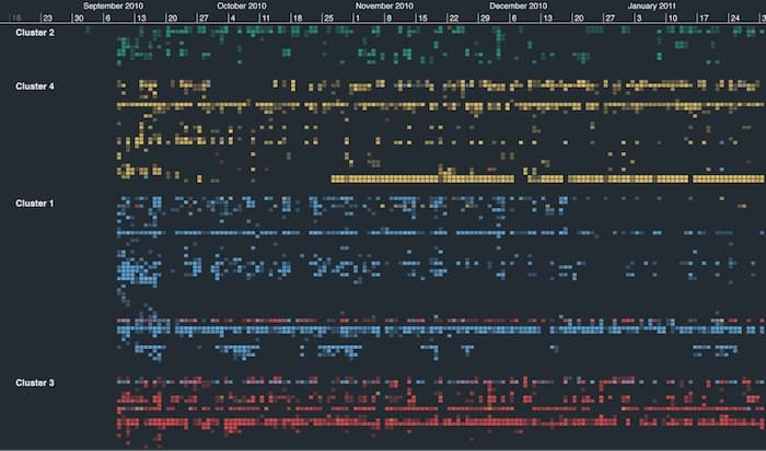
We’re looking at the entire output of the study here in a single visualization. One thing stands out immediately: students communicate mostly with others from their own friendship group, but there are exceptions. It’s also clear that some are far more active than others.
There are also two timelines in clusters 1 and 3 whose color coding suggests that they kept in regular contact throughout. Let’s use KronoGraph’s lens to take a closer look.
So at first glance, the timelines for cluster 1’s Ella Love and cluster 3’s Victoria Schneider appear to correlate. We simply need to focus on one of them to confirm whether they’re calling each other.
Now we’ve filtered out the other calls, the frequent communication between the two seems pretty conclusive. To verify, we simply zoom in to reveal the direct connections.
Incorporating network analysis with time-based analysis
You can integrate KronoGraph with one of our graph visualization toolkits to create a complete visualization solution. KeyLines and ReGraph provide a detailed network view so you can explore the same data in a different way.
Combining the two visual analysis methodologies gives users the full contextual and connected information they need – a clear topological view of the entities and connections in their data, alongside the time-based view showing sequences of unfolding events.
Both components are closely integrated, so any activity on one side automatically updates the other, creating a consistent and insightful user experience.
Start visualizing your time-based analysis
Getting started with KronoGraph’s time-based analysis is easy. Just sign up for a free trial and you’ll get access to the showcase demos featured in this post, plus many more to suit every major use case.
Share: