FREE: Start your trial today
Visualize your data! Request full access to our SDKs, demos and live-coding playgrounds.
Understanding how drugs interact with the human body, and with each other, is at the heart of drug discovery and pharmaceutical development. And in the life sciences, we have an ocean of data that’s openly available for research. But how do we make sense of thousands of drug mechanisms and protein interactions, when traditional tools like histograms just show us noise? I built a demo to tackle the problem with pharma data visualization.
I wanted to visualize all the known drug mechanisms, and give users the opportunity to delve in – to see key connections between protein families, and to look at cross-reactivities within these massive datasets.
Pharmaceutical scientists, data scientists, and software developers working in the life sciences have a lot of important decisions to make, and my demo shows that visualization can be the key to making those decisions faster and with more confidence.
In this short video, I explain why I built this demo, what it does, why it matters, and the problems it helps solve. Keep reading for a closer look at how it works in practice and some specific examples.
Traditional tools often present drug discovery data in spreadsheets, tables, scatterplots, heatmaps, or static pathway diagrams. While these formats are all useful, they often struggle to convey the complex, many-to-many relationships that underpin much of pharmaceutical research.
Think about:
These are inherently networked relationships – perfect candidates for graph visualization. Even in approaches that use AI-driven tools, you’ll often only have a number or a prediction that comes out at the end, and scientists need to explain and trust that an answer is an answer. Graph visualization is a beautiful tool to understand the why behind a number or prediction, and gain clarity into that black box.
Let’s explore how drug mechanism visualization with KeyLines reveals hidden relationships, supports better hypothesis generation, and creates more intuitive interfaces for pharma platforms.
In our graph network visualization, we’ll visualize entities such as drugs, proteins, and genes as nodes, and their interactions or relationships as links. Using KeyLines, we can create an interactive visualization that makes it easy for scientists and software developers to navigate huge datasets with clarity and context.
Depending on the use case, the model could include:
You could also include optional pathway nodes or clinical trial markers for added depth and context, or even predicted data as additional links.
I used data sourced from ChEMBL for my demo app. It brings together chemical, bioactivity, and genomic data to support drug discovery.
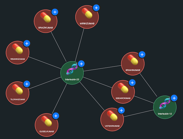
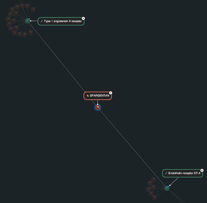
In this graph model, drugs are represented by red nodes, and protein targets are green nodes. The drug mechanisms reported in ChEMBL are modelled as links connecting the drugs to their known targets. This simple visual abstraction immediately reveals interesting structures in the data.
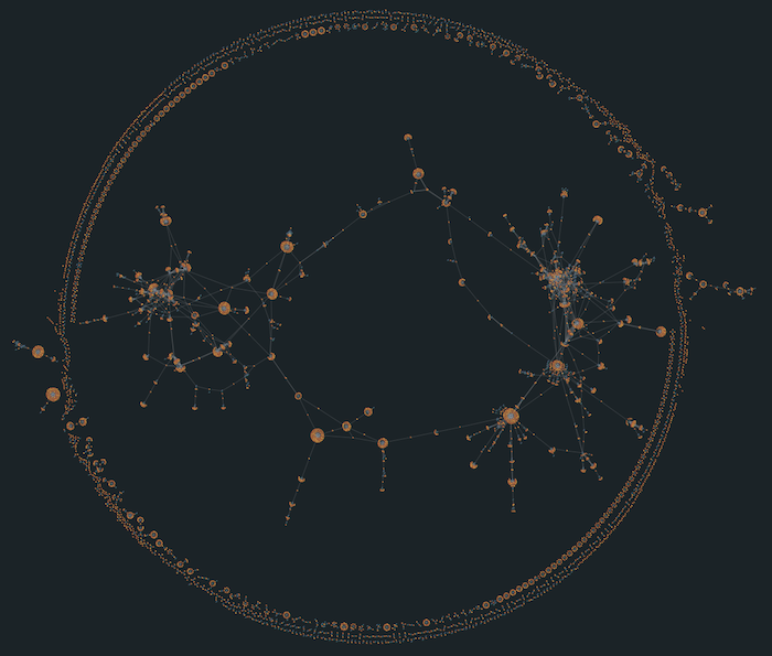
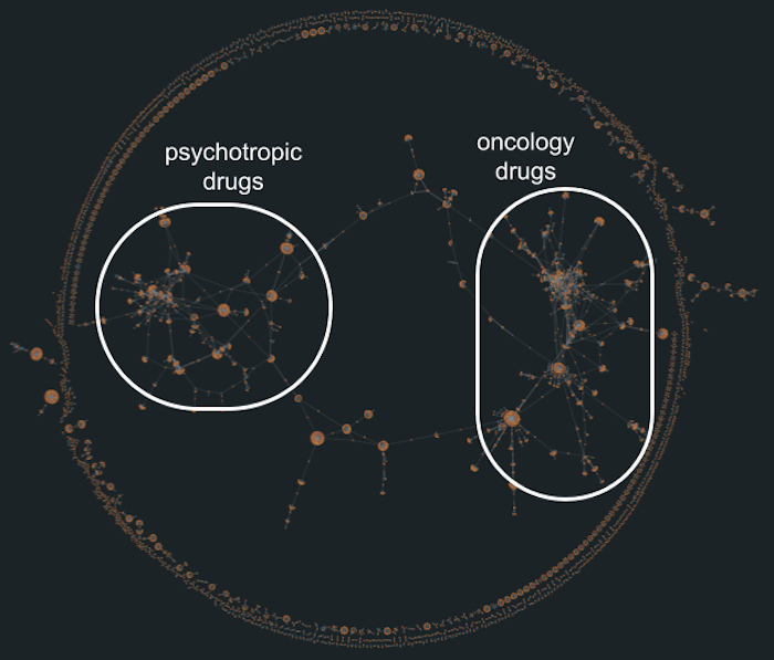
For example, one densely connected cluster shows a web of interactions between drugs and targets related to dopamine, serotonin, and norepinephrine – highlighting how many psychiatric and neurological treatments work through the same biological pathways. Another prominent cluster forms around growth factor receptor targets, drawing attention to therapeutic strategies commonly used in oncology. Visual groupings like this are hard to spot in a table of rows and columns, but they jump straight out in a graph visualization.
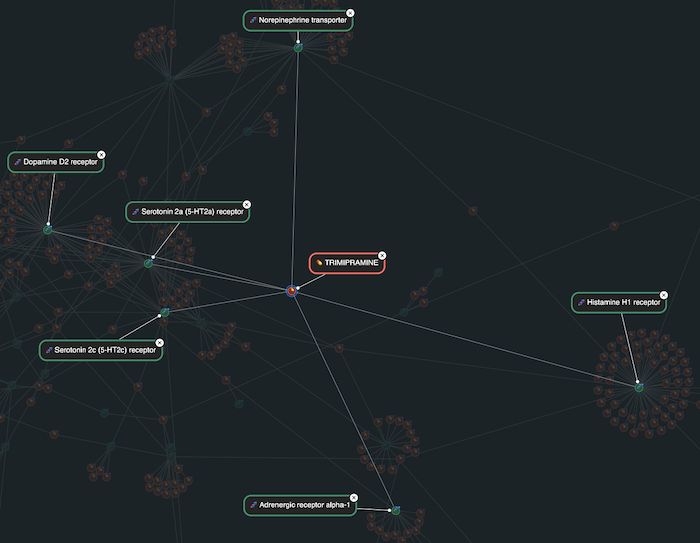
One striking example from the demo is the antidepressant trimipramine. In the visualization, it stands out as a red node with links to a broad range of targets – beyond the serotonin and norepinephrine targets that are typical for an antidepressant drug. These wider affinity-based interactions include the dopamine D2 receptor, the histamine H1 receptor and the adrenergic receptor alpha-1. Visually, trimipramine acts as a hub, connecting multiple target clusters that are often studied in isolation.
This cross-reactivity not only helps explain why trimipramine is used to treat anxiety and depression, but also highlights its sedative and antipsychotic properties. Seeing this networked behavior in a visual form makes the compound’s complex clinical profile easier to understand – and opens the door to thinking about how similar drugs might be repurposed, and how off-target effects can be analyzed or anticipated during the discovery process.
Another example is sparsentan, which stands out in the visualization as a red node with direct links to two receptors. This dual-target approach is central to sparsentan’s therapeutic strategy in treating rare kidney conditions like Berger’s disease, where both of these pathways contribute to disease progression. In the graph, sparsentan appeared as a key connector between two otherwise distinct receptor families, making its dual mechanism immediately apparent.
This kind of structure is especially powerful in a visual context, as it helps communicate complex pharmacology to a broad range of stakeholders, from discovery scientists to clinical strategists. It’s a strong example of how graph visualization can make the rationale behind next-generation drug designs clear, while also helping to spot related compounds that might share, or interfere with, the same targets.
Visualizing drug mechanisms and other pharmaceutical data in this way can be transformative, getting you to key insights and decisions faster, and it’s easier than you might think. With KeyLines, you can:
Want to see it in action? Contact us to learn more.
Visualize your data! Request full access to our SDKs, demos and live-coding playgrounds.
Registered in England and Wales with Company Number 07625370 | VAT Number 113 1740 61
6-8 Hills Road, Cambridge, CB2 1JP. All material © Cambridge Intelligence .
Privacy Policy | Security Framework


