
Let’s see how our graph visualization toolkits help cyber security analysts explore thousands of attack records in a single data breach visualization.
Data sharing presents a huge challenge to the cyber security industry. When organizations are compromised, the common response is to switch to self-preservation mode. The full details of breaches are rarely disclosed which limits collective intelligence and arguably makes the life of attackers easier.
Happily, there are several projects focused on cyber security threat intelligence and working to fix this.
VERIS (the Vocabulary for Event Recording and Incident Sharing) aims to provide a common taxonomy for organizations to share information about their breaches. By helping organizations exchange war stories, they hope to facilitate cooperation and improve risk management.
Alongside this project is the Veris Community Database: a project to collate and disseminate information about all publicly disclosed data breaches. Excitingly for data visualization enthusiasts like us, their cyber security graph data is openly available on GitHub.
Let’s take a look.
The data model
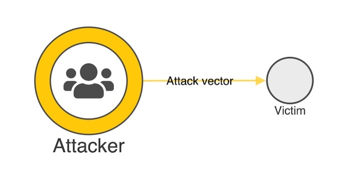
The Veris team has designed a schema that helps organizations record breaches in a ‘structured and repeatable’ way. It uses the A4 model to describe and classify incidents by:
- Actor – i.e. who performed the attack?
- Action – i.e. what was the attack vector?
- Asset – i.e. who or what was the attack victim?
- Attributed – i.e. what was the outcome / impact of the attack
For each of the 5500+ attacks listed there are more than 150 data points, so we need to design a visual model that will enable us to explore the cyber security data set and answer some key questions.
As actors (attackers) and actions (vectors) are grouped into categories, we will model our graph in the following way:
Let’s take the VERIS Community Database (handily available from GitHub in JSON format) and load it into a KeyLines chart.
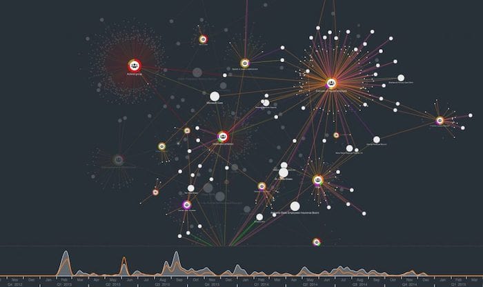
Step 1: Data overview
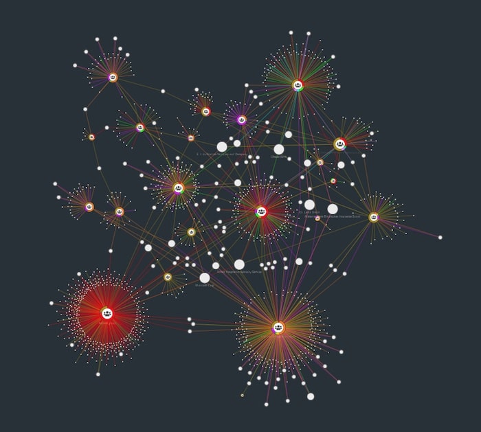
This is a fairly large dataset, but KeyLines’ powerful Web Graphics Library (WebGL) engine delivers impressive rendering speed and quality. We have color-coded the links (attack vectors) by the categories supplied in the dataset, which helps us pick out some early patterns:
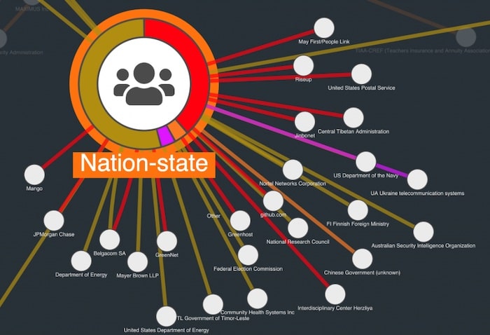
- The large red group shows that Activist Groups favor ‘Advanced Technology’ including remote access, command shell and VPNs.
- The yellow/purple/orange clusters indicate breaches originating from end-users or employees. These are more likely to be caused by carelessness, physical access or basic technology, like desktop sharing or document theft.
Step 2: Temporal patterns
One of the data points collated by Veris is a date stamp of when the breach was reported. Let’s add this to our chart with the KeyLines time bar:
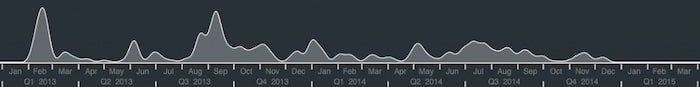
The overall picture here is quite lumpy, with peaks in February ’13 and ’14. But using the filters, let’s take a sub-network view of how different vectors change through the months:
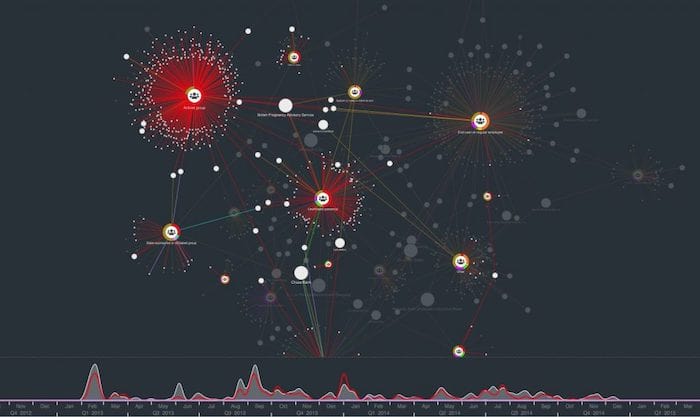
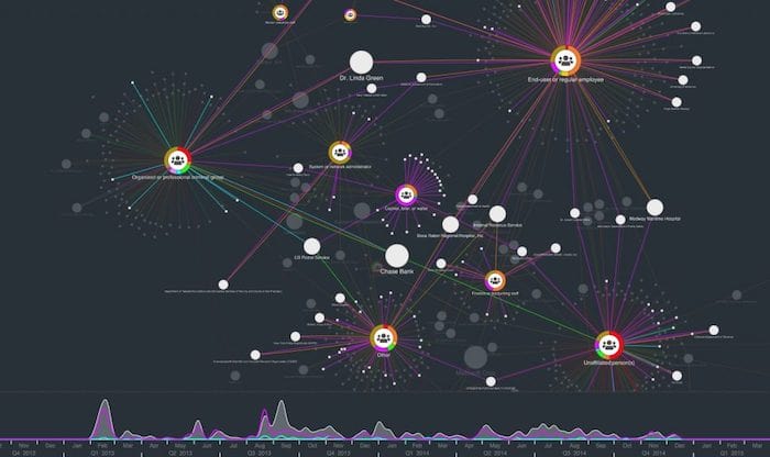
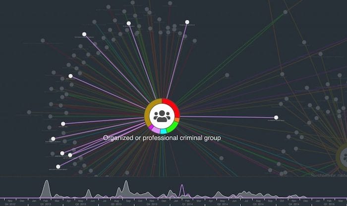
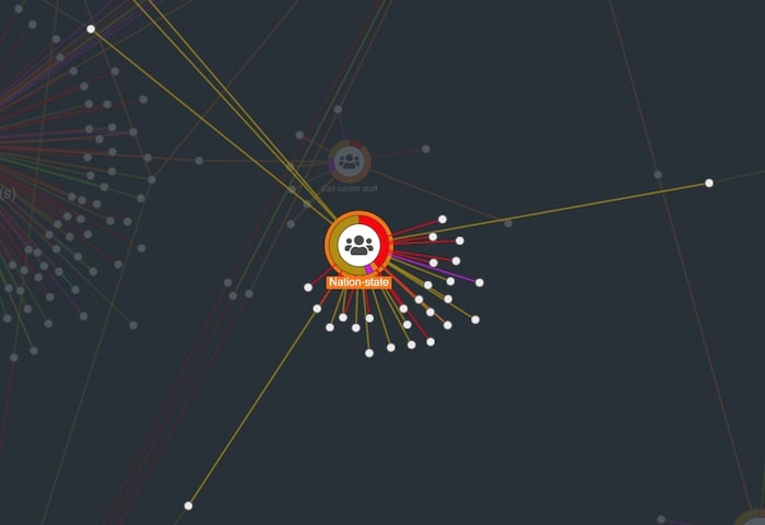
Step 3: Attack vectors by attacker group
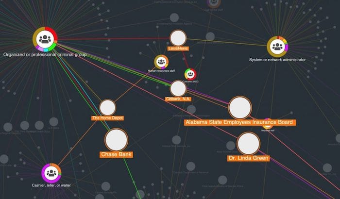
The advantage of a graph-based visualization is we can see our data in its full connected environment. Using simple filters, we can find some other trends. For example:
Step 4: Find the unlucky victims in our data breach visualization
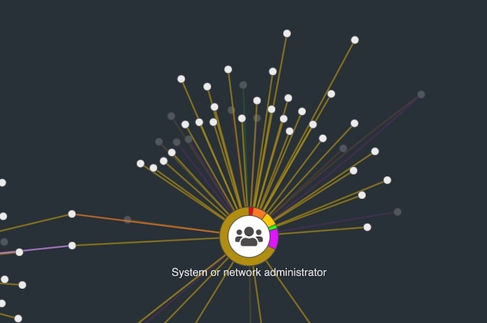
We’ve looked at the attackers and the attack vectors. The third entity type in this data is the victim. By sizing victim nodes by degree (number of connections to other nodes in the network) we can get an idea of the most frequently breached organizations:
Create your own data breach visualization
With our toolkit technology, you can visualize and explore thousands of attack records in a single chart. By configuring the data model to show different aspects of the Veris schema we can find new trends – a process made faster and more interactive with the help of automatic layouts, clever filters, social network analysis and the time bar.
Want to explore the data for yourself? You can find this demo and over 80 others on our KeyLines SDK. Ready to start an evaluation?
We first published this popular post some time ago. This version features brand new example visualizations to keep it useful and relevant.
Share:
