Pattern of life analysis is a powerful technique used in investigative applications. It helps investigators understand the habits or behaviors of persons of interest based on large quantities of observed data. In this blog, we look at how timeline analytics can help in this scenario. We’ll use KronoGraph – our timeline visualization toolkit – to reveal the hidden patterns in our data.
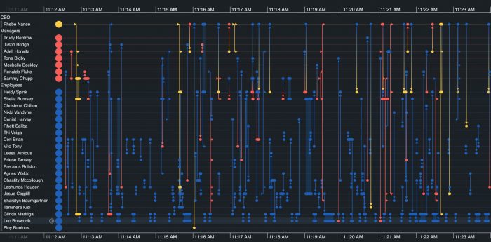
The pattern of life visualization challenge
There are many wide-ranging reasons why pattern of life analysis might help your use cases:
- Finding insight in anonymized datasets – it’s a popular technique in signals intelligence (SIGINT) and open-source intelligence (OSINT) methodologies. Applying pattern of life analysis to metadata generates intelligence from communications without needing to see the content of the communications themselves.
- Suspicious activity and fraud investigation – understanding ‘typical’ behaviors makes it possible to identify unusual activity.
- Predictive intelligence – if we know how criminals usually act, we can make pre-emptive operational decisions. For example, analyzing airline ticket purchases made by known drug traffickers may reveal patterns. This can help border surveillance investigators decide which flights to intercept.
If you want to see how KronoGraph fits into your investigative toolkit, take a look at 5 popular use cases for KronoGraph timeline analysis.
Scale wrapping makes pattern of life analysis possible
KronoGraph includes a simple but extremely powerful scale wrapping feature. When combined with KronoGraph’s innovative heatmap view of large quantities of temporal data, scale wrapping instantly shows us behavioral insights from a soup of activity.
To explain how it works, imagine we collect data on emails sent by staff in an organization, and we classify them by type (support, out-of-office, sales, etc.). Each email has a timestamp, making it perfect for temporal pattern analysis. A year’s worth of data loaded into KronoGraph might give us something like this:

At first glance, we can see very different patterns depending on email type. For example, promotional emails are more sporadic than support emails, but are there more patterns hidden in this dataset?
Scale wrapping lets us choose a specific time period (a day, a week, a month, etc.) and show where in that time period each event happened. If we switch to a ‘day’ view, our heatmap shows that the various world regions tend to send their support email at specific hours within each day, but there’s no such daily pattern for promotional emails:

Switching to a monthly view shows that promotional emails tend to happen on the first and 15th day of each month (although a glance at the initial yearly view shows that they take a brief break in August):

Let’s take a look at a larger, more realistic dataset to see what other patterns we can spot.
Behavioral analysis of anonymized communication data
For the following examples, we’ve used the wonderful Radosław-email dataset (Michalski, Radosław, 2020, “Manufacturing company email metadata and corporate hierarchy”) which provides the timestamps of some 82,000 email communications between around 170 employees of a mid-sized manufacturing company.
Typical of intelligence data, we only have partial information: we know when the emails were sent, and we’ve anonymized IDs of the participants, but we don’t know who the participants are, or what their emails were about. Nevertheless, KronoGraph’s pattern of life visualization gives us a great deal of insight into behaviors.
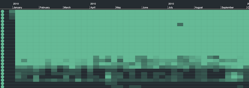
We’ll start by simply loading the data into KronoGraph, with an entity row for each employee and an event for each email. We don’t see a great deal initially, but we can identify some employees who send very few emails (perhaps people on the factory floor with limited access to email clients?) and we notice a few dark spots in July and August during holiday season:
Now let’s switch on scale wrapping, and set it to a scale of one day. Here’s the result:
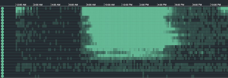
Immediately we spot familiar sequences and can start to analyze temporal patterns in the data. The heatmap reveals when employees typically start and leave work. We can see which employees send emails late into the evening and which ones stop communicating at 5pm sharp.
Digging deeper into our pattern of life analysis
Notice the unusual bright spots in the top corners of the picture? They appear to show regular communication between a small number of employees at around midnight local time. What’s happening here?
Zooming into this interesting area, we see that it’s made up of extremely regular emails from one employee (employee #1) to a group of others. At this time of night, and with this regularity, it’s almost certainly an automated email, perhaps a regular automated report?
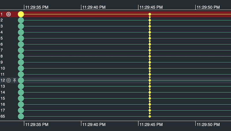
I can now highlight this report in yellow, and switch my scale wrapping to ‘week’ mode. This shows me the wider context and typical pattern of these reports:

They are most common on a Monday evening. By the weekend, they’ve pretty much faded out.
Enriching data for behavioral analysis
We’ve been able to spot working hours, vacations, late-night working and automated reports, all from a completely anonymized dataset. But pattern of life analysis gets even more exciting when we can enrich the dataset with more information.
This version of the Radosław dataset contains some useful information for enrichment – an organizational chart of the company, which lets us identify groups: managers, regular employees, the CEO, etc.
We’ll use KronoGraph’s powerful types feature to color code the ends of each email based on the position in the organization of the sender and recipient. To keep things simple, we’ll focus on a smaller number of employees. Here’s the result, with scale wrapping set to one day:
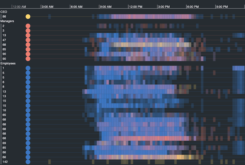
It’s the same daily pattern, and we can clearly see employee #1’s nighttime group emails to the right of the picture. We can also use color to see how patterns differ between different groups.
For example, the CEO is shown at the top in yellow. We can see that this CEO follows a different pattern to most employees, who often start earlier and work later. Focusing on the CEO with a simple double click filters just their activity with the rest of the organization:
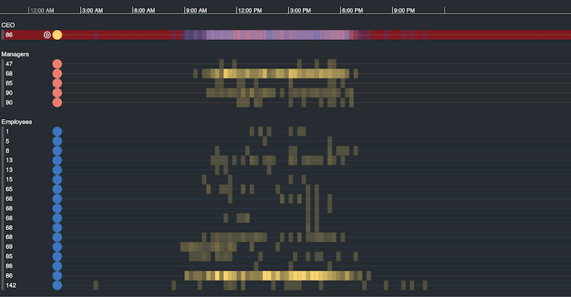
Two employees in particular have very yellow timelines, implying that they talk to the CEO directly and frequently.
Let’s focus on the relationship between the CEO and manager #68. Zooming in brings out individual events from the heatmap.
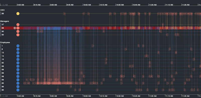
This shows us that manager #68 tends to come in an hour earlier than the CEO and gets a huge number of emails from employee #85 before the CEO arrives. Perhaps getting briefed on projects before a morning meeting?
This kind of pattern of life analysis reveals valuable insight into who usually does what, and when.
Needles in the haystack
Pattern of life investigations are not just about spotting normal behaviors. We can also look for patterns that surround unusual activity.
Switching to an annual view of our email communications, we notice an unusual black spot in employee #13’s activity. Almost certainly a summer holiday (but a long one – two months!).
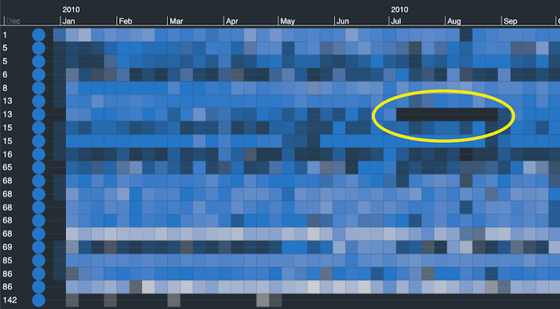
Let’s zoom in and see what activity preceded and followed this gap.
You can see that on either side of the break, the employee sends emails to a red entity – a manager. One before leaving (“I’m off now, see you in two months!”) and a short exchange a week after returning.

This ability to move seamlessly through the data, spotting trends and unusual patterns, makes our interactive timeline tool uniquely powerful. Go from a bird’s eye view of an entire dataset, down to a detailed view of a single sequence of events with just the roll of a mouse wheel.
There is another clever way to take a closer look at the timelines that matter while maintaining overall context of your dataset. Let’s explore KronoGraph’s lens view.
Focus on patterns in timelines
When investigators want to explore patterns of behavior in more detail, they can hold a virtual magnifying glass over their most important timelines. Scrolling through the lens view gives an enlarged picture of key data in the context of the entire dataset.
The lens is just another reason why KronoGraph is so compelling for visual pattern analysis.
What’s new in KronoGraph?
See the lens view, glyphs and more in this 20-minute video
Bringing it all together
Using a timeline to investigate behavioral patterns is powerful. Even more powerful is the combination of a timeline with other visualization techniques, such as the link charts provided by our KeyLines and ReGraph toolkits.
To give just one example: if you fuse geospatial metadata, such as cell tower location, with the pattern analytics of KronoGraph’s scale wrapping, not only can you spot unusual behaviors, but you can also see how the movements of a person of interest correlate with those behaviors.
In other words, where was the subject going and what were they doing when the unusual activity took place?
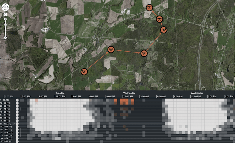
This kind of Activity-Based Intelligence is a powerful technique, made possible by the interactive visual analytics of tools like KronoGraph, KeyLines and ReGraph.
Getting started with these toolkits is simple. Just sign up for a free trial, or get in touch to find out how we can help you build the best investigative application for your users.
