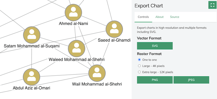
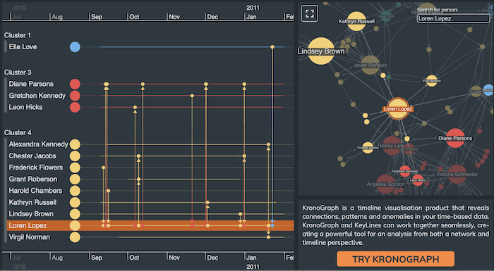
Analysts sometimes need their graph visualizations in a format they can share easily with colleagues or submit to court as evidence. Version 6.3 of KeyLines, our graph visualization toolkit for JavaScript developers, delivers high-resolution exports in a range of popular output types without compromising on quality.
This release also includes a new layout mode to give greater control over small changes, plus further improvements to organic layout. And we’ve added an exciting new demo integrating KeyLines with KronoGraph, our timeline visualization toolkit.
Export vector-based graphics for the first time
Users of KeyLines-built applications can now export vector graphics, with support added for SVG. The finest details are crisp and sharp, even when users zoom into large, complex visualization images. There’s also support for export to ultra high resolution (16K) PNG and JPEG versions of their charts.
Whichever output users choose, they’ll create high-quality images.

To see the quality for yourself, try the updated Export Chart demo on the KeyLines SDK site.
There’s more to come on this, including PDF output support, so for now this is a beta feature. Let us know what you think of it
Get full access to the KeyLines SDK
Greater control over small changes during layouts
Minimizing movement in your charts is key to an intuitive user experience. That’s why we’ve built our best incremental organic graph layout behaviors yet.
A new ‘adaptive’ mode option runs a short force-directed layout instead of a full one. It means items adapt to layout changes while preserving the position of original items as much as possible.
You’ll notice improvements to the way items are filtered or resized, and to the way small changes are handled during time bar animations.
Standard layout supports the new mode too, but we recommend using organic, our most powerful layout, for the best incremental results. You’ll also benefit from further improvements we’ve made to organic layout, which now produces a more compact arrangement, minimizes node overlaps and reduces whitespace.
See all of this in action in the KeyLines SDK’s updated Social Network Analysis demo.
New demo: KeyLines & KronoGraph
Our graph visualization toolkits integrate seamlessly with KronoGraph, our timeline visualization toolkit that drives investigations. It gives users two powerful views of the same data, bringing new perspectives to existing graph datasets.
Our latest demo – Timelines with KronoGraph – introduces the significant benefits of having network and timeline visualizations working side-by-side.

Our Integrating a KronoGraph event timeline visualization with KeyLines blog post gives step-by-step instructions on how to create an exciting new hybrid application.
Find out more about KronoGraph
Try our premium data visualization tools
KeyLines is more feature-rich than ever, so now is a great time to start creating the powerful applications your users need.
Ready to get started? Request a free trial of our product.


