There are lots of ways for a cyber security analyst to look at their data – as tables, bar charts, line graphs. But none of these can capture a key dimension: connections. That’s where graph visualization comes in.
In this series, we’re going to look at how some of our customers have deployed our KeyLines graph visualization toolkit to help them understand the connections in their cyber security data.
Anomaly detection in cyber security data
Patterns and trends are interesting, but are mostly helpful for helping us see anomalies. By detecting anomalies in cyber security data, an analyst can prevent data breaches, find malware entry points, predict externals attacks and generally find vulnerabilities in an organization’s perimeter.
Visualizing a network: Overview or detail?
There are broadly two approaches to graph visualization:
- Local: start at a specific point and explore outwards into the wider network
- Global: start with an overview and zoom into details of interest.
This example uses the global approach to graph visualization. It is a technique widely used in fraud detection and compliance environments – situations that require fast but careful decision-making based on large datasets.
An enterprise SIEM system is likely to generate thousands (or even millions) of security alerts every day. No analyst can hope to check each one, but they equally cannot all be ignored. Graph visualization makes it possible to take a high-level overview of this data, driving effective anomaly detection in cyber security data.
Visualizing Login Logs
This example shows how one KeyLines customer, an online currency exchange provider, uses graph visualization to analyze user login behaviors.
Irregularities in login patterns can be a useful indicator of compromise, often indicating an impending breach. Patterns to look for include:
- Accounts accessing a system from many geographic locations
- Accounts using many different devices
- Logins from locations in which the company does not operate
- Accounts accessing a system from two devices simultaneously
- Multiple failed logins
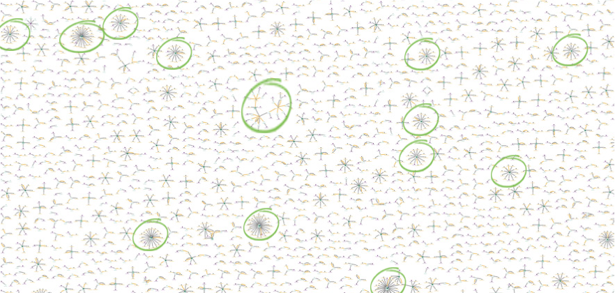
Humans are uniquely equipped with the analytical skills required to see patterns and find outliers. By presenting a visual overview of our data in a single chart, the brain automatically spots unusual patterns:

In this screenshot, the central node of each structure indicates an online account; each connected node is an IP address that has been used to access that account. We can see that most accounts have been accessed by 1-4 different IP addresses.
There are specific star structures throughout the chart that stand out:
Interested in graphs for cyber?
Check out our webinar, exploring the role of graph visualization for cyber security analysts
This indicates that individual login accounts have been accessed from multiple locations. Let’s zoom into one:
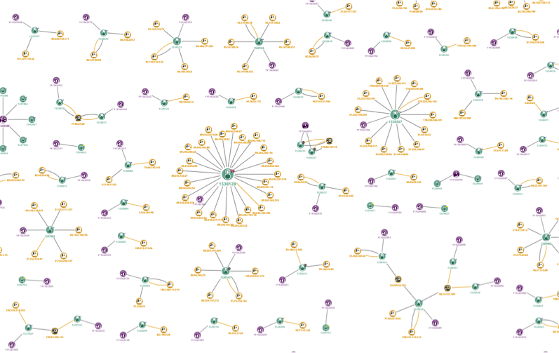
Here we have zoomed in on two ‘star’ structures. At this level, we can see more detail:
- Green nodes are the user
- Yellow nodes are devices used
- Purple nodes are the account.
Looking closer still, we can see that the user node uses a glyph to indicate the country of registration for the account. The node connected by a thick yellow link is the account’s ‘original’ IP address.
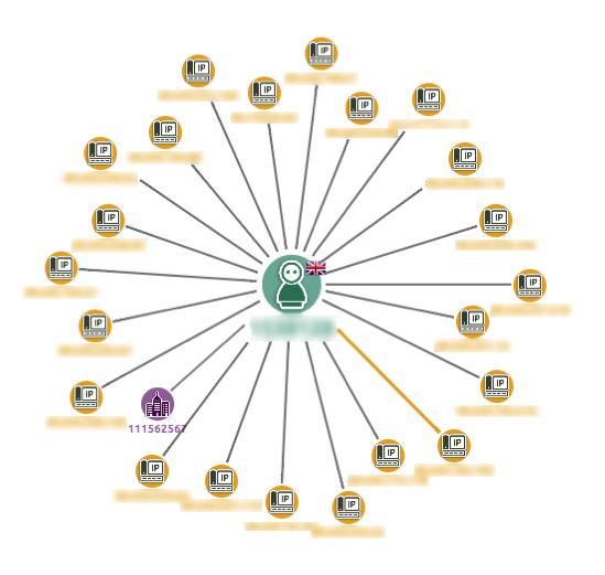
In this example, the analyst should look at this account and ask why this user has logged into the system from more than 20 locations. If we integrate our chart with a case management system, CRM or the login database, the investigation could be reached through a context menu.
Machine + Human Brain = Insight
This simple example shows the power of the global graph visualization approach. Even with advances in machine learning technologies, the human brain is still unique in its analytical and creative ability.
A KeyLines chart provides the perfect way to present this complex connected cyber data in a format that a human can explore and understand.
White Paper: Visualizing Cyber Security Data
Our updated white paper introduces the topic of network visualization for cyber security data, showing five specific examples of how KeyLines can be used to detect threats in complex cyber data, including:
- Analyzing software vulnerabilities
- Anomaly detection in cyber security data
- Finding patterns in data breaches
- Understanding malware propagation
- Performing impact analysis


