
Analysts rely on our data visualization toolkits to spot hidden patterns in their visualized data. They investigate these patterns and use them to predict – and, if possible, prevent – future events.
But what about the things you can’t predict or prevent, like natural disasters? What role can interactive data visualization play?
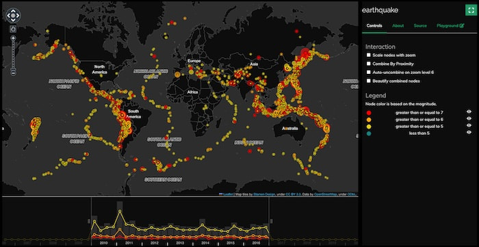
An interactive earthquake map visualization tool built using KeyLines
Recent devastating earthquakes in Turkey, Morocco and Afghanistan made me think about this.
Earthquakes caused by a sudden movement on a fault between the earth’s tectonic plates, which releases energy waves. And despite having time series data from seismic stations across the world at their fingertips, experts agree that it isn’t possible to predict a major earthquake. According to the US Geological Survey (USGS), they can calculate the probability of one happening, but only “in a specific area within a certain number of years”.
But combining pattern analysis with mapping technology still helps us to understand earthquake data better. For example, the USGS website hosts a live world map of earthquakes of 2.5+ magnitude, with useful overlays for tectonic plate boundaries and population density.
Inspired by this, I built a basic KeyLines graph visualization application to explore different ways to present earthquake data, and see what insights each perspective revealed to a seismology novice like me.
The earthquakes data source
The data I used is from the USGS’s National Earthquake Information Center (NEIC), whose extensive databases of seismic information are freely available. I chose one containing significant earthquakes (5.5+ magnitude) between 1965-2016, complete with the longitude and latitude coordinates KeyLines requires. There are over 23,000 earthquake records in there, so to keep things more manageable, I focused only on those that happened between 2010-2016.
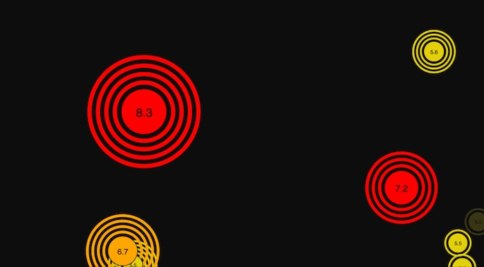
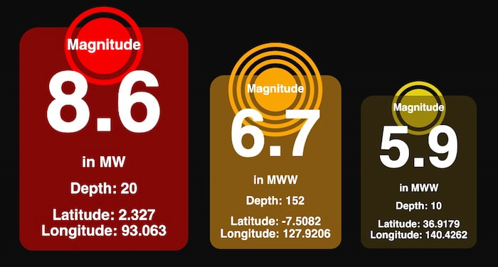
Each node in my data model represents an earthquake, and each is colored and sized according to its magnitude:
- Red for a magnitude of 7+ (classed as ‘major’)
- Orange for a magnitude of 6 – 6.9
- Yellow for a magnitude of 5.5 – 5.9
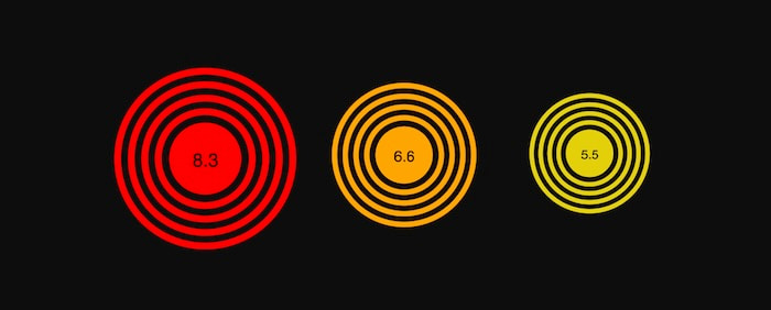
The size and color of each node relate to its Moment Magnitude scale, so larger, major earthquakes stand out more
The USGS uses the Moment Magnitude scale to estimate the earthquake’s size. I won’t go into detail here, but it’s a more reliable way to measure seismic activity compared with the better known Richter scale.
I also used halos on nodes to represent the earthquake’s depth, which can range from 0-700km. It’s a significant metric for obvious reasons: the impact of an earthquake that occurs at the earth’s surface is a lot more intense than one at a 500km depth. The more halos there are, the greater the depth.
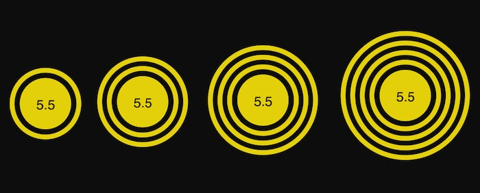
Earthquakes of the same magnitude can happen at different depths. Halos are just one of the KeyLines styling options I could have chosen to show this.
Here’s what six years’ worth of earthquake events look like in a network chart:
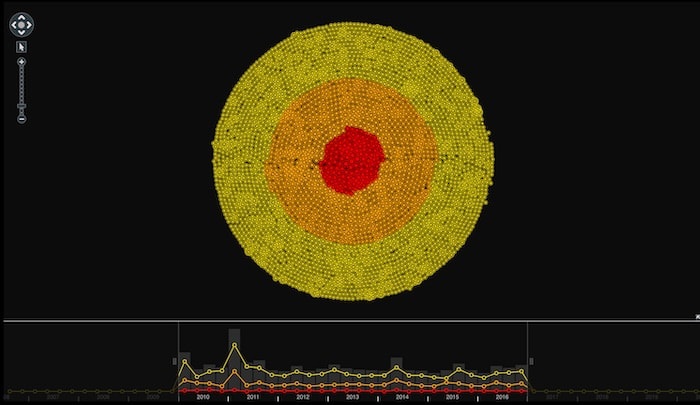
KeyLines’ organic layout is our fastest performing option for large network visualizations
Focus on what’s important
Visualizing six years of earthquake events at once gives us a decent overview of the shape of the data, and tells us that (thankfully) major earthquakes occur less frequently than others. USGS estimates that, on average, there are 16 of these each year.
We can use KeyLines’ clever filtering tools to focus on these major events:
Notice how zooming in after filtering the data reveals each earthquake’s magnitude as a node label. Right in the center is the most powerful – the 9.1 Tōhoku earthquake in the Pacific Ocean, which caused the 2011 tsunami.
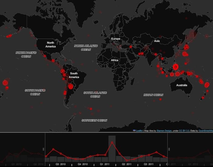
We can filter by time, too. The time bar below the network chart displays colored selection lines to represent how many earthquakes of each magnitude took place over time. For example, if we want to focus on the spikes in earthquakes of magnitude 5.5-5.9 in 2010-2011, we use the time bar sliders to select what we want.
It’ll be much easier to spot the location of events like the Tōhuko earthquake on a map.
Earthquake data as a geospatial visualization
A map view reveals what we’d expect, that the largest clusters of earthquakes occur where tectonic plates meet. I could have added another map overlay showing where these exist, but for now I’d recommend comparing our map visualization with the excellent USGS map.
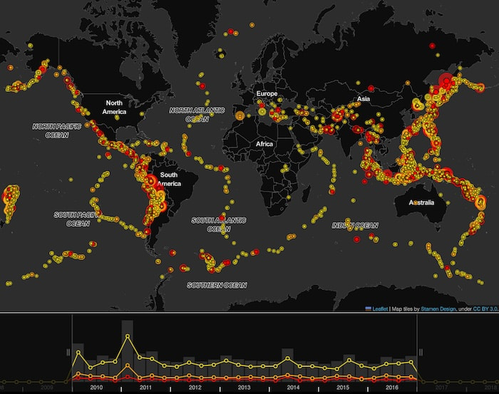
Creating a map version of the data was straightforward. KeyLines uses Leaflet, the popular JavaScript library for interactive maps, which gives you the freedom to choose from a huge ecosystem of map tile providers, projection systems and third-party plugins. I stuck with KeyLines’ default map tile provider, OpenStreetMap.
A couple of things immediately stand out: the higher concentrations of earthquakes around and above Australia and along the west of South America, and what looks like the deepest major earthquake in the top right of the map.
Additional investigation reveals that this was the 2013 Russian Okhotsk Sea earthquake. Thanks to its 609km depth, it didn’t result in casualties but was felt by residents in Belgrade over 8,100km away.
The high concentration of earthquakes around Japan on our original map shows (unsurprisingly) that its position at the boundary of 4 tectonic plates makes it a hotspot for seismic activity. When we take a closer look, the zoomed-in map reveals something interesting.
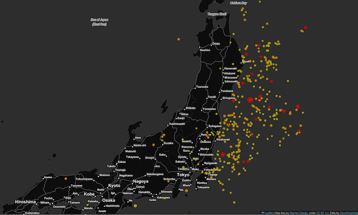
Earthquakes in and around Japan between 2010-2016
Now we can see that the majority of earthquakes took place off the coast of Japan rather than on the mainland. But also notice the number of major earthquakes, like the one in 2011 which caused a massive tsunami.
Combine data to show aggregated hotspots
Our initial map visualization was great for getting a high-level view of where earthquakes occurred, and revealed obvious global hotspots. But we don’t necessarily need to see every individual node to get insights. By aggregating the data on the map, we get a clearer view of which areas were most affected.
I used a third-party library called SuperCluster.js from Mapbox to work out the nearest neighbors of each node, and then combined them by proximity.
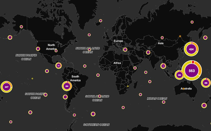
Combos declutter charts and reveal clearer insight
Combined nodes, or “combos”, are sized and labeled according to how many earthquakes happened in that area, and it’s clear that the most active proximity area is between Australia and Japan. We’ve used color-coded donut segments to convey the numeric proportion of each earthquake magnitude. Notice that, of the 563 events just north of Australia, a larger proportion were major (7+ MMS) compared with the 424 combo covering Japan.
Filtering map data
The network chart filtering we did earlier can also apply to map visualizations. Let’s focus on the major earthquakes between 2010-2011, including the 9.1 Tōhoku earthquake.
Notice the cluster of major earthquakes that occurred in northern Argentina. They stand out because they’re some of the few that occurred on land. Further investigation reveals that the largest was the 2011 Santiago del Estero earthquake, a 7.0 magnitude event at a depth of over 560km, which thankfully didn’t result in fatalities or injuries.
We’ve just used earthquake magnitude as node labels up to now, but we can add so much more. KeyLines offers an advanced level of node styling and almost limitless customization options. In this example, our nodes convey the magnitude, depth and geographical coordinates through both labels, node sizing, halos and color.
Visualize your complex connected data
I learned a lot while building this map visualization application and working with earthquake data. Experts can’t predict major events, but the ability to understand the risks in certain regions and learn from the impact of previous earthquakes is important. Visualization makes this so much easier. Check out how the USGS uses its data to create hazard maps and test earthquake scenarios so they can plan ahead.
Want to take it further? MapWeave makes it easy to combine geospatial, network and timeline data into a single intuitive view. For investigations involving movement patterns, locations and relationships – like seismic events or disaster response – it gives you the clarity and interactivity traditional maps can’t.
Share:
